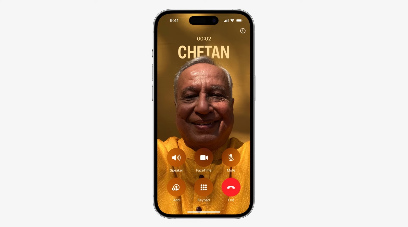
I didn’t have “End call controversy” on my iOS 17 bingo card of potential annoyances, but it’s apparently a big problem that everyone is talking about. The red End call button will no longer be placed centrally on the Phone interface that you see during a call. Instead, it’s getting relegated to the right side, taking the spot of one of the other non-colored buttons. And yes, Apple is shuffling around those buttons as well.
I explained the other day there might be hope that Apple hears complaints and offers users a choice between the two user interface options. Like it does with the Safari URL address bar. I was wrong. That’s not going to happen, and all I needed to do to realize it was to go back to Craig.
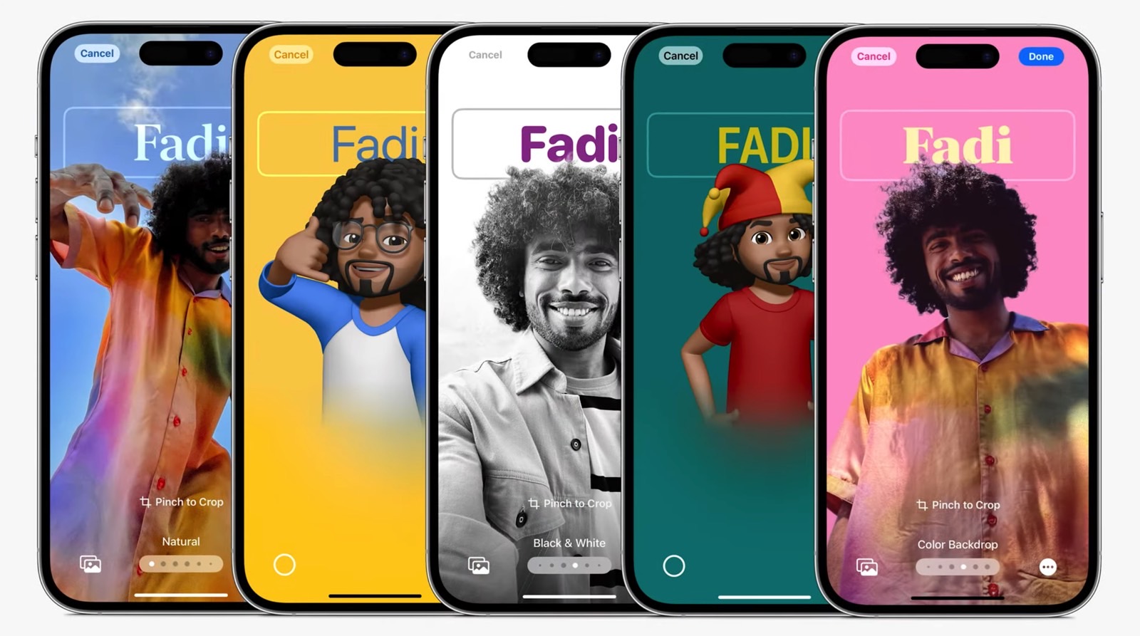
That’s Craig Federighi, of course, Apple’s software guru. He demoed the most important iOS 17 features at WWDC, including Contact Posters. That’s a cool way of creating your contact card by adding a photo and then using the same design options from the Lock Screen customization to create your perfect Contact Poster.
It’s also a feature that made my list of iPhone software innovations I won’t use, so I haven’t given Contact Poster a second thought since.

The End call controversy made me dig deeper, and I rewatched Apple’s Contact Posters segment from WWDC 2023. And, guess what? As you can see above, Apple featured the new End call button location during its presentation. That tells me the design change was decided long ago, and Apple is not reconsidering it.
Contact Posters is the reason we need the button rearrangement. Federighi/Apple made a big deal about how great these customizable contact cards are. How amazing they look and how they put the photo of the call front and center. That means everything else, whether it’s text or UI elements, has to flow around it.

You can’t have the old End call button arrangement because the two rows of buttons would sit directly on top of the face of the person in that Contact Poster. Even if you don’t plan on using Contact Posters at all, others will. So when those people call you, your iPhone will have to display their image of choice in a way that looks good.
Apple also announced that Contact Posters will support third-party apps. Therefore, you can expect similar button arrangements in VoIP apps that let you play voice and/or video calls.

The way I see it, the whole End Call redesign controversy is overblown. It doesn’t matter how iOS 17 will display that End call button. You’ll know it’s the button to tap once you’re done talking. Even if your muscle memory says otherwise. Also, you can end the call with your wireless earphones or the Standby/Power button.
Whatever the case, Apple will stick with this design change because of iOS 17’s Contact Posters. And there’s no going back.


