
Before iOS 17 was revealed at the WWDC 2023 keynote, a sketchy rumor said Apple planned to release a revamped Control Center with this year’s update. When the company finally unveiled iOS 17, there wasn’t a new Control Center, but there were personalized Contact Posters, which provide a new way for users to express themselves by customizing how they appear in incoming calls.
Control Center did get a revamp in tvOS 17, but now, designer Parker Ortolani has imagined what a redesigned Control Center on iPhone could look like based on iOS 17’s modern iMessage app picker.
In his design concept, Ortolani ditches the widget-like boxes in favor of iMessage’s new menu look. To access this feature, iPhone users would swipe from the right corner or press the iPhone 15 Pro’s rumored Action Button. “You can summon a list of essential switches and tools that you can customize to fit your needs,” he explains.
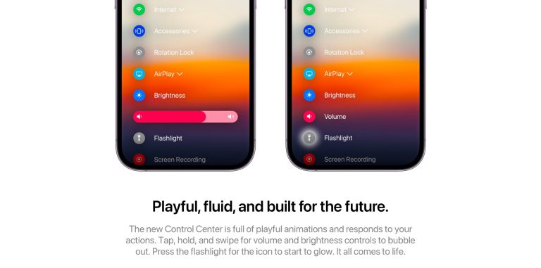
In addition, developers can integrate their apps right into the Control Center. By tapping and holding, users can easily rearrange the list of controls and pin those frequently used. “The new Control Center is full of playful animations and responds to your actions. Tap, hold, and swipe for volume and brightness controls to bubble out. Press the flashlight for the icon to start to glow. It all comes to life,” Ortolani says in his concept imagery.
While Ortolani’s idea is very interesting, especially now that Apple is bringing a new UI to the iMessage menu with iOS 17, I still think a list isn’t ideal for Control Center as you would not be able to see all of the icons at once.
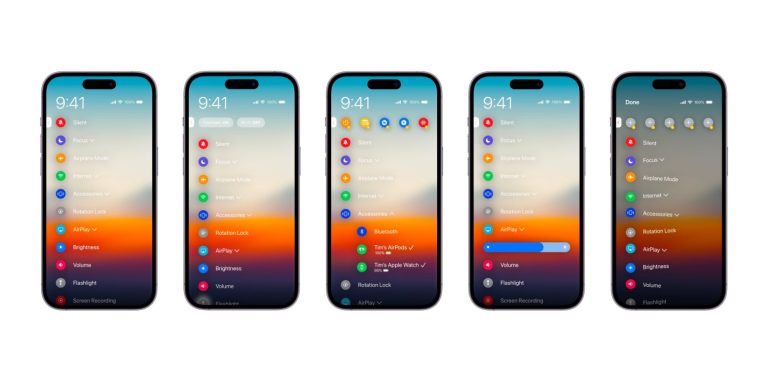
That said, I like the idea of pinning the most used features and having a prominent clock in the top left corner. Also, tapping and holding is an underrated UI function that I’d love for Apple to bring to more of its apps, widgets, and icons.
Parker Ortolani posts many of his concepts on Twitter, so be sure to give him a follow. iOS 17 launches later this fall, and we’ve gathered everything you can expect from this upcoming operating system update in the article linked below.


