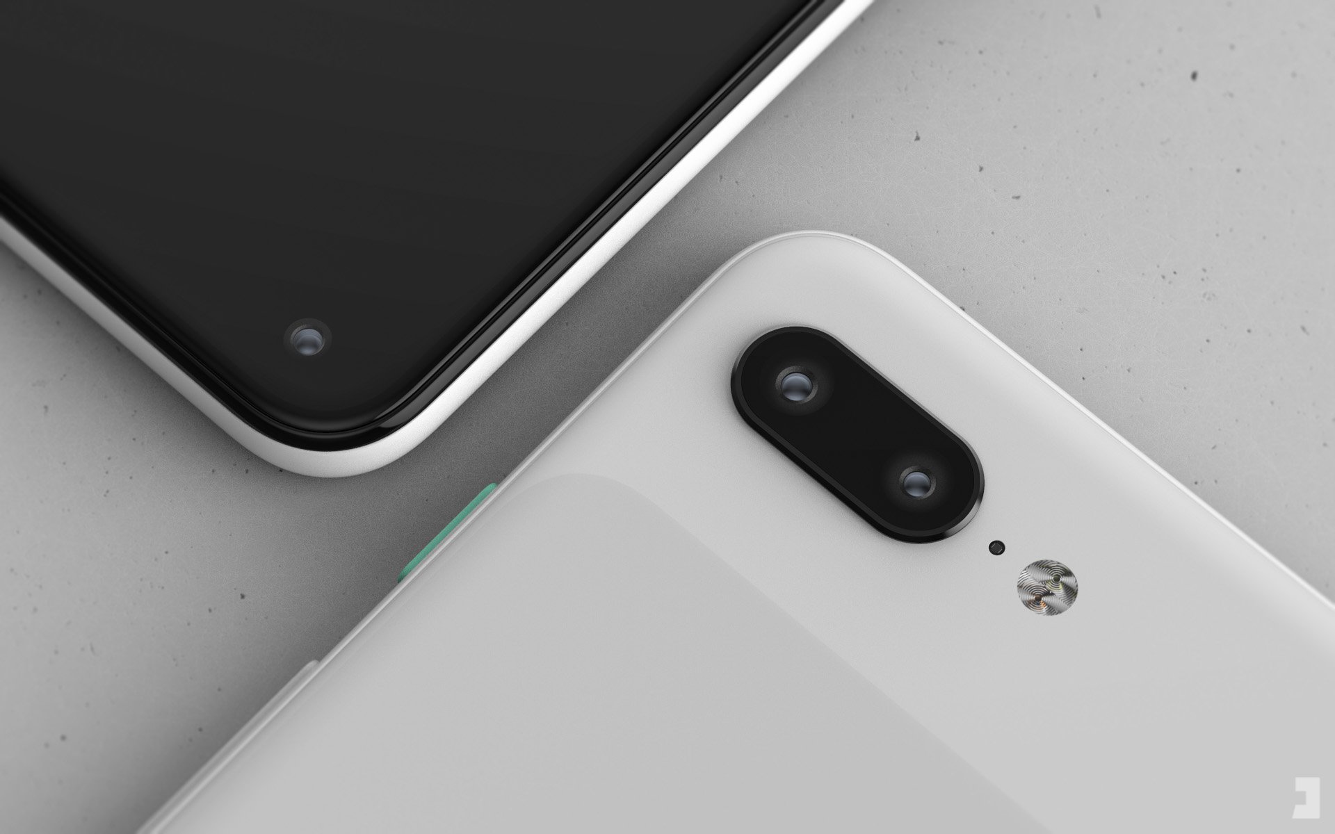
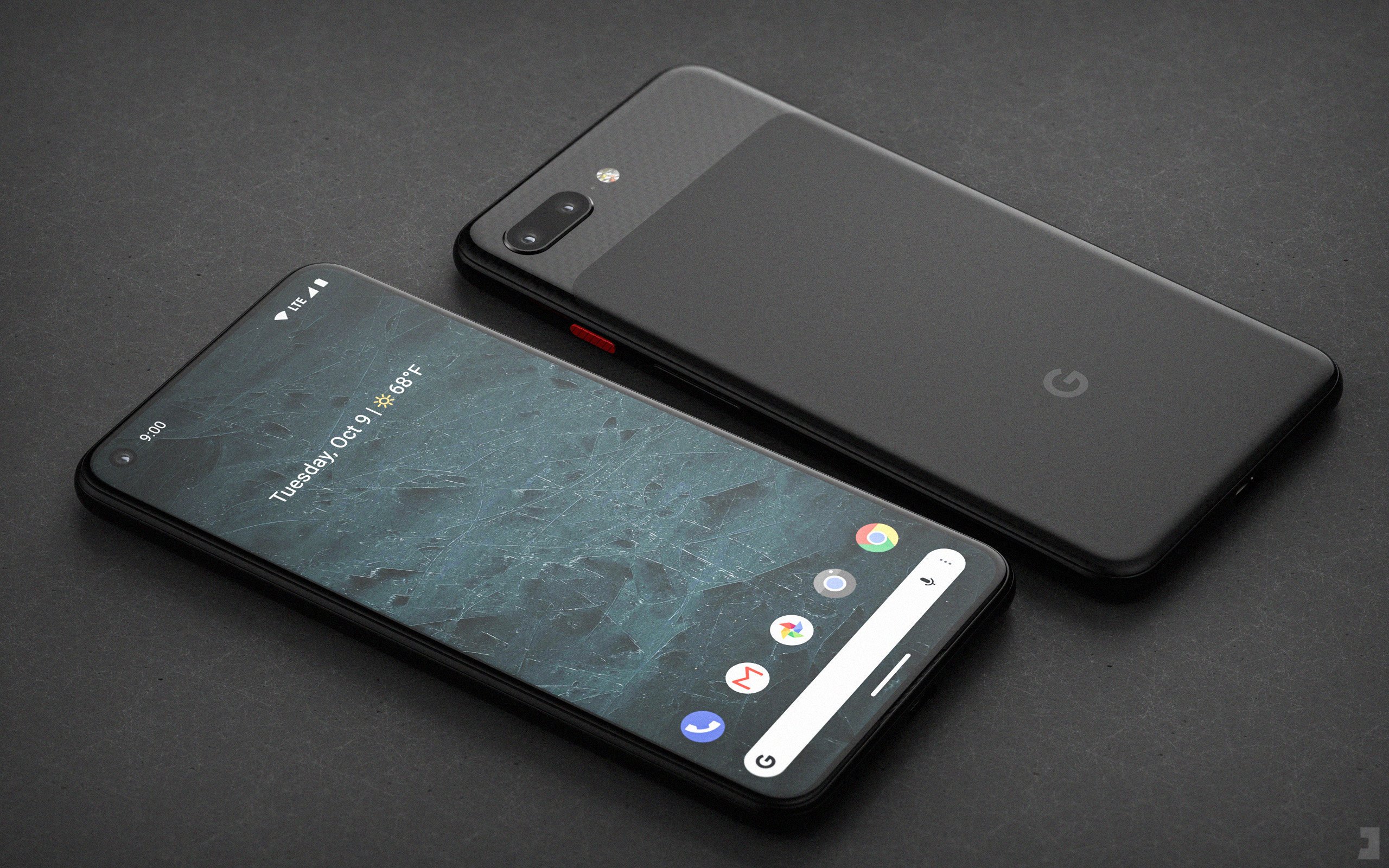
Something very interesting will happen this year when Google finally releases its next-generation Pixel 4 flagship phone lineup in October: it will sell smartphones that feature more modern designs than Apple’s iPhone lineup from the same year. That statement will be an objective truth since Apple decided to stick with its notched display design from 2017, while Google has moved on to the hole-punch display design that is becoming prominent in 2019. Going one step further into the realm of the subjective, we would also argue that Google’s upcoming Pixel 4 and Pixel 4 XL might actually feature better designs than the upcoming iPhone 11, iPhone 11 Max, and iPhone 11R. A hole-punch display doesn’t offer any advantage compared to a display with a notch in terms of the user experience, but we think it’s a much better-looking design.
What’s particularly interesting about all this is the fact that Google’s Pixel lineup was born as a shameful iPhone 6 copycat since it was designed by HTC, which was going through quite a phase at the time. The original Pixel phones were literally just iPhones with a big glass plate slapped on the back at the top of the phone, the Pixel 2 series wasn’t much different, and the current-generation Pixel 3 XL swiped Apple’s notch from the iPhone X. With its updated design, however, 2019’s Pixel 4 will be the first Google phone to move beyond the iPhone and, well, copy a Samsung smartphone instead. Whatever the case, the bottom line is that Android fans will soon be able to get their hands on the sleekest and most modern “pure Android” phones ever. While they wait, a new render from a leading designer shows Google’s upcoming Pixel 4 with a twist we would love to see materialize.
Before we get to this latest Pixel 4 render created by graphic designer Jonas Daehnert — or @PhoneDesigner, as he’s known on Twitter — we’ll refresh your memory and show you a couple of his earlier Pixel 4 and Pixel 4 XL renders:


These renders aren’t perfect, but they’re based on reliable rumors and they’re likely pretty close to Google’s actual Pixel 4 and Pixel 4 XL designs. Daehnert’s new Pixel 4 render is even further from being an accurate representation of the upcoming Pixel 4, but we’re sharing it with you anyway. Why? Because it’s downright awesome.
Is the 🐼-style still a thing? #oldschool #pixel4 pic.twitter.com/Ah3f0qXLzh
— Jonas Daehnert (@PhoneDesigner) May 28, 2019
Here’s a closer look:

This new spin on Google’s Pixel 4 design is gorgeous, and we wish the company would take its color play a step further and release a two-tone Pixel 4. Alas, it’s almost certainly not going to happen — but it never hurts to dream.


