iOS 18 Has The Major Home Screen Design Overhaul That We've Been Waiting For
Apple is a few months away from unveiling iOS 18, a software update it reportedly thinks it's the biggest in the history of the iPhone. That's going to happen at WWDC 2024, which Apple is yet to announce. I already speculated that the claim can only refer to the iPhone's upcoming suite of generative AI features that Apple is working on.
But iOS 18 will offer other improvements aside from genAI tricks. One of them might be a new way to customize the Home Screen, which also happens to be the way to arrange apps some iPhone users have been dying to see in iOS.
Like all rumors, there's no guarantee it'll happen. But we have two distinct sources mentioning the feature.
First, Bloomberg's Mark Gurman penned a new Power On newsletter focusing on Apple's antitrust troubles in the US and the purported Apple-Google partnership on Gemini AI integration in iOS 18.
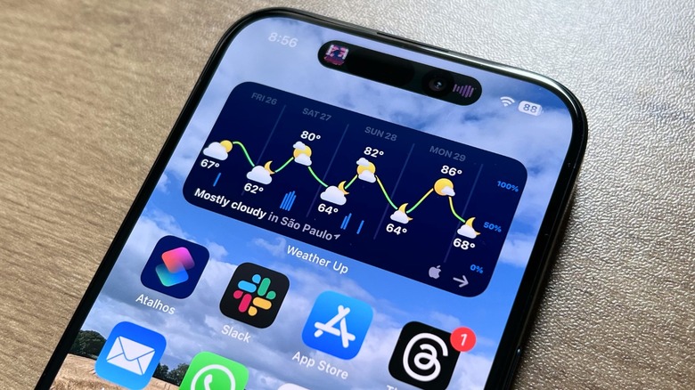
But Gurman also addressed other iOS 18 features, like a Home Screen that's "more customizable." He didn't specify any details. Considering that you can arrange apps any way you like on the Home Screen, and mix them with as many widgets and folders, the implication here might have been that the iPhone app grid that some users hate might become more malleable.
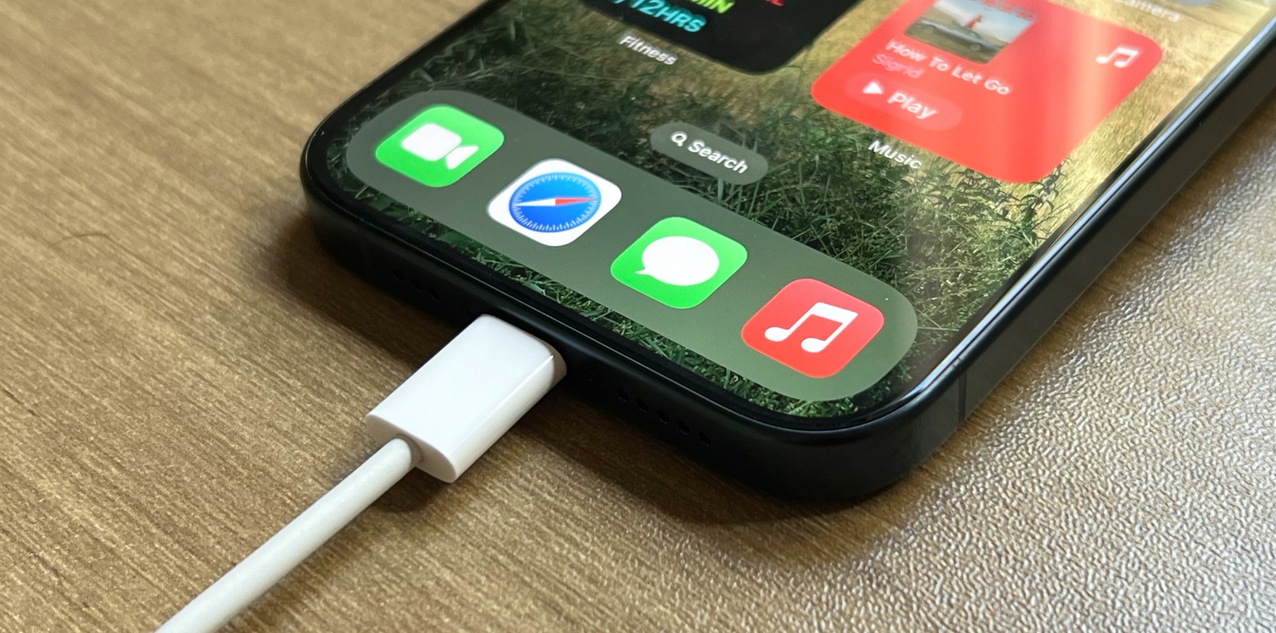
From the get-go, Apple only allowed iPhone users to arrange apps inside the grid. You could leave no space between apps on the Home Screens or folders. Also, with the App Library taking up the last Home Screen, you can remove all the clutter you don't want to see on any Home Screens. You can hide entire Home Screens on your iPhone, and I showed you why that might be such a good idea.
Over on Android, you get the same app arrangement principle. The grid of apps is there. But you can place those apps anywhere you like, allowing for much better Home Screen customization.

For example, I might use such a feature to have a two-dock arrangement on the main Home Screen. I'd place widgets at the top and then a row of apps right on top of the iPhone's actual dock. That way, I'd have up to eight apps I use the most within reach, while the main Home Screen would get a cleaner look. Yes, you can add a folder in the dock, but that's not the way to do it.
Gurman might have not shared additional details about the Home Screen app arrangement in iOS 18, but MacRumors learned from its sources that Apple is indeed working on giving users greater control over it.
Apple will still use the same invisible grid of apps for placing applications on the Home Screen. But the report says iOS 18 will let you put apps on the screen more freely. You'll be able to create black spaces, whether rows or columns.
An immediate benefit of such freedom is enjoying the wallpaper better. You'll be able to move the apps around it so you can see the best parts of your favorite images.
We'll have to wait until June to see the new Home Screen in action. After that, the feature will probably be available to anyone installing the iOS 18 betas that come out after WWDC.
