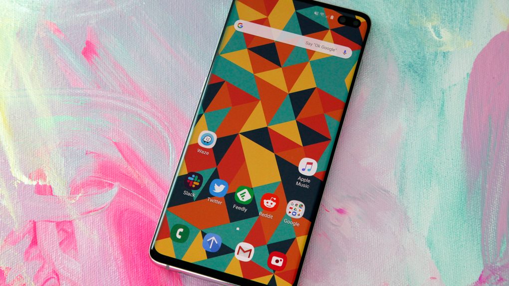
I’ve been covering the smartphone industry for close to 15 years now. In all that time, I’m not sure I have ever seen a smartphone series make such a dramatic reversal from one year to the next. 2018’s Galaxy S9 and Galaxy S9+ were easily the most boring flagship phones Samsung has released in years. In fact, they may have been Samsung’s most boring update ever. The handsets reused the same design as Samsung’s Galaxy S8 and Galaxy S8+ from 2017, similar to what Apple does every other year with its “S” upgrades. The problem with the Galaxy S9 and S9+, however, is that they reused the same design without adding any new marquee features at all.
Some hardcore Android fans complained when I first started discussing how boring the Galaxy S9 phones are on the site, but numbers don’t lie. According to information from insiders and the huge declines in revenue from Samsung’s mobile division, last year’s Galaxy S9 handsets were Samsung’s worst-selling Galaxy S phones since 2012. It’s almost as if Samsung viewed 2018 as something of a gap year while it cooked up the true successors to the Galaxy S8 and S8+, and now the completely redesigned Galaxy S phones we’ve been waiting for are finally here.
Nearly every complaint I had about last year’s S9 phones has been addressed by Samsung’s new Galaxy S10 lineup. But the Galaxy S10e, Galaxy S10, and Galaxy S10+ aren’t just better upgrades, they’re the most exciting new Android flagship phones the world has seen in quite some time. So, in just one year, Samsung went from releasing its most boring Galaxy S upgrade ever to its most exciting new smartphones in the Galaxy S line’s decade-long history.
There is no question that 2019 is shaping up to be a great year for smartphone fans, especially on the Android side of the fence. Apple’s 2019 iPhone 11 lineup is rumored to be getting some nifty upgrades, but the overall design is expected to be largely unchanged from last year’s iPhone XS/XR and 2017’s iPhone X. Meanwhile, Android vendors large and small are launching phones with all sorts of nifty new designs, from dual-screen phones to handsets with OLED screens that actually fold open and closed.
Folding smartphones are stirring up plenty of buzz right now, but I’m honestly not looking forward to them at all in 2019. They might be interesting four or five years from now when prices come down and the tech is here to make them much thinner. In the meantime, handsets like the Galaxy Fold will be far too bulky and far too expensive to truly be usable. I’m much more excited about phones like the Galaxy S10, which pack powerful new tech and smart new features into sleek, futuristic designs.
Smartphone makers have been on a mission for years to push their designs closer to the true all-screen phone fans are waiting for. In 2017 and 2018, the notch was the go-to solution. Apple’s iPhone X wasn’t the first smartphone with a notch, that honor goes to the LG V10 from 2015. But Apple’s notched display design is the one every Android phone maker chose to copy last year, and it got old fairly quickly.
Companies are now looking for new ways to achieve the best possible screen-to-body ratios on their phones, and some solutions are definitely better than others. We’ve seen silly designs like sliding selfie cameras and secondary selfie screens, but I think the best solution available right now is the one Samsung is using on its new Galaxy S10 smartphone lineup.
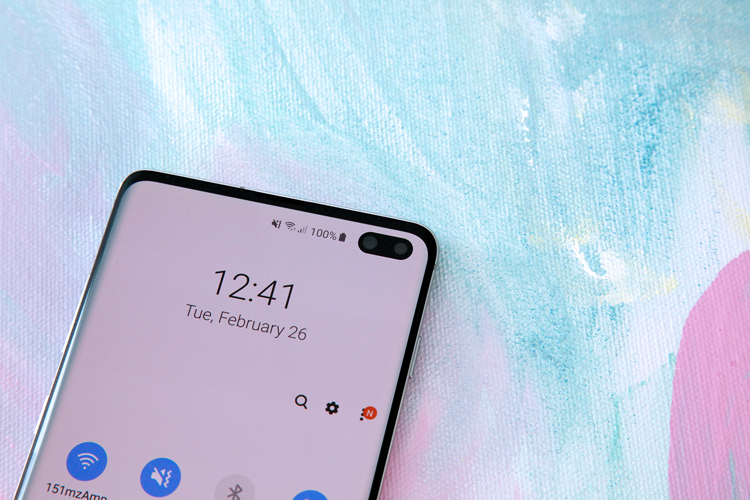
When Samsung set out to redesign its flagship phones for 2019, it sought to achieve the best possible screen-to-body ratio. After all, the Galaxy S9 had much larger bezels above and below the screen than many other smartphones that were released last year. Rather than use a notched display design, Samsung’s Galaxy S10 phones have displays that stretch as close as possible to the outer edges. They still have front-facing cameras, but they’re embedded behind the screen with a hole cut out of the actual display instead of in a notch above the screen.
Is the resulting design any better? Well, that’s open to debate. If maximizing the screen-to-body ratio is the name of the game though, then there’s no question that this new “hole-punch” design is better than a traditional wide notch like the ones on Apple’s iPhones. A hole cut out of a display also takes up less room than the smaller notches found on many Android phones, like the one on the OnePlus 6T. Samsung says the “screen-to-window” ratio on the new Galaxy S10+ is 93.1%, which is indeed quite impressive. (“Window,” by the way, refers to the glass portion of the phone’s face, whereas screen-to-body refers to the total surface area including the metal edges.) The most important takeaway here is that the hole-punch design is a lot like the notch design in that once you use the phone for a little while, you don’t even notice the empty space in the screen anymore.
I really like the design of Samsung’s new Galaxy S10 phones. A lot. Every smartphone maker’s goal right now is to cover as much of a flagship phone’s face as possible with display, and Samsung has more reason than most to work toward this goal. Why? Because Samsung’s smartphone screens are the best on the planet.
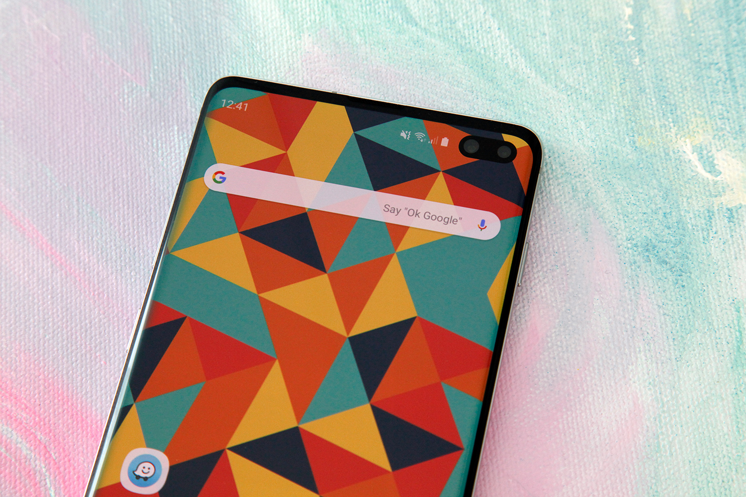
The displays on Samsung’s Galaxy S10 phones barely have any bezel on either side. The bezel is a bit thicker above the screen than it is on the sides, and then the “chin” bezel on the bottom is thicker still. This is probably my one qualm with Samsung’s new design. The fact that it’s asymmetrical with a thicker bezel below the screen than above it is a bit of an eyesore. It’s understandable that Samsung didn’t get the bezel beneath the display any thinner, either because it couldn’t figure out how or because it didn’t want to bear the expense of a costly solution like the one Apple uses in its iPhones. But why not make the bezel above the screen a bit thicker so they match? It’s annoying, but it’s certainly not the end of the world.
Apart from that, Samsung’s overhauled Galaxy S10 design is nothing short of stunning. The new phones maintain much of the design identity from earlier models, so they are instantly identifiable as Galaxy S devices. But the improved all-screen faces on the phones modernize the Infinity Display design from the past two years. The Galaxy S10 and Galaxy S10+ still feel great in the hand thanks to curved sides on the front and back. The flat Galaxy S10e is slightly less comfortable to hold; its display might only be 5.8 inches compared to 6.1 inches on the Galaxy S10, but it’s actually only half a millimeter narrower than its larger counterpart.
Other than the mismatched bezels, I only have one other complaint about Samsung’s design, and it’s a pretty minor niggle: The power/sleep button on the Galaxy S10+ is way too high up on the right edge of the phone, so it’s tough to reach with your thumb when you’re using the phone with one hand.
Of course it only takes a quick glance to realize that Samsung’s new Galaxy S10 phones look great, and the past few generations of Galaxy phones make it a forgone conclusion that the materials and construction are top notch. Let’s take a look under the hood and see what Samsung fans have to look forward to this year.
Specs obviously never tell the entire story, but there’s a ton of tech packed into Samsung’s new Galaxy S10 line so the specs are as good a place as any to start. There are four different models that make up the Galaxy S10 lineup, and three of them will be released at first. Here they are:
Galaxy S10e
- Dimensions: 142.2 x 69.9 x 7.9 mm (150 g)
- Display: 5.8-inch, Full HD+ Flat Dynamic AMOLED, 19:9 (522 ppi)
- Rear camera
- 16 MP (Ultra Wide/F2.2), FF
- Dual Pixel 12 MP OIS (Wide/F1.5/F2.4), AF
- Front camera
- Dual Pixel 10 MP AF (F1.9)
- Memory
- 6GB + 128GB
- 8GB + 256GB
- MicroSD slot (up to 512GB)
- Battery: 3,100 mAh (Typical)
- Charging: Fast Wireless Charging 2.0, Wireless PowerShare
- Sensors: Accelerometer, Barometer, Gyro Sensor, Compass, Magnet (Hall) Sensor, Proximity Sensor, RGB Light Sensor
- Security: Capacitive Fingerprint Scanner, Face Recognition
- Processor: Octa-core, 7/8 nm process
- Network: Up to 7 CA, LTE Cat.20
Galaxy S10
- Dimensions: 149.9 x 70.4 x 7.8 mm (157 g)
- Display: 6.1-inch Quad HD+ Curved Dynamic AMOLED, 19:9 (550 ppi)
- Rear camera
- 16 MP (Ultra Wide/F2.2), FF
- Dual Pixel 12 MP OIS (Wide/F1.5/F2.4), AF
- 12 MP OIS (Tele/F2.4), AF
- Front camera
- Dual Pixel 10 MP AF (F1.9)
- Memory
- 8GB + 128GB
- 8GB + 512GB
- MicroSD slot (up to 512GB)
- Battery: 3,400 mAh (Typical)
- Charging: Fast Wireless Charging 2.0, Wireless PowerShare
- Sensors: Accelerometer, Barometer, Gyro Sensor, Compass, Magnet (Hall) Sensor, Proximity Sensor, RGB Light Sensor, HR Sensor
- Security: Embedded Ultrasonic Fingerprint Scanner, Face Recognition
- Processor: Octa-core, 7/8 nm process
- Network: Up to 7 CA, LTE Cat.20
Galaxy S10+
- Dimensions: 157.6 x 74.1 x 7.8 mm (175 g, or 198 g for the ceramic models)
- Display: 6.4-inch Quad HD+ Curved Dynamic AMOLED, 19:9 (438 ppi)
- Rear camera
- 16 MP (Ultra Wide/F2.2), FF
- Dual Pixel 12 MP OIS (Wide/F1.5/F2.4), AF
- 12 MP OIS (Tele/F2.4), AF
- Front camera
- Dual Pixel 10 MP AF (F1.9)
- 8 MP AF (Depth/F2.2)
- Memory
- 8GB + 128GB
- 8GB + 512GB (Ceramic version only)
- 12GB + 1TB (Ceramic version only)
- MicroSD slot (up to 512GB)
- Battery: 4,100 mAh (Typical)
- Charging: Fast Wireless Charging 2.0, Wireless PowerShare
- Sensors: Accelerometer, Barometer, Gyro Sensor, Compass, Magnet (Hall) Sensor, Proximity Sensor, RGB Light Sensor, HR Sensor
- Security: Embedded Ultrasonic Fingerprint Scanner, Face Recognition
- Processor: Octa-core, 7/8 nm process
- Network: Up to 7 CA, LTE Cat.20
The fourth model is the Galaxy S10 5G, which will be released sometime in the second quarter of 2019. 5G connectivity is indeed one of the key features that distinguish this model from the other three, but it’s not the only big change. Here are the Galaxy S10 5G’s specs:
Galaxy S10 5G
- Dimensions: 162.6 x 77.1 x 7.94mm (198 g)
- Display: 6.7-inch Quad HD+ Curved Dynamic AMOLED, 19:9 (505 ppi)
- Rear camera
- 16 MP (Ultra Wide/F2.2), FF
- Dual Pixel 12 MP OIS (Wide/F1.5/F2.4), AF
- 12 MP OIS (Tele/F2.4), AF
- 3D Depth: hQVGA
- Front camera
- Dual Pixel 10 MP AF (F1.9)
- 3D Depth: hQVGA
- Memory
- 8GB + 256GB
- No microSD slot
- Battery: 4,500 mAh (Typical)
- Charging: Fast Wireless Charging 2.0, Wireless PowerShare
- Sensors: Accelerometer, Barometer, Gyro Sensor, Compass, Magnet (Hall) Sensor, Proximity Sensor, RGB Light Sensor, HR Sensor
- Security: Embedded Ultrasonic Fingerprint Scanner, Face Recognition
- Processor: Octa-core, 7/8 nm process
- Network: Up to 7 CA, LTE Cat.20, Enhanced 4×4 MIMO, Up to 7CA, LAA, LTE Cat.20
- 2.0Gbps download, 150Mbps Upload + None Standalone (NSA), Sub6 / mmWave (28G, 39G)
Samsung’s Galaxy S10 5G release is still at least a couple of months away, so the company hasn’t yet allowed the media to test the phone. I’ve spent some time with the three other Galaxy S10 phones though, and Samsung sent me a Galaxy S10+ to test so that will be the main focus of this review.

Because the Galaxy S10 and Galaxy S10+ are so similar, many of the takeaways from this review will apply to both phones. In fact, there are really only five main differences between the two devices: display size, battery size, front-facing cameras, memory configurations, and an available ceramic finish on the two top S10+ tiers. The Galaxy S10 has a 6.1-inch screen and a 3,400 mAh battery compared to the 6.4-inch display and 4,100 mAh battery you get with the Galaxy S10+. The S10+ also adds an 8-megapixel depth camera to the front of the phone, in addition to the Dual Pixel 10-megapixel sensor found on both models.
As far as configurations go, the Galaxy S10 comes with either 128GB or 512GB of storage, and both versions have 8GB of RAM. The S10+ has the same two configurations as its smaller sibling, but there’s also a 1TB model that packs 12GB of RAM. I can’t say for sure how significant the performance benefits are from the added RAM because I haven’t yet tested the 1TB model. Samsung supplied me with a 128GB Galaxy S10+ model to test for this review. The company’s new flagships also support microSD cards up to 512GB, which means the top-tier Galaxy S10+ can pack as much as 1.5TB of storage… if you’re willing to spend $1,600 on the phone and another $150 on a 512GB microSD card.
Apart from those differences, the Galaxy S10 and Galaxy S10+ are basically the same. They run the same software and are powered by the same processors, either a Qualcomm Snapdragon 855 in the US and a few other markets, or Samsung’s own next-generation Exynos chipset in most regions around the world. So despite the fact that most of what I’ll cover in this review is based on my time with the Galaxy S10+, just about everything will apply to the Galaxy S10 as well. As for the Galaxy S10e, there are tons of important differences that I’ll cover in the future once I’ve spent more time with Samsung’s entry-level S10 model.

Performance is as good a place as any to go next, and this phone’s performance is as good as any I’ve tested… for the most part.
Samsung’s flagship phones are always known for being among the most powerful devices on the market, and the Galaxy S10 series is no exception. Most regular functions are smooth as butter, and the phone also handles heavy lifting with no problem most of the time. There’s even a special optimized gaming mode for when the phone really needs to flex its muscles with graphics-heavy games. That said, the experience is not without the occasional hiccup.
I’ve found during my time so far with the Galaxy S10+ that it does occasionally freeze for a beat, which is frustrating when you’re in the middle of doing something. For example, I might open the app switcher using the phone’s new Android gestures, and then swipe to scroll through my recent apps. But the phone sometimes just sits frozen for a second or two before finally registering my swipe and scrolling to the side. This is a cutting-edge, $1,000+ smartphone so it can be aggravating when it happens, but my hope is that Samsung will address these performance issues in a future software update.

Hiccups aside, the Galaxy S10+ is a beast. Geekbench 4 is one of the most popular benchmark tests for smartphones, and Samsung’s new flagship phablet blew away most of the competition in the tests I ran. It registered a top single-core score of 3483, while racking up 11081 in the multi-core test. Those figures beat just about every Android phone on the planet, but they don’t quite match the reigning champ. Apple’s iPhone XS scores a ridiculous 4797 in the single-core test, which blows the Galaxy S10+ out of the water. On the multi-core test however, the new Samsung flagship came dangerously close to reaching the iPhone’s score of 11269.
The last nifty thing to note when it comes to performance is a new set of features Samsung calls “Intelligent Performance.” Using artificial intelligence, the Galaxy S10 lineup can automatically and continuously optimize battery, CPU, RAM, and even device temperature based on what you’re doing with the phone at any given time. Intelligent Performance also learns when you use certain apps over time, and it can pre-load them in the background based on time and location. This way, your most frequently used apps are lightning-fast to launch.
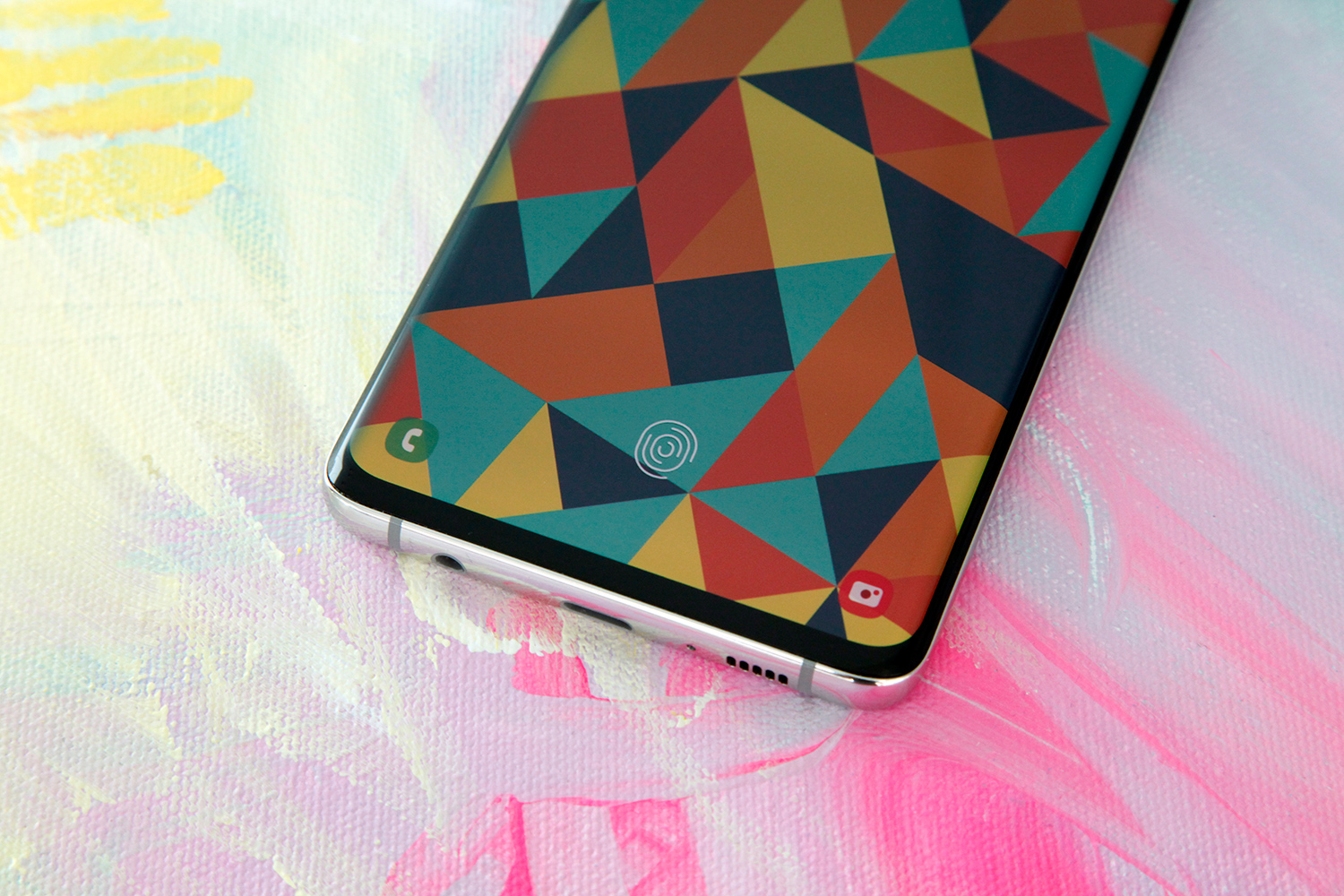
There are a few new features that are particularly intriguing on the Galaxy S10+, and one of them is definitely the in-display fingerprint sensor.
Samsung certainly isn’t the first company to launch a flagship smartphone with an in-screen fingerprint reader. Plenty of Chinese phone makers are already using them, including OnePlus. The OnePlus 6T happens to be the first widely available flagship phone in the United States with an in-display sensor. But OnePlus phones are nowhere near as popular as a flagship handset from a company like Samsung, which makes the sensor in the Galaxy S10 a big deal since it’ll be most people’s first experience with an in-screen fingerprint reader in the US. Samsung is also the first company to use a more secure ultrasonic sensor instead of an optical fingerprint reader.
Moving from a fingerprint sensor on a home button or on the back of the phone definitely takes a bit of getting used to. In either of those cases, it’s easy to feel for the sensor so you know your finger is in the right spot as you pick up your phone. That obviously isn’t the case with the Galaxy S10 since the sensor is embedded beneath the display. There’s no conventional target to feel for your finger, of course, though there is a visual indication on the display that shows you where to touch for a reading. That said, I found that it only took me a day or two before I was able to consistently grab the phone in my pocket so that my thumb was placed right over the sensor. This way it’s unlocked long before I even look at the screen.
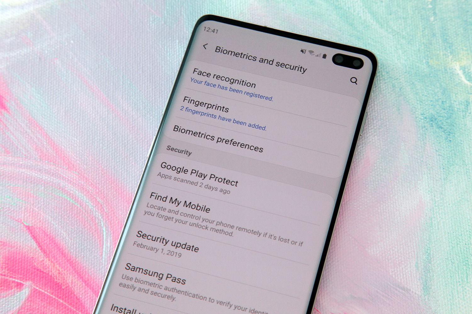
As for performance, I’ve found in my testing that there are some differences between a conventional fingerprint sensor and Samsung’s ultrasonic sensor on the Galaxy S10 and Galaxy S10+. The biggest one is the amount of pressure you need to apply in order to get a fast and accurate reading. You don’t need to use too much force, but it’s definitely important to press a bit more firmly than you might have on your old phone. If you press too lightly, the reading takes a bit longer than normal or it might even fail. Regardless of how hard you press though, the in-screen sensor on Samsung’s Galaxy S10 and S10+ is a bit slower to read your print than traditional fingerprint sensors.
Also of note, the fingerprint reader isn’t the only biometric security on the Galaxy S10. While Samsung ditched the dedicated iris scanner that was on previous Galaxy flagships, it still offers a face unlock feature on the S10. It uses the regular front-facing camera so it’s not secure enough to be used for mobile payments or to open secure apps, but it’s lightning fast since it’s so simple — much faster than Face ID on Apple’s iPhones, which uses more secure and complex 3D scanning tech.

The new cameras on the Galaxy S10 and S10+ have also gotten plenty of buzz since the phones were announced earlier this month, and I spent plenty of time testing them out on my Galaxy S10+ review unit.
Samsung has offered a consistently impressive camera experience on its flagship phones for the past few years. Galaxy S and Note phones are always found near the top of smartphone camera rankings from professionals and amateurs alike, and I fully expect that to be the case again in 2019. Since they’re not sold in the US, I haven’t spent much time with Huawei’s latest smartphones. As such, I can’t really compare the Galaxy S10’s cameras to the class-leading cameras from Huawei. What I can state conclusively, however, is that the Galaxy S10 has the best mobile camera I have ever tested. Period.
The new 10-megapixel front-facing camera on the Galaxy S10+ is outstanding. In fact, it’s as good as the rear cameras I’ve tested on some smartphone recently. Selfies are crisp and clear, and color reproduction is far more accurate than I found it to be on last year’s Samsung flagships. The Galaxy S10+ I reviewed also has a secondary 8-megapixel front-facing camera that captures depth data for Samsung’s “Live Focus” mode, which is what the company calls its bokeh effect that blurs the background of portraits. The quality of Live Focus shots is terrific, and you can adjust the amount of blur after an image is captures. You can also change between four different blur effects before you take a photo, or after the fact.
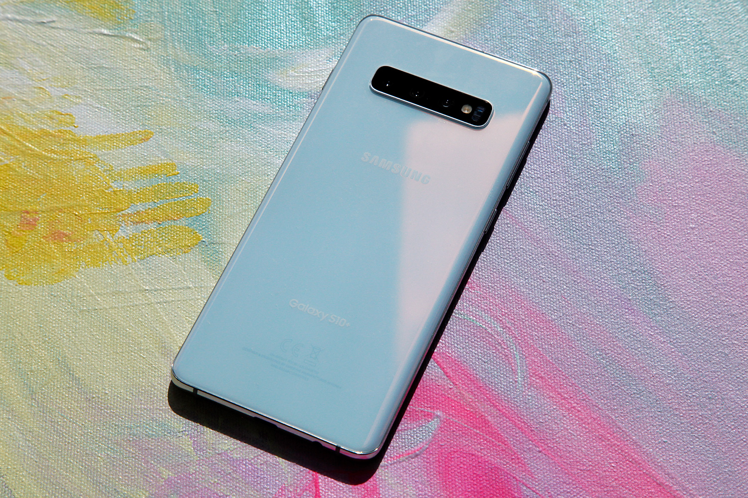
Around back, the Galaxy S10 and S10+ have a new triple-lens camera that Samsung pitches as having “the right lens for every moment.” The main lens is a 12-megapixel Dual Pixel sensor with dual apertures and optical image stabilization. Then there’s also a 123-degree ultra wide-angle sensor with 16-megapixel resolution, as well as a 12-megapixel telephoto lens with OIS for 2x optical zoom.
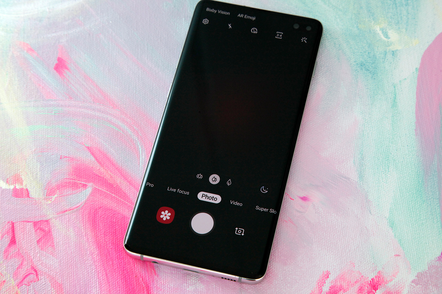
The Galaxy S10’s camera app has three buttons near the bottom of the viewfinder that lets you swap between the lenses, but the phone will also do it automatically as you zoom in and out. The ultra wide-angle lens captures a remarkable amount of content in the frame — according to Samsung, it covers 4.3 times more area than the standard wide-angle lens on last year’s Galaxy S9. Meanwhile the main lens and the telephoto lens both offer dramatic quality improvements over last year’s Galaxy S9 flagships. Also of note, I found that photos captured on the Galaxy S10+ were more crisp and had better color accuracy than similar photos shot on the iPhone XS.
OIS on the two main rear lenses results in nice clear still photos. It also provides much-needed stability when shooting video. The camera software further assists with stability in both cases, and it’s packed full of all sorts of great features like a special mode for taking photos of food, improved super slow-motion video, Bixby Vision, a scene optimizer feature, shot suggestions that pop up and help you line up the perfect shot, flaw detection that notifies you if your subject blinks, tracking auto-focus, and more. There’s also a new Bright Night feature that becomes available when you’re capturing photos in low light, though I’ve found that it’s not quite as impressive as the much-hyped Night Sight feature on Google’s Pixel phones. It’s still impressive though, and low light photos were far more clear on the Galaxy S10+ than they were on my iPhone XS.
As great as the cameras are and as gorgeous as the Galaxy S10+’s design is, my favorite thing about this phone is something else entirely: the battery life. Put simply, the Galaxy S10+ has the best battery life of any widely available flagship smartphone I have tested.
It’s not just the 4,100 mAh battery that gives the Galaxy S10+ fantastic battery life. It’s also not just the more efficient Snapdragon 855 processor or the advanced AI features like Adaptive Battery, which learns your habits and cuts back on resource consumption when it knows it can do so without slowing you down. It’s a combination of those things and more that give the Galaxy S10+ phenomenal battery performance.
Samsung says its Galaxy S10+ offers more than 24 hours of battery life per charge, and I can happily confirm that is indeed the case. On a day with very heavy usage and tons of testing, I still had more than 30% left when it was time to put the phone down for the night. With light to normal usage, I can definitely envision people going more than 24 hours between charges.
Improved fast charging means less time spent with your phone plugged in, and Samsung says the Fast Wireless Charging 2.0 tech on the Galaxy S10 series will charge just as fast wirelessly as it does with a wired fast charger. You’ll need a compatible fast wireless charger to take full advantage, of course, but that’s an impressive feat to say the least.
There’s also one other noteworthy feature of the Galaxy S10’s battery, and it’s the ability to share power wirelessly with other devices. Samsung calls it Wireless PowerShare, and it’s something we’re going to see much more of in 2019.
When Wireless PowerShare is enabled, you can place your phone face down and it becomes a wireless charging pad. Any smartphone or accessory that’s compatible with the regular Qi wireless charging standard can be charged using this nifty feature. That means you can give a friend’s smartphone a quick charge, or you can charge accessories like the new Galaxy Buds that are included for free when you pre-order a Galaxy S10 or Galaxy S10+.
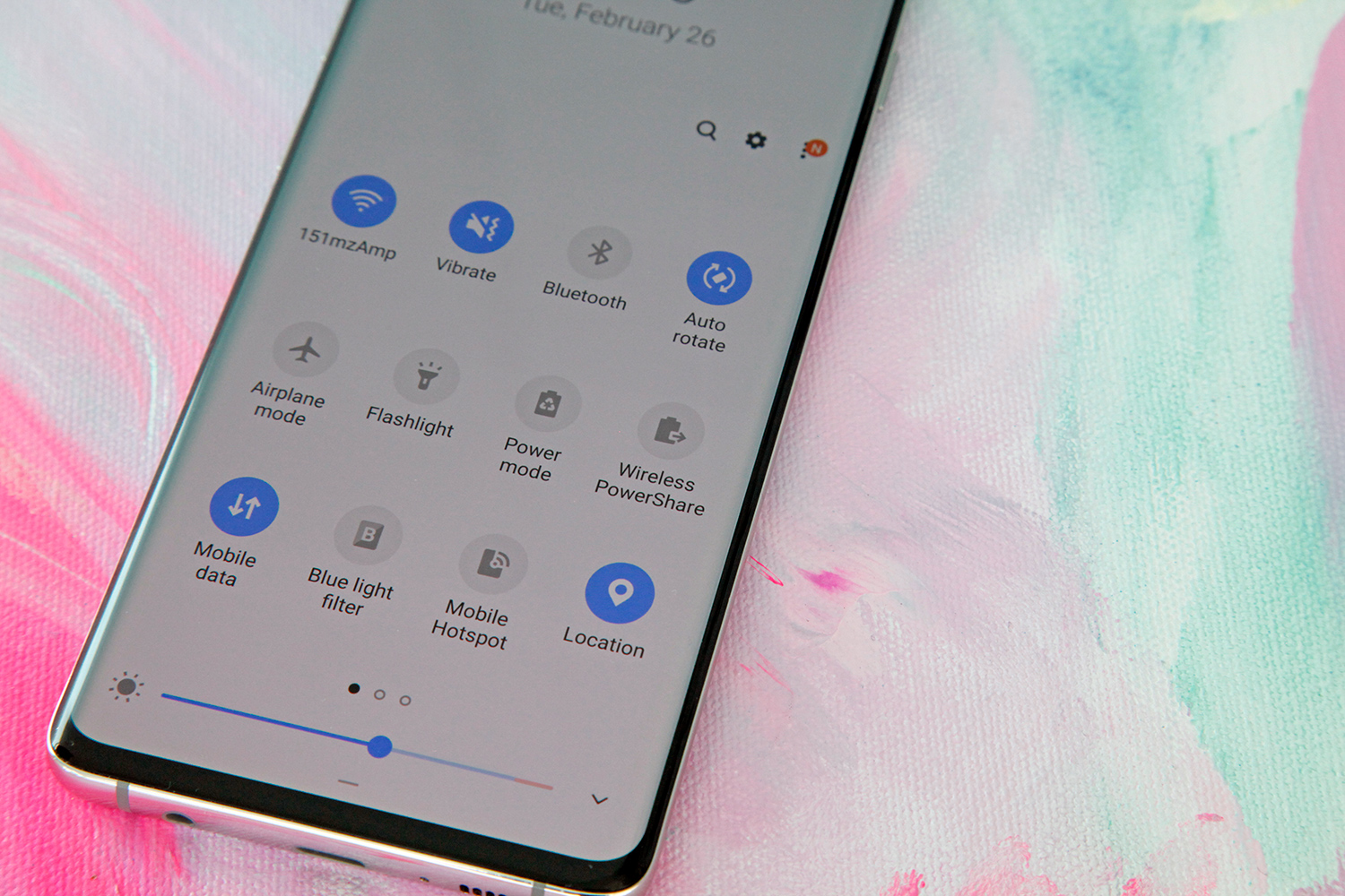
Wireless PowerShare is very easy to use. You simply slide down the “Quick Panel” from the top of any screen and tap the Wireless PowerShare button to enable the feature. I can definitely see it coming in handy once in a while and it will also be nice for charging your phone and another device simultaneously when you travel. On a day to day basis though, it’s not the sort of thing most people will use very often.
After a very rough year in 2018, Samsung’s mobile division needed a win to start off 2019 on the right foot. Well, I have great news for Samsung fans: I’m really not sure how Samsung could have done any better than it did with its Galaxy S10 series phones.
The Galaxy 10 isn’t just a big step forward for Samsung, it’s a giant leap ahead of the competition. In so many ways, Samsung surpassed even its toughest rivals with the Galaxy S10. The new all-screen design is so stunning that Samsung likely could have stopped there and had a smash hit on its hands. But Samsung certainly didn’t stop there, it also added several exciting new marquee features, a class-leading camera experience, and substantial speed and performance gains. There are plenty of other things that Samsung fans will appreciate when upgrading from an older phone as well, such as the refined One UI interface, IP68 dust- and water-resistance, and the fact that Samsung kept the dedicated 3.5mm headphone jack on all three of its Galaxy S10 phones.
It goes without saying that nothing is perfect, and that is of course true here. The ultrasonic in-display fingerprint sensor takes a bit of getting used to, and even once you’re used to it, it’s still a bit slower than traditional fingerprint readers. I also mentioned the little performance hiccups I experienced while testing the phone, such as brief freezes or delayed swipe recognition. All things considered, though, these are minor issues that don’t detract much from the overall user experience.
Samsung’s Galaxy S10 and Galaxy S10+ start at $899.99 and $999.99, respectively, and the base models ship with 8GB of RAM as well as 128GB of storage and microSDXC support. That means for $100 less than the base iPhone XS and iPhone XS Max models, you get twice as much storage along with expandable memory. The Galaxy S10 series is still quite expensive, but that comparison should help put things in perspective.
The Galaxy S10e, Galaxy S10, and Galaxy S10+ are all available for pre-order right now, and they’ll hit store shelves on March 8th.
