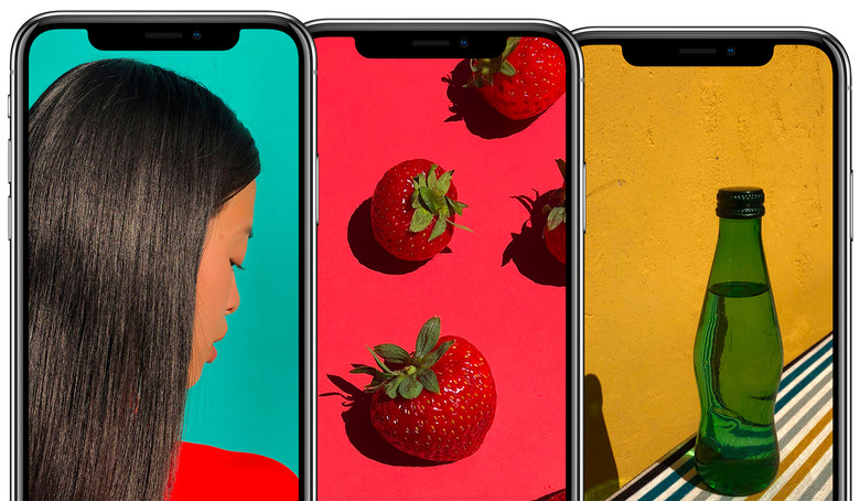
How Apple Came Up With The Infamous Notch
The iPhone X is finally out, which means the first video previews, partial reviews, and full reviews are also hitting the web as we speak. As expected, the major iPhone design changes, including the large screen, the absence of the Touch ID home button, and the notch and the associated Face ID camera, are major topics.
One of these reviews shares more details about how Apple approached designing the worst thing about the iPhone X, the notch.
Not only does TechCrunch provide one of the few full reviews out there, but Matthew Panzarino also got to speak with a few Apple execs about the handset.
Apple's vice president of User Interface Design Alan Dye explained the company's thinking when it comes to designing the notch. The exec said that Apple felt like being honest about the top bezel.
"We've got this amazing True Depth camera system packed into this space at the upper center of the display," he said. "And we thought a lot about how to design for that. And ultimately we felt really comfortable with this notion of being really honest about it and allowing for the content to push out into those beautiful rounded corners."
Did Apple look at ways of hiding the notch? Yes, yes it did.
"We did look at various different design iterations and considered some things that kind of acted as digital bezels if you will. But ultimately we never really felt comfortable with this notion of cropping into the content. We really love the new display, we love that it's edge-to-edge. We love the way that it fits. It feels so perfectly designed for the overall form and so we're encouraging people just to kind of push the content right out to the corners."
Craig Federighi, Apple's senior vice president of User Interface Design, explained that Apple used an iPad to prototype the Face ID camera early on.
"On the prototype front, early in the project, we had all manner of makeshift hardware prototypes with crazy True Depth bolt-ons and things like that, but we also had the interface running on iPads. And so we'd have a big iPad with iPhone X in the middle and we could run a whole user experience on it before we had the hardware with this dimension [of] display and everything else and that enabled a lot of prototyping in parallel with the early hardware builds."
Federighi then said that Apple then chose the final iPhone X design as it felt that was a good way to go, and that it provided people with a definition about where Control Center lived on the screen.
Wait, you'll say, doesn't Control Center sleep at the bottom of the screen. Not on the iPhone X! You have to swipe down on the screen's right ear to enable it.
