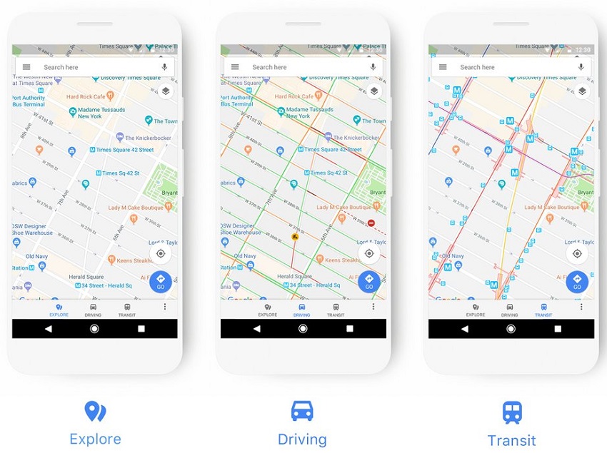
Google earlier today announced a new Google Maps update designed to make getting from point A to point B even easier. Complete with new icons and a refreshed color scheme, the latest version of Google Maps is better at providing users with various points of interest tailor-made to their mode of transportation. For example, if you’re travelling by public transit, a map with a detailed list of nearby gas stations isn’t exactly useful. At worst, it can be downright distracting.
In a new blog post highlighting the recent changes, Google draws considerable attention to the new colors and icons that will now populate the screen. Specific points of interest, whether it be a coffee shop or a museum, will now be graced with their own unique icons and colors, thus making it easier for users to find what they’re looking for, even when exploring a completely new area.
Google Maps’ new color scheme is laid out below and will be used across a wide variety of new icons for places as varied as car rental locations, hiking areas, and monuments. As evidenced below, the icons are divided up across 8 different categories with the express aim of helping users find exactly what they’re looking for.
Google be rolling out the update slowly, with the search giant noting:
You’ll see these changes over the next few weeks in all Google products that incorporate Google Maps, including the Assistant, Search, Earth, and Android Auto. Over time, the new style will also appear in the apps, websites and experiences offered by companies that use Google Maps APIs as well.
Once the update goes live, the standard navigation pane in Google Maps will look like this.


