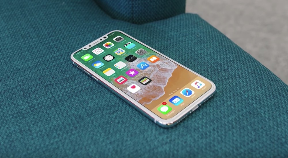
When the iPhone 8 launches this September it will bring over a few features never before seen on an Apple smartphone. The handset will have an almost edge-to-edge display, though a cameras-and-speakers protrusion at the top will steal away some real estate from the massive screen. The new iPhone design also kills the home button, which happens to be one of the most used iPhone elements to interact with iPhones.
But just because the physical home button is going away, that doesn’t mean that any of the features associated with it will disappear. And thanks to Apple’s biggest iPhone leak in years, we have an idea of how the virtual home button will work.
Developer Steven Troughton-Smith, who’s at the forefront of iPhone 8 discoveries from the leaked HomePod code, took to Twitter to post more information about how iOS 11 will handle the new home button.
He found evidence that suggests that Apple developed a special UI for the home button. Rather than a button, we’re looking at a home button area that can resize and offer tab bars under it.
We know some facts re iPhone 8 home button area:
• it resizes• indicator can be hidden• no API to change color• tab bars extend under it
— Steve Troughton-Smith (@stroughtonsmith) August 10, 2017
The home button area will disappear to accommodate content on the screen, which is what we’d expect from it. After all, you wouldn’t want a digital home button to hover allover apps, especially games and video that can take up the entire screen.
Here’s a mockup of what it could look like:
very simply, that tab bar backgrounds extend beyond their regular bounds outside of the 'safe area' pic.twitter.com/MkOxxKIhIK
— Steve Troughton-Smith (@stroughtonsmith) August 10, 2017
The developer also says that there’s no evidence to suggest that app UI can be associated with the home button area, as some speculated in the past.
There is no evidence to suggest any app UI moves to the home button area at all. No toolbars, no other junk. Fullscreen video does hide it
— Steve Troughton-Smith (@stroughtonsmith) August 10, 2017
Troughton-Smith also says that Apple may have devised a home button design that contrasts well with all kinds of backgrounds.
Having bars bleed under it, and no color API, auggests w/e indicator there is for the home button will have to contrast well with all bgs
— Steve Troughton-Smith (@stroughtonsmith) August 10, 2017
Apple will probably dedicate plenty of time to the home button during its September iPhone event, given its importance for navigating iOS.


