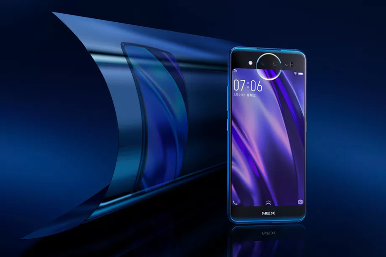
Behold: The Stupidest Smartphone Design Trend Of 2019 Is Already Here Now
In 2018, the biggest trend in smartphone design among Android phone makers was simple: copy Apple. Nearly every smartphone vendor on the planet used Apple's iPhone X design on their own phones. It was pretty embarrassing, to say the least. Moving toward "all-screen" phone designs became a top priority this year though, and the iPhone X's notch was the best way to improve screen-to-body ratios.
Apple wasn't the first company to use a notch in its smartphone display, but it was Apple's design that Android phone companies chose to copy. Beginning in late 2018, however, Android vendors finally began to come up with their own designs. We've seen all sorts of different solutions for increasing screen size and reducing bezel size, though most of them so far have been pretty horrible. A perfect example can be found on the Oppo Find X, which has a selfie camera that slides up mechanically from behind the display. It's practically begging to be damaged, and it makes using an effective case impossible.
Thankfully, much better notch-free designs will become prevalent in 2019, such as the Galaxy S10's Infinity-O screen that has a small hole cut out for the front-facing camera. There will still be some terrible design trends in 2019 though, and the worst one has already hit the market.
vivo NEX dual screen version pic.twitter.com/3WUGC1atcq
— Ice Universe (@UniverseIce) December 14, 2018
The video in the tweet above shows the Vivo Nex. It's the latest handset from China-based smartphone maker Vivo, and for the most part it looks like any other modern Android phone from the front. It has wonderfully thin bezels on three sides of the display, and the bottom "chin" bezel isn't much thicker. It looks fantastic... but you might notice that something is missing. Where's the selfie camera?
Your eyes aren't playing tricks on you — there is no selfie camera. Instead, there's only a triple-lens camera setup on the back. So, how are you supposed to take selfies? Well, there's also a 5.5-inch display on the back.
The second screen on the Vivo NEX does everything the screen on the front can do, but it's smaller and has a lower resolution. Why would anyone want that screen while using their phone instead of the nice big 6.4-inch screen on the front? The answer is simple: they wouldn't. The only reason the second screen is on the back of the phone is so that people can use the rear camera as a selfie cam. In other words, Vivo is driving up the cost of the handset but adding a second display just because it couldn't find a way to include a camera on the front of the phone and still achieve the screen-to-body ratio it wanted.
Sadly, this isn't the only phone out there with a second screen on the back of the phone for selfies, and more are coming in 2019. Our only hope is that this ridiculous design trend only lasts until screens like Samsung's Infinity-O display become more widely available.
