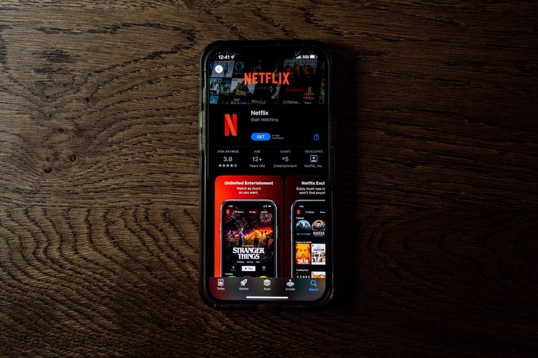
Netflix Redesigned Its iPhone App, And You Can Download It Now
Netflix is constantly making subtle changes to the user interfaces of its apps, but it's not often that we get a comprehensive refresh. The time has finally come, as Netflix rolled out a massive update for its iPhone app this week that completely revamps the UI.
Design engineer Janum Trivedi shared a video of the UI refresh on which he led development for the iOS Netflix app. One of the big changes is a billboard layout for featured content that responds as you move your device (similar to the cards in Marvel Snap).
Other changes include wallpaper gradients created on the fly from the art of the movie or TV show currently on the screen, an interactive card transition you can interrupt in case you click the wrong title, new launch and profile animations, and haptics.
You can see all of these in action in the short video from Trivedi on Twitter below:
This last year, I've been leading a UI refresh to make Netflix feel more fluid, delightful, and polished.
Today, all that work shipped!
Huge thanks to @nebson and @b3ll for helping bring this to life ❤️
Details below, but try it out yourself! pic.twitter.com/cZFb7c42Fd
— Janum Trivedi (@jmtrivedi) January 16, 2023
The Netflix app on iPhone and iPad was never an especially sluggish or unattractive app, but this refresh is a significant upgrade nonetheless. Everything on the app feels snappier, from switching profiles to previewing titles. If you watch a lot of Netflix on your iPhone or iPad, you will definitely appreciate all of these changes once you update.
And best of all, the update is available right now on the App Store. Just make sure that your app is up to date with the latest version (15.14.0), and you should get the new UI.
If you're looking for something to watch on your updated Netflix app, be sure to check out our list of all the new content coming to Netflix this month. Some of the highlights in January include That '90s Show, Vikings: Valhalla season 2, and You People.
You can also see all of the shows that Netflix has cancelled in 2023 right here.
