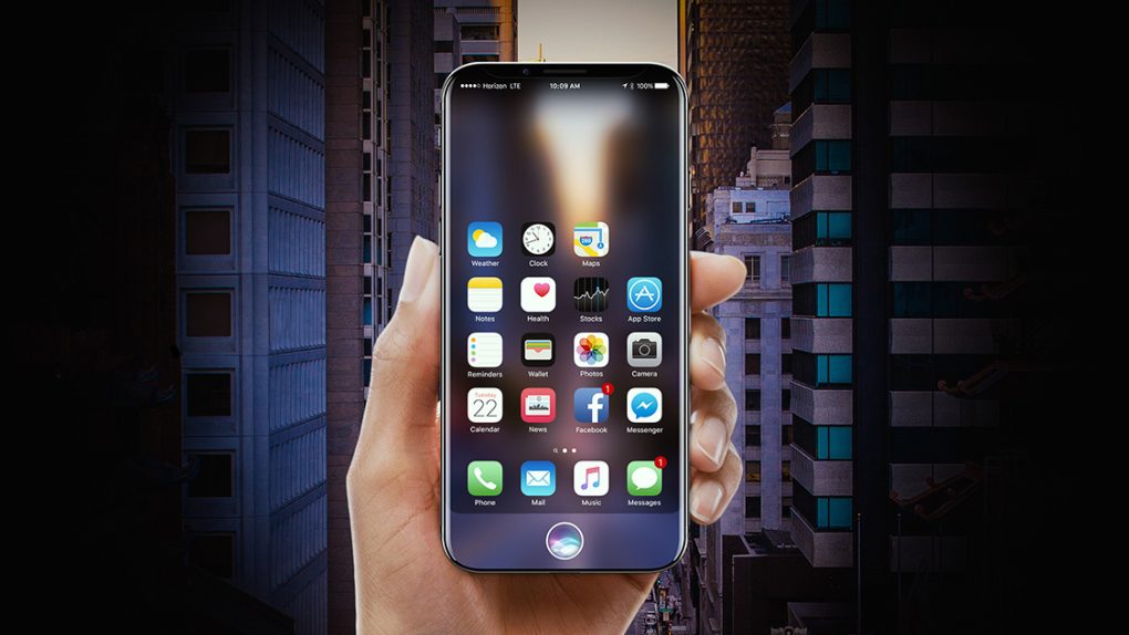
Apple’s upcoming iPhone 8 will feature the company’s first new iPhone design since 2014. But the handset’s exciting new design includes a big compromise. The technology Apple needs to hide its speaker and sensors underneath the iPhone’s display isn’t yet ready for mass production, and yet Apple sought to release a new flagship iPhone with the best screen-to-body ratio in the world among widely available smartphones. So, rather than include a uniform bezel above the display that leaves enough space for the speaker, camera, and other sensors, Apple went with a design that injects a huge “notch” into the top of the screen.
The iPhone 8’s design is indeed a compromise. There’s no denying it. But, there is an elegant way to approach this compromise and another option that is far less appealing. Unfortunately, it looks like Apple chose door number two.
Apple’s new iPhone 8 will be the first iPhone to feature an AMOLED display. Sourced from Samsung, the pixels in these stunning displays are pure black when they’re not lit. And since they’re OLED screens, each pixel can be lit individually while other pixels remain unlit.
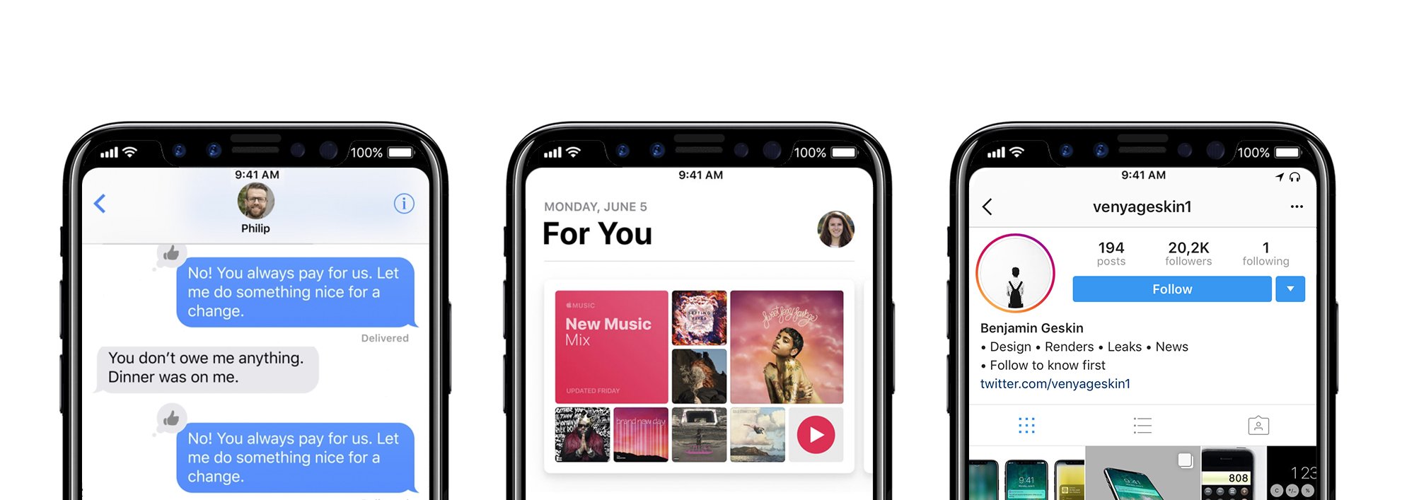
With that in mind, Apple could have only release iPhone 8 models with black bezels surrounding the display. Then, the background of the “ears” on either side of the already-infamous notch could always stay black. This portion of the screen would then blend in with the notch, and it would be reserved only for status bar information like the time, signal strength, and Wi-Fi status.
Here’s what it might look like (though the actual iPhone 8 will show the time in the top-left corner, with things like signal strength and Wi-Fi status shifted over to the right side):

We discussed this solution several times in passing, and then at length back in June. It would’ve been a great way for Apple to salvage the phone’s design, but sadly it looks like this won’t be the case. Instead, a report from Bloomberg late last month stated that Apple has opted to wear the notch like a badge of honor.
“Apple has opted to not hide the notch area at the top of the screen, showing a definitive cutout at the top of apps with non-black backgrounds,” the report said. “The cutout is noticeable during app usage in the middle of the very top of the screen, where the status bar (the area that shows cellular reception, the time, and battery life) would normally be placed, according to the images. Instead, the status bar will be split into left and right sides, which some Apple employees call ‘ears’ internally.”
Ugh.
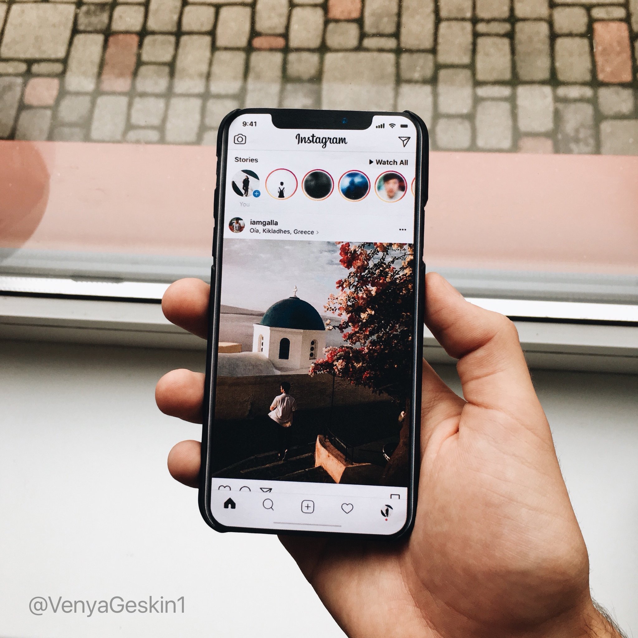
Bloomberg’s sources are typically accurate, so we fully expect that this will be the case. Unfortunately, this means that the ugly interface on the iPhone 8 is going to take a bit of getting used to. Instead of looking like the mockups above, running apps with light backgrounds on the iPhone 8 will likely look like the new mockup Twitter user Benjamin Geskin posted earlier this week.

We repeat… ugh.
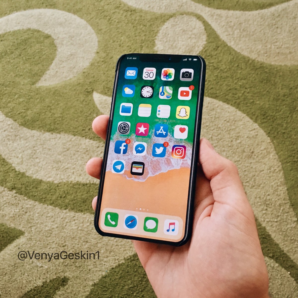
This will only be the case for apps that have light backgrounds, thankfully. In other cases, the iPhone 8’s interface will look more like another mockup Geskin posted on Twitter:

Muuuuuuch better.
Apple is set to unveil the new iPhone 8, which may launch as the “iPhone Edition,” next week on September 12th. The phone will debut alongside two additional new iPhones that have been referred to as the iPhone 7s and iPhone 7s Plus. All three models should become available for preorder beginning Friday, September 15th, and then they’re expected to be released on the following Friday, September 22nd.


