A little over three weeks ago, Samsung felt it needed to explain the design of its gorgeous Galaxy S8 to everyone with yet another annoying design story. If you ask me, the Galaxy S8’s design doesn’t need any explanations, at least as long as they sound as bad as the design posts Samsung used to write when it had to defend its plastic phones. But Samsung did it anyway. For some reason, Samsung is now back with a second Galaxy S8 design story, and it’s just as equally disturbing as the first one.
This time around, the blog post is structured as an interview between Samsung and Samsung. I’m not even going to get into the fact that a Samsung employee is interviewing a different Samsung employee for the time being. Let’s just check out some of the “best” parts of it. The oneness is back
“It’s often said that the whole is greater than the sum of its parts, and this certainly rings true for smartphones,” Samsung designer Hyoungshin Park said. “So, in line with our philosophy of neutrality, we aimed to create a seamless design that highlights the visual unity of the device under the concept of ‘oneness.’”
“The Galaxy S8 in particular is differentiated by the oneness of its materials,” designer Hyejin Bang answered when asked how the concept of oneness applies to glass and metal.
Later in the interview the reporter asked this question: “Considering so many different people worked on various aspects of the design, how were you able to apply the concept of ‘oneness’ to create a coherent design?” It really is something every Galaxy S8 user should know.
The response itself would not be important, but Park gave us this tidbit: “Designing the Galaxy S8 was a lengthy, systematic process – one that lasted much longer than a year! – and required a great deal of teamwork.” Later in the interview, Samsung designers explained how they interacted with the development team and the hardware team to come up with the final version of the Galaxy S8. “In the end, however, we were able to collectively, as one, achieve our goals.”
All that teamwork talk only made me wonder how long the design, development, and hardware teams spent on creating the Galaxy Note 7 last year and whether they had enough time to do a good job given Samsung’s pressure to release the phone as early as possible. But the Samsung reporter did not ask any hard questions, so we’ll never know.
One thing that also sticks out is that the word “safety” doesn’t appear anywhere in the interview, which is strange considering Samsung has been under a lot of pressure to deliver a product that won’t explode or show any other massive manufacturing fault.
That elusive true essence
Oneness isn’t the only buzzword Samsung is throwing out there. We also have the true essence of the Galaxy S8. To create a device under the concept of oneness, Samsung “focused on creating a design that is harmonious, natural and centered on the true essence of the Galaxy S8.”
It’s really unclear what that true essence of the phone is, but as you keep reading you find out it’s the display. Apparently, at some point during the development of the phone, the design team recognized the smartphone’s true essence is the display, more than anything else. Better late than ever, I suppose. It’s only been 10 years since everyone realized the display is all that matters in a smartphone.
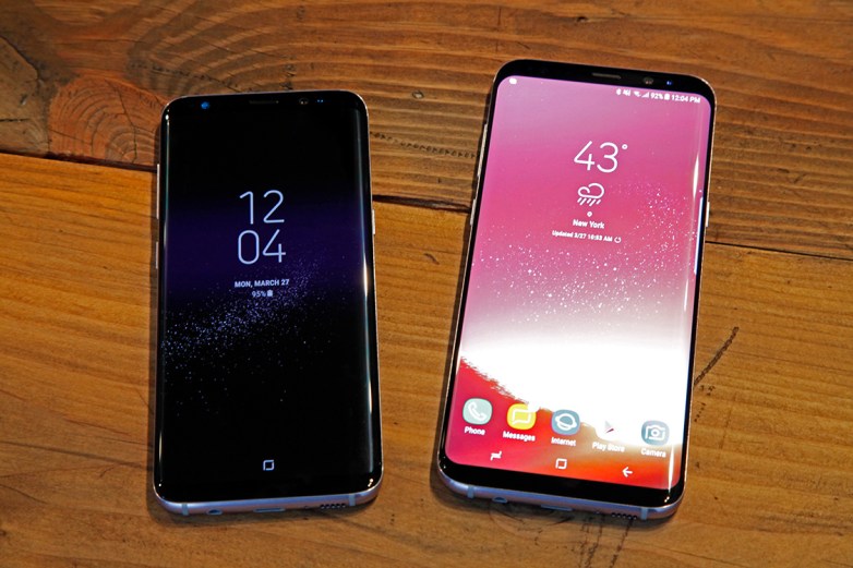
To maintain that essence, Samsung placed the home button under the display and moved the fingerprint sensor to the back, “a location users can easily reach when holding the device in their hand.” Yes, Samsung said that.
Furthermore, it gave the phone black top and bottom bezels to make it appear like it stretches seamlessly from the top to the bottom. The Bixby button is also a solution Samsung created to avoid compromising the design of the phone. Too bad the button doesn’t really work right now.
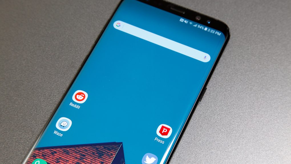
The full interview is available at this link, but you’d be better off just looking at this pretty picture of the Galaxy S8 than reading the second party of its design story.


