If you woke up to a different Facebook app this morning, that’s because it may have been updated to the latest Facebook mobile version, which brings over a significant News Feed design overhaul. But what’s interesting in Facebook’s announcement is that it features only “old” phones.
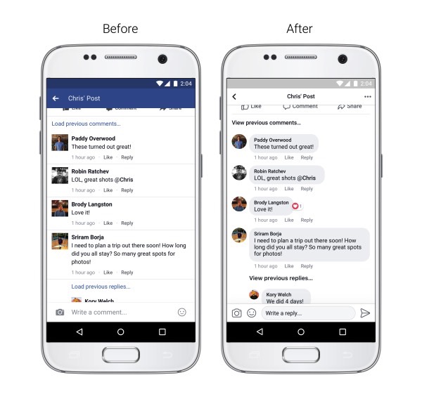
Facebook wants to make the feed “an easier place to connect and navigate,” the company said in a blog post. That means it wants to deliver, in its own words: better conversations, improved readability, and easier navigation.

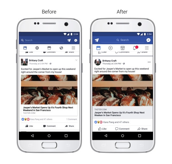
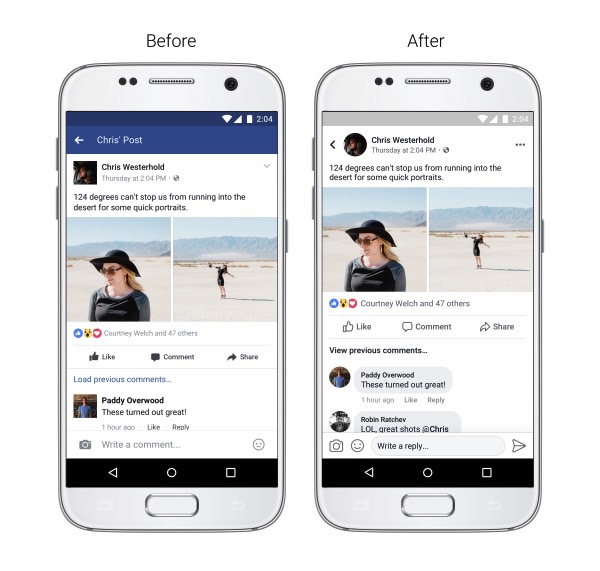
What that means, in practice, is that the app is getting rid of the iconic blue header, increased contrasts, circular profile pictures, updated icons, a better comment system, and links preview.
But take a look at all the images Facebook provides in the post. They all feature the same Android phone, even though the update should be available on iPhone as well. There’s no mention in the announcement about these new Facebook features hitting only Google’s platform.

More people use Android than iPhone, but Apple sold more than 1.2 billion iPhones to date. Hundreds of millions are still in use, and most iPhone owners probably Facebook. A lot.
Furthermore, they all show a device that looks rather old by 2017 smartphone design standards. Almost bezel-less smartphones are increasingly becoming the norm, yet Facebook seems stuck in 2016 or earlier.

Sure, most smartphone users don’t own an all-screen phone yet, which could explain Facebook’s decision to highlight the app updates using a familiar smartphone example. But it still seems like a glaring oversight from Facebook. An app developer who’s looking to keep people stuck on the screen for as long as possible will surely benefit from the extra display real estate that should be available on more and more phones in the future.


