Ex-Google Maps Designer Hates The New Design, And It's Not Just The Colors
Google released a big Google Maps upgrade a few weeks ago, including a significant redesign and new AI features. The new Google Maps color palette is now similar to Apple Maps, which is one widespread criticism from users. It's not necessarily bad, but I can see how longtime Google Maps users will have difficulty adjusting to the new colors. And no, there's no way to switch back to the old theme.
The new colors have been rolling out more widely, drawing more criticism from users who have found themselves experiencing a new Google Maps design overnight. Among them is former Google Maps designer Elizabeth Laraki, who took to Twitter/X to complain about the new Google Maps design.
She penned a lengthy review of Google Maps, mostly complaining about the clutter that now impacts the Google Maps experience, rather than the color choices.
The color choices
She said that 15 years ago, she helped design Google Maps. "I still use it every day. Last week, the team dramatically changed the map's visual design," she continued. "I don't love it. It feels colder, less accurate and less human. But more importantly, they missed a key opportunity to simplify and scale."
15 years ago, I helped design Google Maps.
I still use it everyday.
Last week, the team dramatically changed the map's visual design.
I don't love it.
It feels colder, less accurate and less human.
But more importantly, they missed a key opportunity to... pic.twitter.com/HMcpKiOEdr
— Elizabeth Laraki (@elizlaraki) November 22, 2023
Laraki then highlighted the biggest color changes coming to Google Maps:
- All roads are now gray
- Water changed from blue to teal
- Parks and open spaces are now mint green
If you haven't seen the new colors, you'll spot them soon. It just means the Google Maps redesign hasn't rolled out yet in your region.
The former Google Maps designer says she sees benefits, acknowledging that Google's goal was to improve usability and make maps more readable. "Admittedly, I do think major roads, traffic, and trails stand out more now," she said while complaining about the colder color palette that feels "more computer generated."
She also pointed out that the colors of water and parks/open spaces blend together.
The Google Maps UI is getting worse
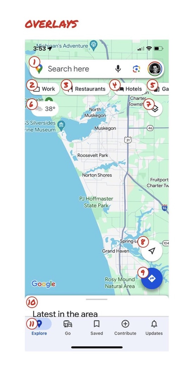
Laraki's main complaint addresses the overall Google Maps experience. She said that Google missed a "big opportunity" if the goal was to improve usability. The designer listed all the things that sit on top of the map in Google Maps, making usability a problem:
So much stuff has accumulated on top of the map. Currently there are ~11 different elements obscuring it:
- Search box
- 8 pills overlayed in 4 rows
- A peeking card for 'latest in the area'
- A bottom nav bar
The following image shows the overlays Laraki mentioned:
"Personally, I would LOVE to see usage metrics for all these overlays," she continued. "The map should be sacred real estate. Only things that are highly useful to many people should obscure it. There should be a very limited number of features that can cover the map view. And there are multiple ways to add new features without overlaying them directly on the map."
How can Google fix Google Maps?
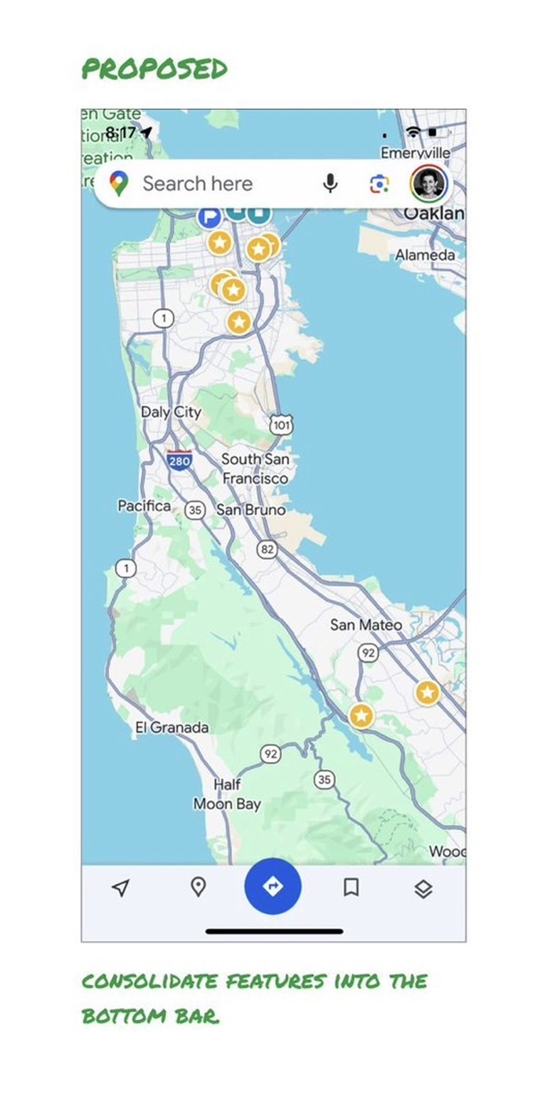
The designer might not be working on Google Maps anymore, but she proposed a much cleaner Google Maps UI that keeps the colors in place but eliminates many of the overlays:
As you can see above, Laraki would keep the search bar and the bottom bar. But she would move everything else into a redesigned bottom bar.
I have to say I'm a big fan of Laraki's suggestions, and I say that as a Google Maps user who rarely taps most of the map overlays.
"I assume the search box and directions are top priority and should remain prominent," she said. "But everything else, including location buttons, the map layers, nearby places, and other elements, could sit in the bottom bar"
The former Google designer acknowledged that it's normal for apps to accumulate features over time. Google Maps is no different. It happened during her time as a Google Maps designer in 2007 when the app had become a "cluttered mess."
"We were wedging new features into any space we could find in the UI," she continued. "The user experience was suffering and the product was growing increasingly complicated. We had to rethink the app to be simple and scale for the future."
Laraki thinks it's time for Google Maps to do it again.