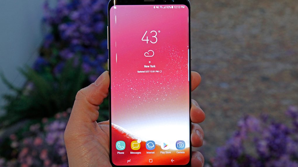
After months of countless leaks and rumors, it was starting to feel like this day might never actually come. Believe it or not, however, it’s finally here: Samsung’s new Galaxy S8 and Galaxy S8+ are finally official. No more specs leaks, no more renders, no more spy shots on Weibo, no more dummy models being compared to rival smartphones, and no more guessing. Samsung on Wednesday finally took the wraps off of its next-generation Galaxy S flagship phones.
We spent some time with the new Galaxy S8 and Galaxy S8+ earlier this week, and there’s really only one thing you have to know: You don’t know anything about these phones. You’ve seen all the leaks and you’ve read all the rumors, but nothing you’ll ever see on a computer screen or a smartphone display can properly convey just how stunning Samsung’s new flagship phones truly are.
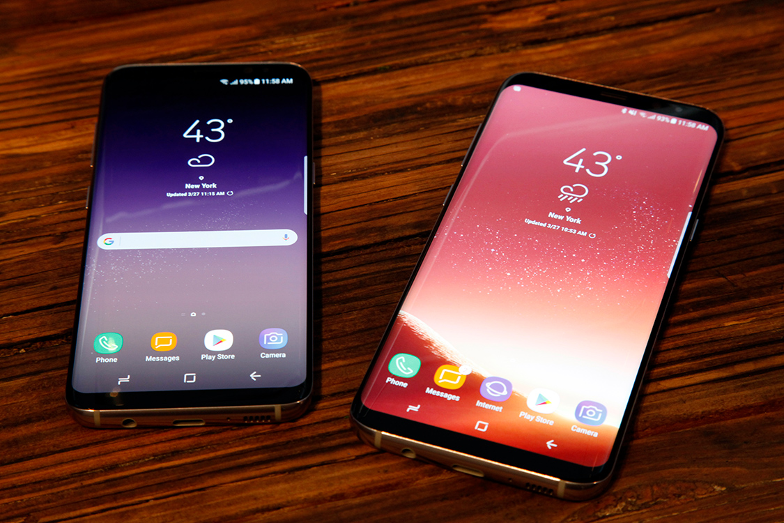
We’ve obviously got plenty of Galaxy S8 coverage lined up for you today, but in this post I’m going to focus on one thing in particular: Samsung’s design.
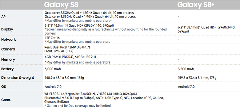
First, let’s quickly run through the specs. Aside from the displays (5.8-inch QHD+ Super AMOLED vs. 6.2-inch QHD+ Super AMOLED), the batteries (3,000 mAh vs. 3,500 mAh), and the overall size, the new Galaxy S8 and Galaxy S8+ are identical. Both phones are powered by the new 10nm Qualcomm Snapdragon 835 chipset in the US, while the global models pack Samsung’s own Exynos 8895 SoC. Both phones also pack 4GB of RAM, 64GB of internal storage, microSDXC support, a 12-megapixel rear camera, an 8-megapixel front-facing camera, IP68 water- and dust-resistance, and Android Nougat.
Both phones also share what is unquestionably the most stunning smartphone design of all time.
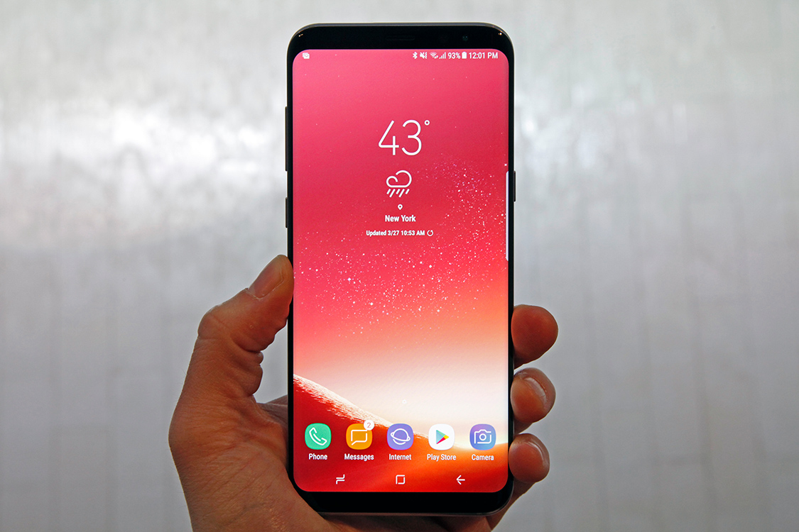
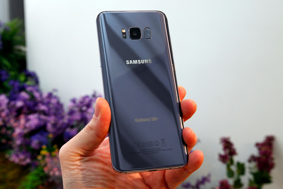
Samsung’s new Galaxy S8 and Galaxy S8+ are an evolution of the design we’ve seen on other recent Samsung phones like the Galaxy S7 edge and the ill-fated Galaxy Note 7. The similarities are obvious, but the S8 and S8+ look and feel brand new in the hand. Samsung removed the oblong home button on the face of the phones and reworked the phone’s guts, which allowed the company to design two smartphones with displays that occupy a staggering 83% of the phones’ faces.
The look is incredible. While it will still be quite some time before any company launches the all-screen smartphone we’ve all been waiting for, Samsung’s Galaxy S8 is as close as any mass-market device has come. Because the narrow bezels that remain are a deep, glossy black that matches the display itself, distractions seem to fade away and content takes center stage more so than on any other phone.
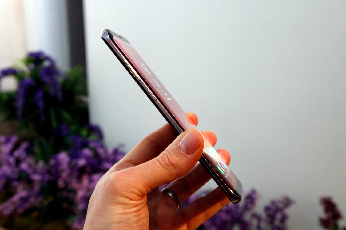
Like the S7 edge and Note 7, the sides of the phone are curved on both the front of the phone and on the back. As a result, the Galaxy S8 feels impossibly thin. I was really looking forward to using a phone with a nice big 5.8-inch screen crammed into a handset that is barely bigger than the iPhone 7, but I might actually prefer the larger Galaxy S8+ to the smaller model. It’s unbelievably comfortable in your hand thanks to the curved edges. Even though the phone is about the same size as the iPhone 7 Plus, it feels much smaller.
Of note, there is a new virtual home button that appears on the bottom of the display where the old physical home button used to be, and Samsung has included its own take on Apple’s 3D Touch haptic feedback that offers localized vibration feedback when you press the button. For those wondering, it’s not even in the same league as Apple’s solution. It does the trick in that you feel some feedback when you tap the home button, but it’s nothing like Apple’s Taptic engine.
When you press the virtual home button on the iPhone 7, it feels like you’re clicking a real button. When you press the virtual home button on the Galaxy S8, it feels like the phone is vibrating.
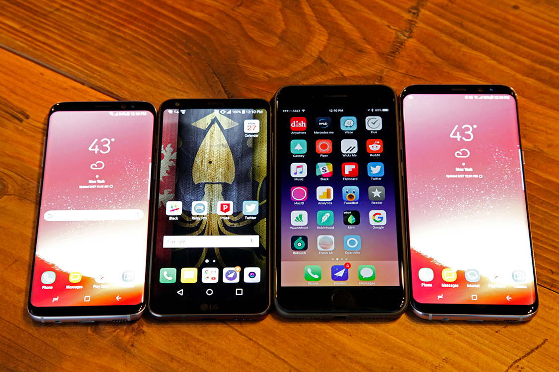
From left to right, the photo above shows the Galaxy S8, LG G6, iPhone 7 Plus and Galaxy S8+. Here’s another shot without the iPhone in the image:
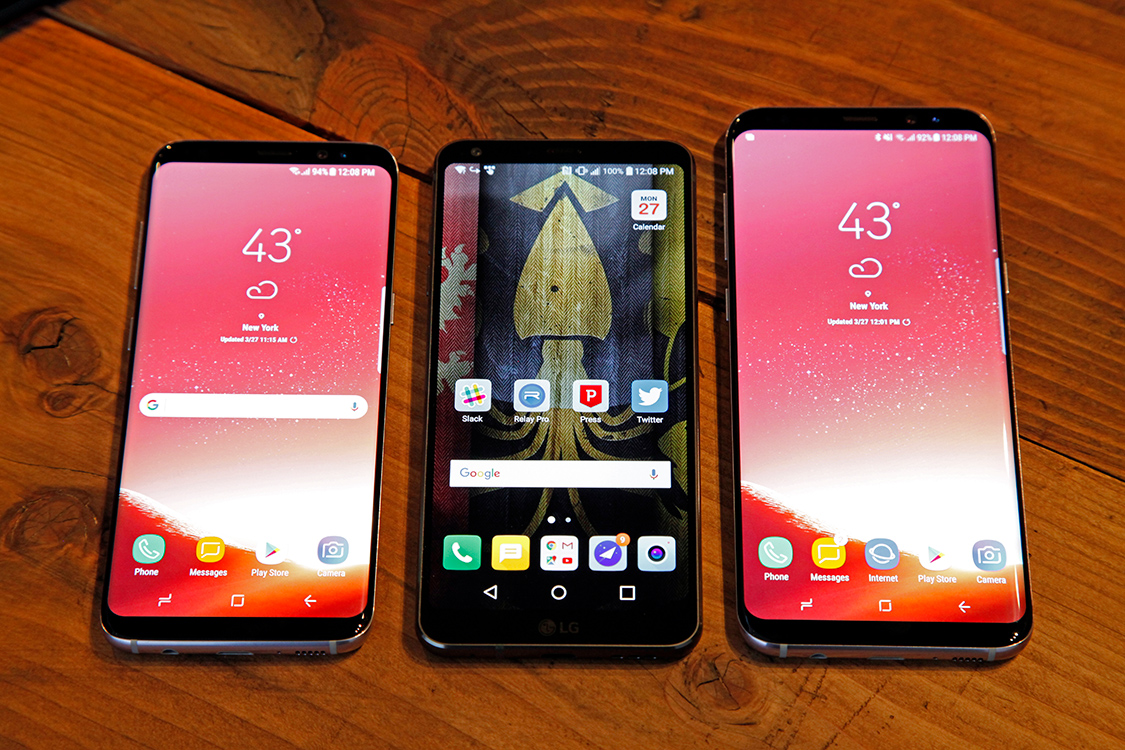
As you can see, the Galaxy S8 and LG G6 are about the same size, though the Samsung phone is far more comfortable in the hand thanks to LG’s peculiar design snafu that I wrote about recently. Both phones feel like the future, though. Smartphone design had become stagnant in the past few years, but this new leap toward all-screen phones brings some much-needed freshness to the market.
There’s plenty more to cover, of course, and we have much more Galaxy S8 and Galaxy S8+ coverage lined up for you today. We’ll dive into the phones’ software and performance much more in that coverage, but there are a few things I wanted to touch on briefly in this post.
First, Samsung’s new Desktop Experience is flat-out awesome. Either phone can be connected to Samsung’s new DeX dock to instantly power an Android desktop experience alongside a connected monitor, keyboard, and mouse. Several of Samsung’s apps like the browser and email app have been optimized for the new Desktop Experience, though every first- and third-party app on the phone can be used in desktop mode.
I haven’t spent time diving in yet, of course, but so far I’m very impressed. The experience is lightning-fast (apps open so much faster than they do on my MacBook that it’s a little depressing, to be honest) and it’s great for multitasking. I could easily see Samsung’s Desktop Experience replacing the need for a PC or Chromebook for many users, especially if some big-name third-party developers get on board and optimize their apps.
Microsoft has already done so with its Office suite, in fact, and more announcements should come soon. In fact, Samsung even partnered with VMWare, Citrix, and Amazon to enable all three popular Windows 10 virtual desktop experiences on the Galaxy S8 and Galaxy S8+. In other words, if you want, you can use your new Android phone as a Windows 10 desktop.
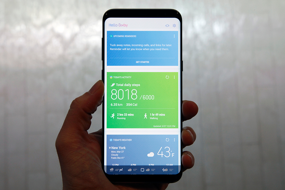
Bixby seems like it will be another highlight, though I haven’t yet spent much time testing it. Samsung’s answer to Alexa, Siri, and Google Assistant can be called upon with a voice command or by holding down the dedicated Bixby button on the left edge of the phone, and it will support a very wide set of features at launch.
In terms of core functionality, Samsung said anything that can be done with a touch in any app can also be done with your voice using Bixby. The new virtual assistant is also context-aware, and a nifty feature called Bixby Vision brings the camera into play. Bixby Vision can recognize objects or points of interest and give the user info, and it can also recognize text and translate more than 50 languages in real-time.
If Bixby isn’t your speed though, don’t worry — Samsung also included Google Assistant in the Galaxy S8 and Galaxy S8+. Simply press and hold the home button to pull up Assistant, just like you would on any other Android Nougat device that ships with Google Assistant.
Samsung’s new Galaxy S8 and Galaxy S8+ will be released on April 21st, and preorders open tomorrow, March 30th, at 12:01AM from all major US carriers. The phone will be available in black, gray and silver in the US, and preorders will include a free next-generation Gear VR headset with Samsung’s new wireless remote and a free Oculus game pack.
