The past few months of leaks and rumors have painted quite a picture of Apple’s next-generation iPhone 8. The device is expected to sport a huge redesign that replaces Apple’s aluminum iPhone housing with a glass sandwich design, wireless charging will finally debut on the iPhone 8, and the LCD displays Apple has been using for a decade will apparently be swapped out with an OLED that has curved edges on either side. If those sleek new design elements sound familiar, it’s probably because they’re not new at all.
While Apple’s new iPhone will undoubtedly feature a different look, the big changes that keep popping up in reports sound just like the design we’ve seen for the past couple of years on Samsung’s flagship smartphones. Are the tables turning? Samsung built an empire by copying Apple’s iPhone pixel by pixel, but now it sounds like Apple has taken a fair amount of inspiration from Samsung. If these new images of the next-generation Galaxy S8 are accurate, however, Apple may have some trouble improving on a design that Samsung seems to have perfected.
Apple has always been a leader when it comes to smartphone design — even when the company is following — and we’re expecting more great things from the iPhone 8 when it debuts in the late summer this year. Competition has been getting tighter at the top, however, and this year it looks like Samsung will make its strongest showing yet.
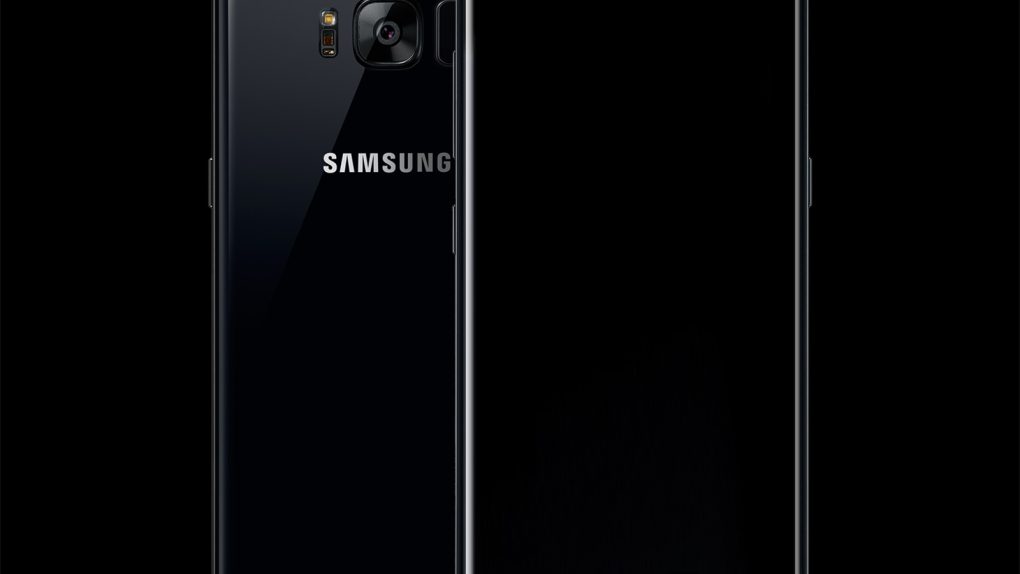
We’ve seen the Galaxy S8 in a number of leaks as we inch closer to the phone’s announcement in late March. In fact, we may have gotten our first look at a fully functional Galaxy S8 last week in a leaked photo. The full finished product has eluded us thus far, but 3D schematics have leaked so there’s precious little we don’t know at this point. With that in mind, a new series of renders from DesignWoOS could be our best look yet at what’s to come from Samsung next month.
In a blog post on Monday, the site created a huge batch of renders based on all the leaks we’ve seen and read so far. The results are… stunning. The Galaxy S8 and Galaxy S8+ seen here feature the larger all-screen designs we’ve been reading so much about, and the home button has been removed to help narrow the bezel beneath the display. The fingerprint scanner has been moved around back as a result, and the overall design appears to be an iterative but beautiful advancement of last year’s Galaxy S7 edge.
A few of the site’s renders follow below, and the rest can be seen in DesignWoOS’s blog post.


