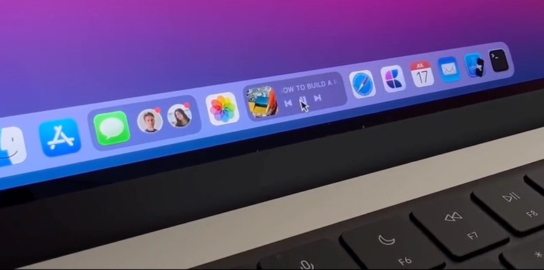
This Mac Dynamic Dock Concept Is Everything We Want For The Next macOS Update
After macOS Big Sur brought a more iOS-like look for the apps in the dock, we have yet to see another revamp with the Mac software UI. Thinking about what could change with macOS, designer Janum Trivedi shared his concept for a macOS dock with a more dynamic and fluid look.
In his 23 seconds mockup video, Trivedi shows a few examples of what a dynamic dock on Mac could look like. For example, placing the trackpad on the Messages icon could show the pinned people for you to interact with. You can preview the message by placing the pointer at one of them, which you can't do with the Mac version of iMessage currently.
With Apple Music, the app becomes a mini-player that can play, pause, or go to the next/previous song. Safari, on its way, could show how long it will take to finish a download.
What if the macOS dock and its icons were more dynamic and fluid?
Made a little demo that shows message previews, live music, download progress, and more.
Pretty happy with how this turned out! pic.twitter.com/YpzrWU5klA
— Janum Trivedi (@jmtrivedi) May 2, 2023
The designer explains the idea behind the Mac dynamic dock. "Icons could be expanded automatically, like music playing, or manually, like always wanting to see pinned chats. The content is fully vibrant to match the dock's design language."
What is interesting about this Mac dynamic dock is that Apple has recently added hover support for the M2 iPad Pro with Apple Pencil, which could also bring software tweaks like this. In addition, Dynamic Island on the iPhone 14 Pro is rumored to get more features with iOS 17.
Rumors so far also believe Apple will bring dynamic widgets to the Home Screen of the iPhone and iPad. Something similar could come to the macOS, as this designer has shown. In the replies to his concept, another designer, Andreas Storm, also shared a similar dynamic dock for the Mac, indicating that more people think the next layer of interaction coming to Mac devices is a dynamic dock.
Although it's unclear if Apple plans to adopt this change, at least we can dream that this could be a convenient feature request for an upcoming macOS version.
Will we see a dynamic dock soon?
Concept: https://t.co/GuLeuddTdx pic.twitter.com/SId16fcgs7
— Andreas Storm (@avstorm) February 10, 2023
