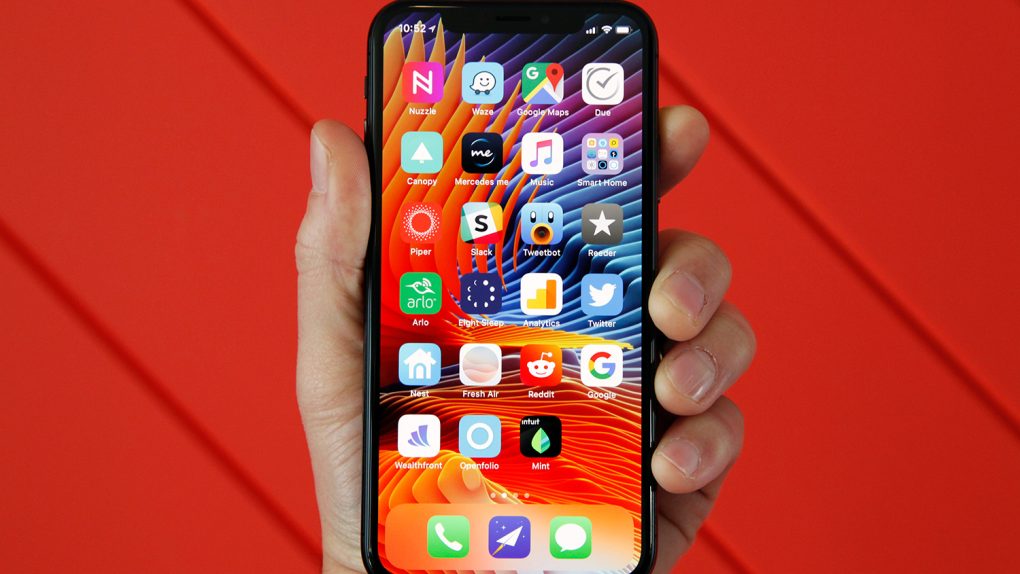
Apple’s iPhone X is not only the most impressive iPhone Apple has ever made, it’s also the most controversial. It’s a completely reimagining of the iPhone, and much of what users have grown accustomed to over the years has changed. Of course, it goes without saying that many people don’t like change, especially with regards to a device that is such an integral part of our lives.
The iPhone X is Apple’s first iPhone that doesn’t have a home button, which means users have to learn new navigation gestures. Most people seem to like them, but there are also people who do not — and that’s the least controversial of the major changes in Apple’s iPhone X. The infamous “notch” at the top of the phone’s display continues to be a point of content, and the wounds left by the removal of Apple’s beloved Touch ID fingerprint scanner are nowhere close to healing.
On top of everything else, iOS 11 is the buggiest software release Apple has issued in many, many years. While nothing can change the gestures, the lack of a home button, the notch, or the fact that Touch ID has been removed from the iPhone X, many Apple fans are looking to iOS 12 to at least fix some of the problems they have with Apple’s tenth-anniversary iPhone.
YouTube channel ConceptsiPhone teamed up with graphic designer Amir Estefad to create a video showcasing one of the best iOS 12 concepts we’ve seen so far. This particular YouTube channel has gone off on the rails a bit lately, posting videos of some bizarre and downright laughable concepts, like an iPhone that can become completely invisible (mmmkay). This time around, the iOS 12 concept showcased in the new video is rooted entirely in reality, with new features that are all not only plausible, but also might seriously improve the user experience on Apple’s iPhone X and all other iPhone models.
Here are five things we would love to see become a reality in iOS 12, which Apple will unveil during its WWDC 2018 keynote event on June 4th.
Grouped notifications
Apple’s notification system in iOS continues to be a major pain point among many, many iPhone users. We’ve discussed it a million times before here on the site, so we’re not going to dive back into all the ways it’s annoying. Suffice it to say the notification system in iOS needs a lot of work.
In this new video showcasing Amir Estefad’s concept, one of the most common iOS notification pain points is addressed right off the bat. Apple’s iPhones display notifications in chronological order, as all users undoubtedly know. So when you wake up in the morning, for example, you pick up your phone to find a mile-long list of individual notifications that couldn’t be more annoying to scroll through.
Estefad has fixed the problem, in part, by creating notification groups. This way instead of having notifications from each app spread throughout the list, each individual app’s notifications are displayed in a group, one on top of the other. A simple 3D Touch would then expand any app’s notifications.
Improved widgets
Apple’s widget implementation in iOS is somewhat useful, but Estefad has a way to improve it in iOS 12. In addition to a single page where multiple app widgets can reside, as is the case now, this iOS 12 concept allows app developers to create widgets that are displayed when the user 3D Touches an app icon. So instead of just an action menu that almost no one uses or even remembers is available, a 3D Touch on an app icon would give users access to key info and features without having to actually open an app.
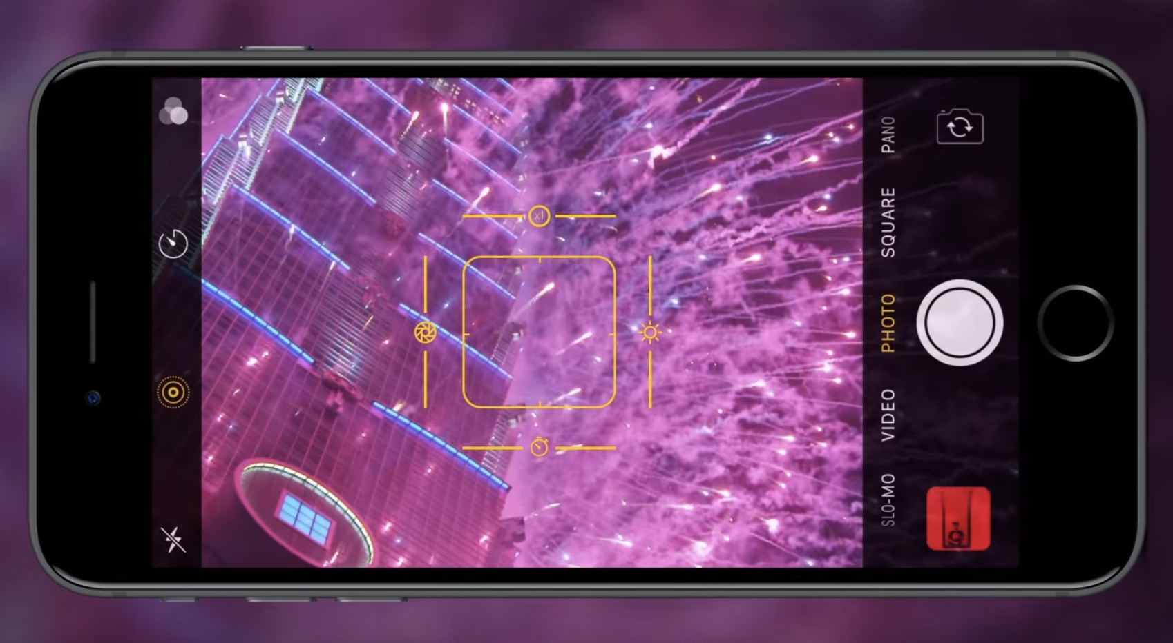
Pro camera mode

Apple’s iOS Camera app is pretty great, but this iOS 12 concept envisions a more robust and capable camera for Apple’s iPhones. Our favorite change is the new UI seen above, where on-screen sliders can are available to adjust multiple settings, not just exposure.
Dark Mode
This one needs no introduction. iPhone users have been clamoring for a dark mode in iOS for years. The difference with iOS 12 is that a dark mode would finally make a lot of sense. Beyond being easier on the eyes at night, a dark mode on devices with OLED displays like the iPhone X would save battery life.
New pull-down menu for apps
For a long period of time, iOS was all about uniformity. As the years passed with more and more new features being added, things have gotten far less organized. App settings is one area where there is no continuity in iOS. Some settings are accessible within each app itself, though there are a million different places where one might find the settings menu. Then there’s a section in iOS’s main Settings app where additional settings are located for third-party apps. Ugh.
In this iOS 12 concept, there’s a great hidden pull-down menu that creates a single, uniform location for key features and a shortcut to app settings. Adding a nifty additional piece to the puzzle is a great feature at the top of that pull-down menu: a way to secure each app behind Touch ID (or Face ID on the iPhone X) at the system level. Many apps include Touch ID and Face ID implementation, but why leave it up to developers?
Check out the full iOS 12 concept video below.


