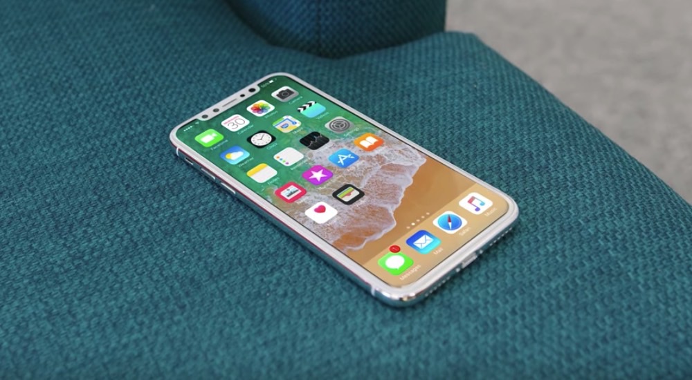
Based on what we’ve seen, the iPhone 8 is going to be a good-looking phone, but the top notch that houses the complex camera systems, the sensors, and the speaker is unsightly, to say the least. There’s no beating around the bush on this one. It is, once again, a design compromise that we’ll have to live with for at least a year, if not more — Apple is working on integrating all these front-facing phone features into the display, but that may be a slow process.
There are ways for making that notch look better than it currently does, and some designers explored some not too long ago. But after recent iPhone 8-related findings in the HomePod’s firmware, someone came up with an even better version. It’s a smart way to deal with the iPhone 8’s top bezel which I totally love. But I also ferociously hate it.
Here are the ways Apple could “fix” that top notch issue according to one designer. One way of doing it is to turn the notch into a larger bezel by keeping the top corners of the display dark. Because the phone has an OLED panel, this solution wouldn’t consume any power.

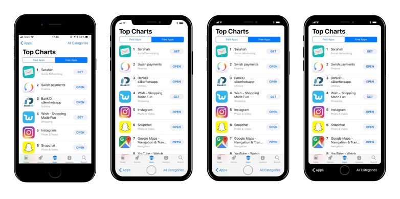
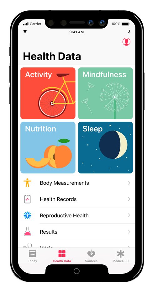
However, recent findings in HomePod’s software leak indicate that Apple may want to use the entire display to show more content. Furthermore, the same code also revealed how the virtual home button would work. Using that information, here’s what one designer conceived:

The mockup above was posted by the same developer who found most of the iPhone 8’s secrets in the leaked HomePod code. But the image is not based on actual code:
Double-notch pic.twitter.com/ZdkdCVL0Zp
— Steve Troughton-Smith (@stroughtonsmith) August 11, 2017
So don’t think for a second that Apple will actually use this particular design to bring some sort of symmetry to the iPhone 8’s display, but it’s an intriguing solution to the problem.
This “double-notch” design includes a physical bezel on top and a virtual one on the bottom. It certainly looks functional, but it’s also incredibly ugly. I’d much rather have symmetrical upper and lower bezels like the Galaxy S8 has than seeing this disaster on the iPhone 8. It’s not really an edge-to-edge display if both the top and bottom edges are actually bezels, virtual or otherwise.


