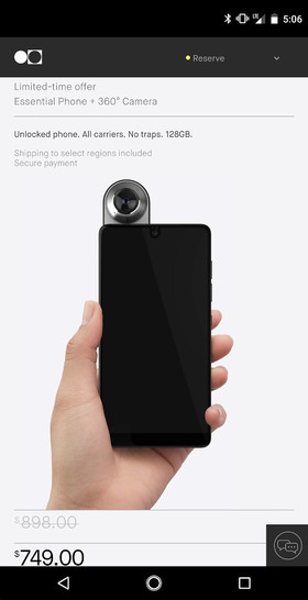
Remember that Essential Phone that Andy Rubin announced a few weeks ago? It’s supposed to be a high-end Android handset that will deliver a high-end Android experience, unlike anything we’ve seen so far. The phone has an all-screen design that matches this year’s smartphone design trend, but it does have one ugly trait: the front-facing camera bezel. Unfortunately, the design trend looks set to spread, as most of the iPhone 8 leaks we’ve seen so far have the same bezel.
Well, it turns out that the design of the Essential (and, if we’re unlucky, the next iPhone) comes with a hideous side-effect.
Check out the following screenshot taken on an Essential Phone. Notice that huge black status bar at the top? It’s incredibly ugly. And it’s likely that all screenshots taken on the phone look like that. Forget the ugly camera cutout. This thing is even worse on a device that’s supposed to maximize the display and anything that comes off it. Is this what caused the Essential Phone’s launch delay?

Screenshot-taking is an important part of the current smartphone experience, and Essential Phones screenshots seem to be a miserable failure.
The screenshot was posted on Twitter by the company’s head of sales, Phone Arena explains, so it’s not a fake.
— Jason Mackenzie (@JasonBMac24) July 31, 2017
The iPhone 8 will have its own camera-and-sensors cutout at the top. It’ll be thinner than the one on the Essential Phone, but longer. That means any screenshots taken on the iPhone 8 could have the same annoying black status bar on top. Let’s just hope that Apple already found a clever way of dealing with this issues. You know, like not using the top side of the screen in any screenshots.


