Here's Everything Wrong With iPhone 14 Pro's iOS 16 Lock Screen
The main feature of iOS 16 is a revamped Lock Screen with widget support and lots of customization. The Lock Screen got even more interesting when Apple announced the iPhone 14 Pro models in September with the Always-On display technology. But after a few weeks of using it daily, the iPhone's Lock Screen on iOS 16 doesn't seem genuinely functional, here's why.
iPhone 14 Pro's Lock Screen looks too on, except when near an Apple Watch
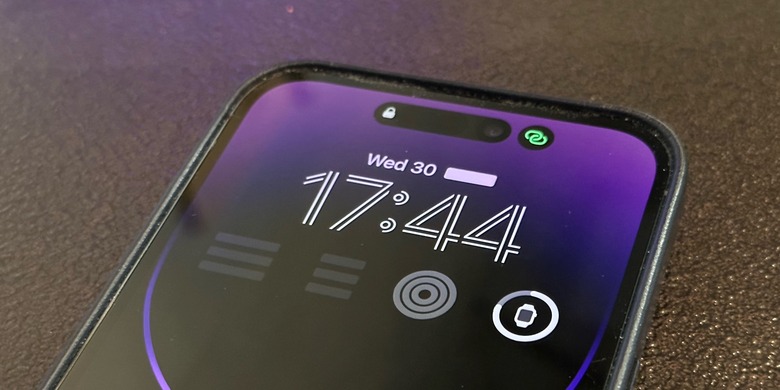
The first problem with the iOS 16 Lock Screen on the iPhone 14 Pro is the display's brightness – it looks too on. While Apple will address that with iOS 16.2 as the company is working on an Android-like Lock Screen with everything black and just widgets and the clock available, it's bizarre to have a similar Apple Watch Always-On display experience on the iPhone.
For example, why have the Always-On displayed on your iPhone while wearing an Apple Watch with the same technology on your wrist? If you don't have an Apple Watch, sure, that makes sense, but if you do have a Watch, what's the point?
Apple hides essential information with the iOS 16 Lock Screen if it's not unlocked
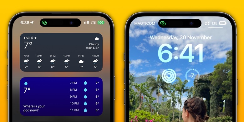
As you can see in the featured image, Apple hides important information such as Weather, Fitness, and Stock data while you don't unlock your iPhone. This happens if you have blocked widget access when your iPhone isn't unlocked.
Personally, I think Apple should separate the widgets section when you swipe left to right at Home or your Lock Screen to the complications available on the iPhone, mainly because more apps are supporting that widgets page than apps supporting the Always-On display complications.
In addition, even if you can see Weather and Stock information if you allow widgets with the display locked, it doesn't make sense why showing the Fitness rings is an issue – especially since the Apple Watch Always-On display shows it all the time.
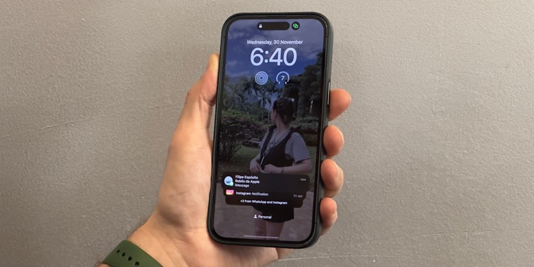
While Apple makes these weird choices, I think the company displays too much data when you receive an iMessage notification from a group chat. While all notifications show the app icon and name, iMessage ensures you know who sent you the message and from which group. Personally, I'd prefer to get the Messages icon and the app name instead.
Wrap up
There are still a few inconsistencies with the iOS 16 Lock Screen and the Always-On display. Apple has already fixed some. Previously, it was harder to edit the Lock Screen and the Home Screen, which the company fixed with iOS 16.1.
That said, Apple still has to add more widgets/complications, change how the Always-on display behaves, and adequately identify when the user has an Apple Watch, so you don't have two Always-On displays on simultaneously.
More Apple Coverage: Will AirPods Pro 2 ever support Lossless quality? Apple engineer answers


