It has been nearly three years since Apple released its first smartphone with a notch at the top of the display, and it wasn’t even the first company to launch a smartphone with a notch in the screen. That honor goes to LG, which released a smartphone called the V10 all the way back in 2015 that had a notch cut out of the top-left corner of the screen. With that in mind, the notch has now been a part of smartphone design language for almost five years, and yet some people still can’t seem to accept it. Anyone who has used a smartphone with a notch knows that it’s really not a big deal at all. You might focus on it at first, but after a short while it just becomes part of the user experience and you don’t even really notice it at all. Nothing of any importance is ever really displayed on the very top edge of the screen anyway, aside from any icons or indicators that might appear in the status bar. Needless to say, those items are all moved to either side of the notch on phones with notches, so nothing of any importance is ever lost.
Still, there will always be people who hate this particular smartphone display design, and 2020 is turning out to be a year they should enjoy. Why? Because all of the Android phone makers that had shamelessly stolen Apple’s iPhone X notch design are now stealing Samsung’s Galaxy S10 hole-punch design instead. We’ve already discussed that the hole-punch design really isn’t any better than a notch in terms of user experience, but many people seem to prefer it because it removes less physical space from the screen. Now, one of the most hotly anticipated flagship Android phones of the year just leaked, and it has one of the biggest holes we’ve ever seen. Is it really any better than the notch that Apple will reuse again on its upcoming iPhone 12 series smartphones? Let’s take a look.
The smartphone pictured at the top of this post is the Huawei P30 Pro. It was released last year and while it’s not available for sale through traditional channels in the US, it’s quite popular in Eastern markets. It’s also one of the most powerful smartphones out there right now, and it has one of the best cameras ever used on a phone.
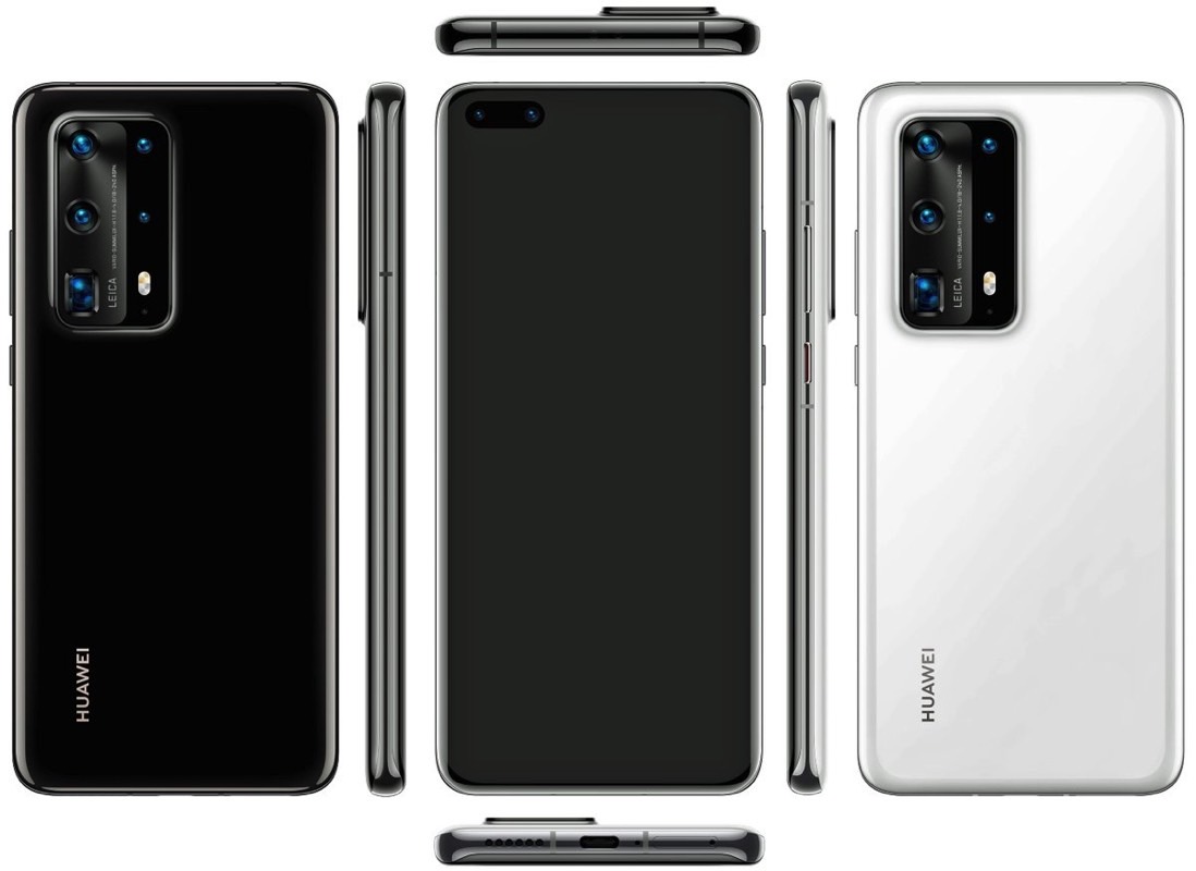
With that in mind, it’s no mystery why the phone’s successor has been getting a lot of buzz. Huawei has already confirmed that it will unveil the new P40 Pro along with the rest of its P40 lineup in late March, though it hasn’t made anything official where the phone’s new design is concerned. That said, nothing stays secret for long these days and the P40 Pro’s design was already leaked by Evan Blass.

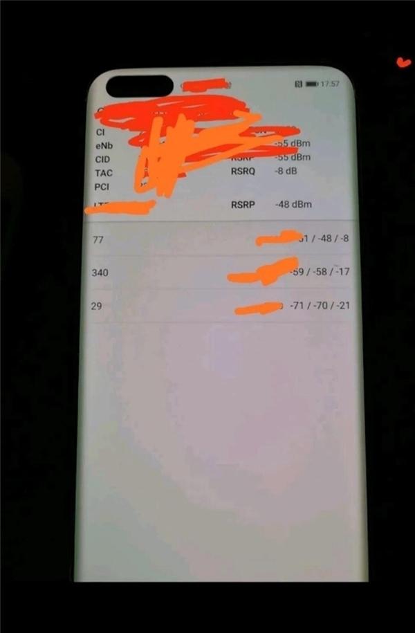
It’s a sleek phone overall and we can’t wait to see how impressive that new quad-lens camera system is, but look at the hole-punch selfie camera in the top-left corner of the screen. The phone has a huge oblong hole in the display thanks to two large front-facing camera sensors, which means that entire portion of the screen is completely unusable. Here’s a better look at the design in a supposed live image of the P40 Pro that just leaked on Baidu:

Now, let’s take a look at the leaked iPhone 12 design we’ve seen over and over, which retains the notch from Apple’s current iPhone 11 lineup:

So, I ask again: is the hole-punch design on Huawei’s new P40 Pro really any better or worse than the notch people are still complaining about on Apple’s iPhone 12 and iPhone 12 Pro phones that will be released this September? If you ask us, it doesn’t matter if a portion of the display is missing from the middle of the upper edge or from the corner. And as we said before, neither is a big deal when you consider the fact that any important UI elements that might’ve been shown in those areas are obviously moved to the side of the notch or the hole.
The bottom line is that either solution is perfectly fine, so pick whichever one you prefer. Until smartphone makers figure out how to mass-produce phones with front-facing sensors hidden behind active areas of the screen, we’ll continue to see both of these designs on popular handsets like the P40 Pro and iPhone 12.


