I have never been afraid to eat crow here on BGR. When I’m wrong, I’m wrong. One example that comes to mind is the first-generation Samsung Galaxy Note, which I stopped just short of calling an abomination. At the time I was convinced that the market for oversized smartphones that barely fit in one’s pocket was miniscule, and phablets would be a fad that died off in a year or two at most. I was as wrong as wrong can be, and I’ve admitted as much countless times here on the site. In fact, until just three days ago, I was a phablet user myself. To this day I still hate how huge phablets have become, which is one of many reasons I’m so happy with my new iPhone X. But there’s no denying that millions and millions of people around the world love their supersized smartphones.
Speaking of eating crow, let’s have a quick chat about the iPhone X’s notch.
Apple has made plenty of questionable design decisions over the past few years. Imagine thinking it’s okay to release a rechargable wireless mouse with the charger port on the bottom so it can’t even be used while it’s recharging. Imagine thinking the Touch Bar was actually going to revolutionize notebook computers.
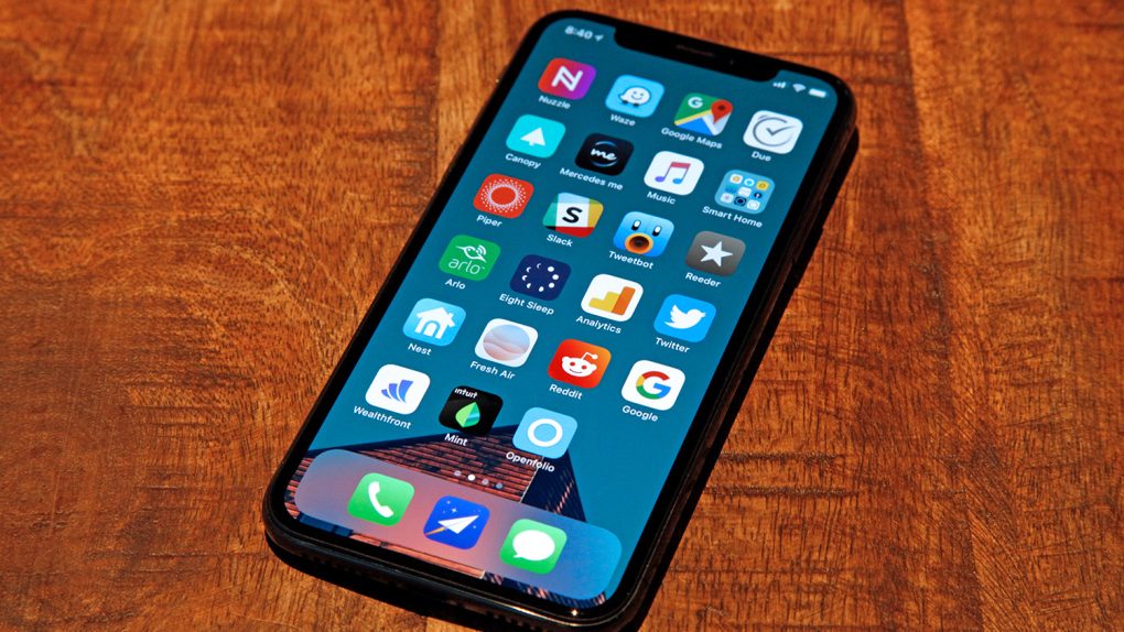
Amid all the leaks ahead of the iPhone X’s unveiling, I ranked the phone’s notch right up there among the worst design designs Apple has made in the past decade. For those unfamiliar with the term, the “notch” is what people are calling the TrueDepth camera and sensor array at the top of the new iPhone X’s display. The OLED panel has a big bite taken out of it where the front-facing camera, sensors, and ear speaker reside, and it then extends up on either side of the notch.
Ahead of the iPhone X’s release, I suggested that the notch design was “embarrassingly bad.” I was wrong.
Apple is the only company that doesn’t invite us to events or send us review units (it’s a long story), so my first experience with the iPhone X was when I took delivery of it on Friday. After seeing the flood of photos and videos over the course of the prior week, I had a sneaking suspicion that I would flip-flop on the notch even before the phone reached my hands on Friday. Once my iPhone X arrived though, it probably took less than a minute before I knew conclusively that I had made a mistake.
I like the notch. A lot.
I’ll be writing plenty about the iPhone X in the coming days and weeks, both good and bad. And make no mistake, there are plenty of bad things about Apple’s tenth-anniversary iPhone (though they hardly overshadow all the good things). But I had to get this off my chest now that I can see firsthand just how wrong I was.
Let’s briefly discuss why the notch exists in the first place. It was born entirely of necessity. Apple is researching ways to embed things like cameras and ambient light sensors beneath the display of a mobile device, and it has several patents that prove as much. But that technology is still several years away from being mass-producible, and Apple had no interest in waiting several years to release an iPhone with Face ID.
Face ID, by the way, is fantastic. But that’s another thing I’ll discuss a bit more later in the week.
So with all that in mind, Apple had to decide exactly how to implement the components that enable Face ID on a phone that it also wanted to be “all screen.” As another quick aside, the iPhone X is obviously not “all screen” like Apple’s marketing insists. It does have the best screen-to-body ratio among widely available flagship phones, and it took some brilliant engineering to make it happen. But still, it is absolutely not an “all screen” phone.
So, Apple could either leave a somewhat wide bezel on the top of the display and ruin the symmetrical look of the iPhone X, or it could use the shapable characteristics of OLED displays to get creative. Apple’s designers decided to get creative, and I’m glad they did.
The notch design is fantastic on the iPhone X. I love it. It’s a design that I believe will vanish in time as technology improves, but in 2017 it’s a smart way to differentiate the iPhone X while introducing the next generation of biometric authentication technology. Every iPhone X is instantly recognizable as an iPhone X thanks almost entirely to the notch. And Face ID is absolutely glorious.
That said, let’s keep the notch on the iPhone where it belongs and not try to rationalize it on other devices.
The Apple OLED TV is real pic.twitter.com/bHTfJ8XplE
— Zach Epstein (@zacharye) September 15, 2017


