Google surprised us all last week when it came from out of nowhere and released the first Android Q beta. At first we had expected it a bit earlier in the month since the company released its first beta version of Android P on March 7th last year. But when the first week of March 2019 came and went with no release, many people thought Google might be switching things up this year. They were pleasantly surprised when the first Android Q beta was released to the public on March 13th, and it’s now available to anyone and everyone with a compatible phone who is brave enough to run early beta software.
Developers have now had almost a week to dig through Android Q, but they really haven’t found anything too exciting at this point. There are a bunch of new privacy features and plenty of optimizations, as well as a few new notifications settings people will appreciate. That’s pretty much it. Of course Android Q’s new marquee features will be added to future versions of Android Q, likely after Google’s annual I/O developer conference this spring. After all, early Android betas are intended only for developers and smartphone vendors so they can get to work on accommodating the new core features. That said, a bit of digging has revealed at least one nifty new feature Google will undoubtedly highlight in a few months at Google I/O 2019, and it was swiped right out of Apple’s latest iPhones.
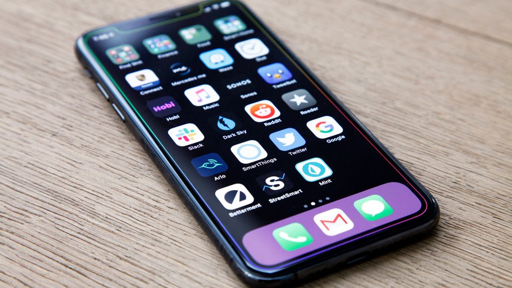
When Apple began working on software ahead of its iPhone X launch in 2017, the company had an important decision to make. Since the home button had been integral to the iPhone experience ever since the first iPhone was released a decade earlier, Apple had to find an elegant way to replace the button’s functionality. The company came up with a series of gestures that ended up being even more intuitive than the home button, allowing users to navigate the iPhone’s interface more quickly and naturally using a series of swipes.
We’re sure by now that you know where this is going: Android Q swiped the iPhone’s swipes.
Google borrowed a few iPhone gestures in last year’s Android Pie release. The traditional on-screen navigation buttons are still available at the bottom of the screen in Android Pie, but users can opt to remove them and instead navigate with a series of gestures. To be frank, however, those gestures stink. Users have to swipe up from different areas on the bottom of the screen to do different things.
It looks like Google realized how much better and more natural Apple’s iOS gestures are, because it decided to stop being shy and just steal Apple’s work. XDA-Developers dug into the Android Q beta and discovered an option to enable an entirely new set of gestures. Well “new” certainly isn’t the correct word, but they’re at least new to Android.

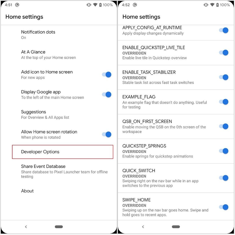
Buried in Android Q’s Developer Options menu is a series of flags that allow users to enable the available gestures. Here’s the list of new navigation gestures in Android Q, as compiled by XDA-Developers:
- Swiping right on the pill now uses a more seamless transition animation when changing tasks.
- Swiping left on the navigation bar can now switch to the task you just left. The transition animation here is a work-in-progress.
- Swiping up on the pill goes home. A new animation has been made for this gesture.
- Swiping up and holding on the pill shows the recent apps overview.
Do any of those gestures sound familiar? Oh, right, they all sound familiar because they’re straight out of iOS on Apple’s iPhone X, iPhone XR, iPhone XS, and iPhone XS Max. And the “pill” being referenced there is the oblong graphic on the bottom of the screen, which is a condensed version of the same UI element seen on Apple’s all-screen iPhones.
Here’s a video of the “new” Android Q gestures in action:


