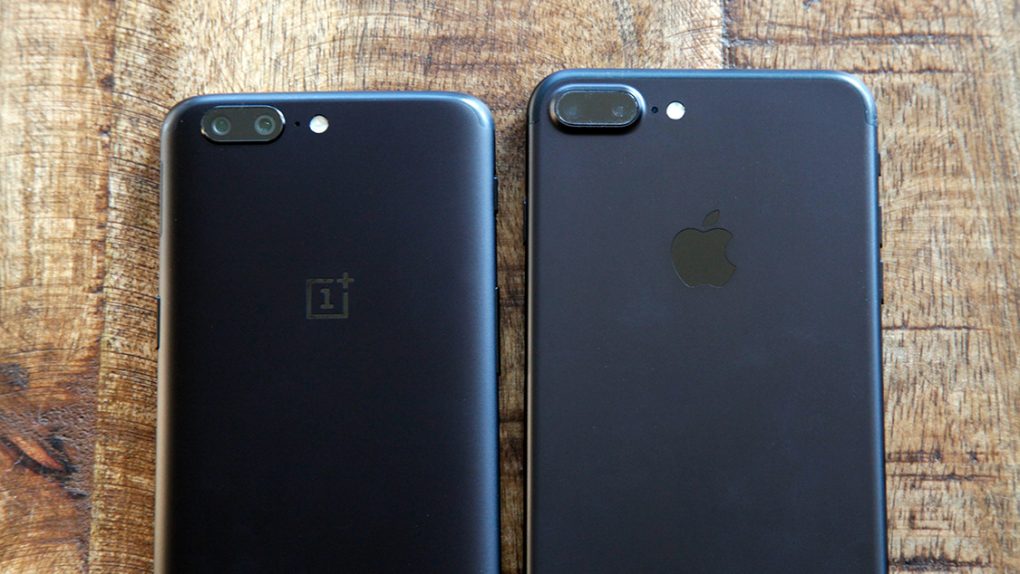
It’s no secret that Android manufacturers “take inspiration” from Apple’s work on the iPhone. It makes sense — Apple does the same thing! After all, when you have thousands of engineers all trying to make similar rectangular slabs as simple and elegant as possible, it’s almost impossible to work in a vacuum.
But OnePlus has always followed Apple more closely than the rest. It’s evident in the design of the OnePlus 5, which is nearly indistinguishable from the iPhone 7 Plus. It was clear when OnePlus debuted a brand-new Face Unlock feature just days after the iPhone X’s Face ID launched. And if there was any lingering doubt that OnePlus cribs from Apple, it just vanished.
With its latest update, OnePlus is throwing any shred of shame out of the window. In the latest beta build of Android Oreo for the OnePlus 5T, the company has added a feature that lets you disable the software navigation bar along the bottom in favor of gesture controls. Those gesture controls will feel oddly familiar to anyone who’s used an iPhone X: It’s the same kind of upwards swipe to go to the home screen, and a swipe-and-hold for multitasking. Swiping from the left or right side of the screen takes you back.
Honestly speaking, this is a good thing for OnePlus 5T owners. The whole point of the all-screen smartphone design that became popular last year is to maximize the amount of real estate available for content and apps. Gesture controls provide the same functionality as physical or digital buttons, but without taking up the same amount of room. Apple’s gesture controls feel natural and intuitive enough not to be a pain, and they’re certainly simple. If OnePlus forced users to draw out a circle to return home, rather than just mimicking Apple’s swipe up, that would be a poor design decision taken purely for appearances.
When OnePlus launched the OnePlus 5T, the designers told BGR that they first tried to make a phone that looked less like the iPhone 7 Plus. But they also said that “the company never wants to be different for the sake of being different. Instead, it tries to make design choices that are familiar to users.” It’s not a bad idea in the slightest — maybe just try to be more subtle next time.


