A few months ago, designer Vianney le Masne put together an absolutely stunning concept video depicting what Dark Mode on iOS 11 might look like. While iOS 11 mockups are certainly a dime a dozen these days, Masne’s effort was so elegant and thoughtfully designed that it easily stood out from the rest of the pack.
Of course, Apple at WWDC did not introduce an official Dark Mode option for iOS 11, though a “Smart Invert Colors” toggle is certainly a step in the right direction. That notwithstanding, Masne recently put together an intriguing collection of photos which help illustrate what iOS 11 may look like on Apple’s highly anticipated iPhone 8. Though we already have a clear idea as to how iOS 11 will look and feel on existing devices, it remains unclear how Apple plans to tweak iOS 11 as to take advantage of the iPhone 8’s larger screen real estate and edgeless display.
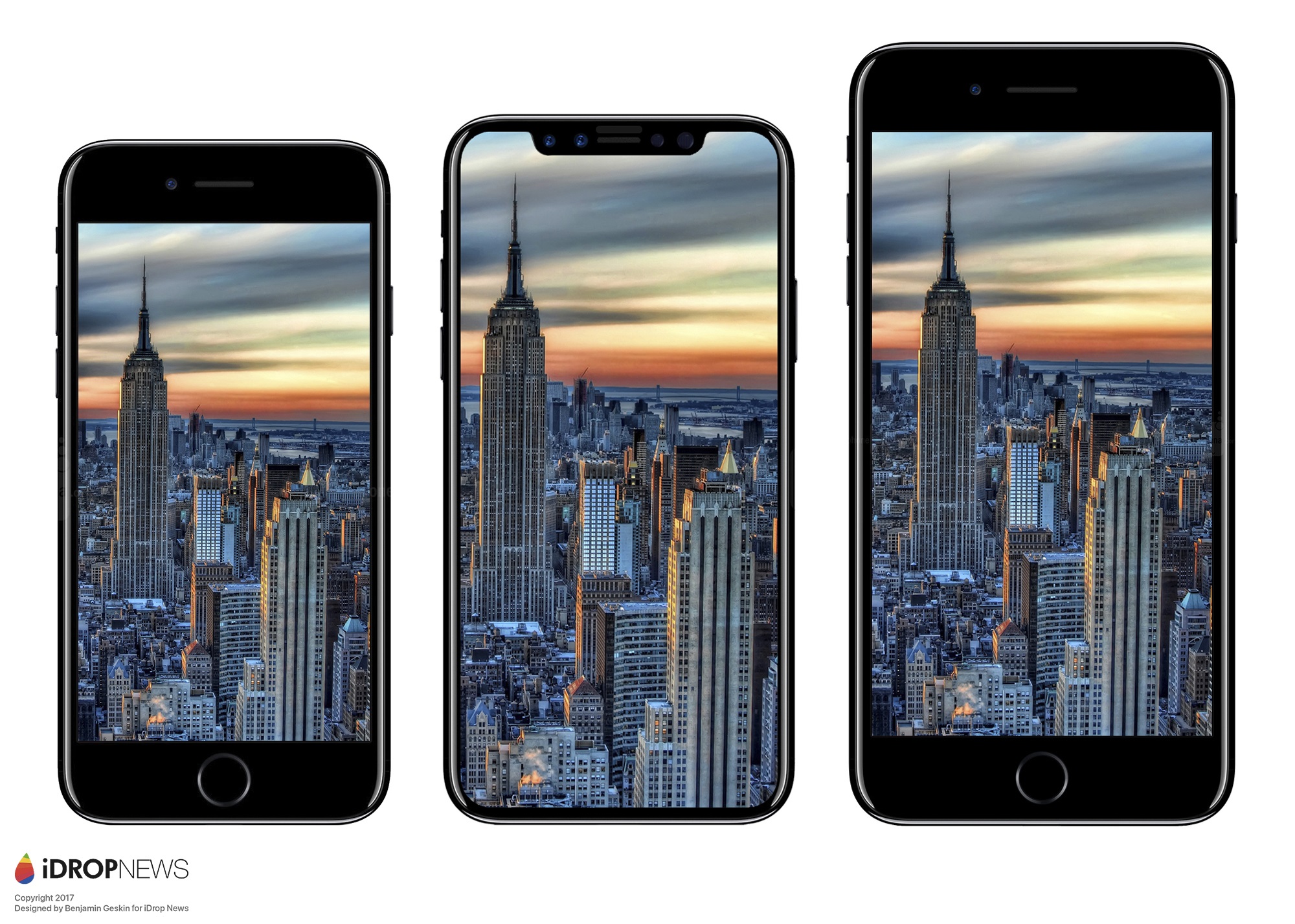
As evidenced by a number of credible leaks, the iPhone 8 display will likely feature two flaps which will flank the earpiece along with a number of forward facing cameras. The rumored iPhone 8 design currently making the rounds is illustrated below in the center.

From what we can gather, though, the two flaps will not be used to display an image (as pictured above) but will instead be used as an area for Apple to display pertinent information such as signal strength and battery life.
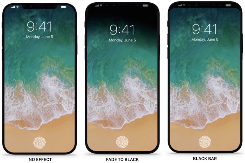
Nonetheless, Masne points out that Apple has a few implementation options it can consider. Specifically, Apple can simply utilize the top area of the phone as a straight forward black bar. Or, Apple could amp things up a notch by minimizing “visual breaking points,” as evidenced by the photo below.

The design on the right is serviceable, but the Fade to Black mockup looks incredibly sleek and helps showcase how the iOS 11 design we saw at WWDC might be tweaked to take advantage of the iPhone 8’s edgeless display.
Masne writes:
Even though most mockups tend to show iOS 11 using maximum screen real estate (left), I wouldn’t be surprised if Apple defaulted to subtle ways to blend the screen into the edges using fade-outs or simply making the top bar black. As mentioned previously in my post about the iPhone without borders, every classic layout reminding the users that they are interacting with a rectangle will be an unnecessary way of taking them out of the experience, even for a microsecond.
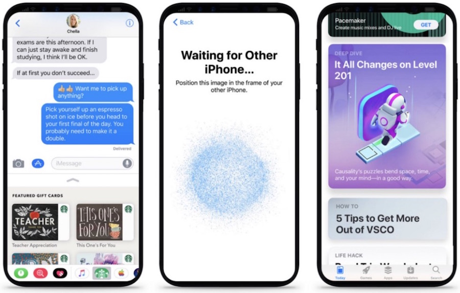
In a similar vein, the following concepts depicting what iOS 11 could might look like on the iPhone 8 are incredibly engaging and immersive.

Masne is clearly a talented designer, and this video he put together showcases a number of other interesting ideas that we can only hope will be similar to what Apple ultimately unveils later this year.


