Apple’s new iPhone 11 lineup is set to debut just over than three months from now, but a fairly complete picture has already formed. We know that this year’s iPhone 11, iPhone 11 Max, and iPhone 11R will look exactly like last year’s iPhone XS, iPhone XS Max, and iPhone XR from the front, with the same all-screen design interrupted by the same large notch at the top of the display. We also know that the new iPhone 11 series will feature new rear cameras on the back of each handset. The iPhone 11 and iPhone 11 Max will have triple-lens cameras in a large square camera bump, while the iPhone 11R (or whatever Apple ends up calling it) will feature the same square camera bump but with only a dual-lens camera, likely the same setup that can currently be found on the iPhone XS and iPhone XS Max.
Beyond the new cameras and a few other changes like frosted glass backs and a round mute switch, there isn’t much excitement to speak of when it comes to Apple’s iPhone designs in 2019. Meanwhile, Android vendors have moved past the iPhone X design they all copied last year and begun to develop some sleek new designs of their own. Samsung’s Galaxy S10 lineup features a beautiful all-screen design with hole-punch cameras instead of a notch, and phones like the OnePlus 7 Pro don’t even break up the screen with a hole. Instead, they feature true-all screen designs and have a selfie camera that pops up out of the top edge of the phone when needed.
Apple’s iPhone 11 design is indeed a bit stale in comparison, which is likely why one graphic designer took all of the leaks and rumors we’ve seen so far and added his own unique spin to create an iPhone 11 with a much sleeker and more modern design.

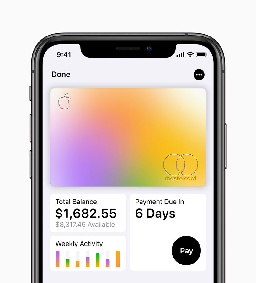
The image above shows the front of Apple’s current-generation iPhone XS, which looks exactly like Apple’s previous-generation iPhone X from 2017. It’s a fine design, and we all know that people who use a smartphone with a notch don’t even notice the notch anymore after a very short time. But it has been about two years since Apple first introduced this design, so there’s no question that it’s feeling a bit dusty at this point. That’s especially true now since so many Android phone makers have released handsets with more modern looks.
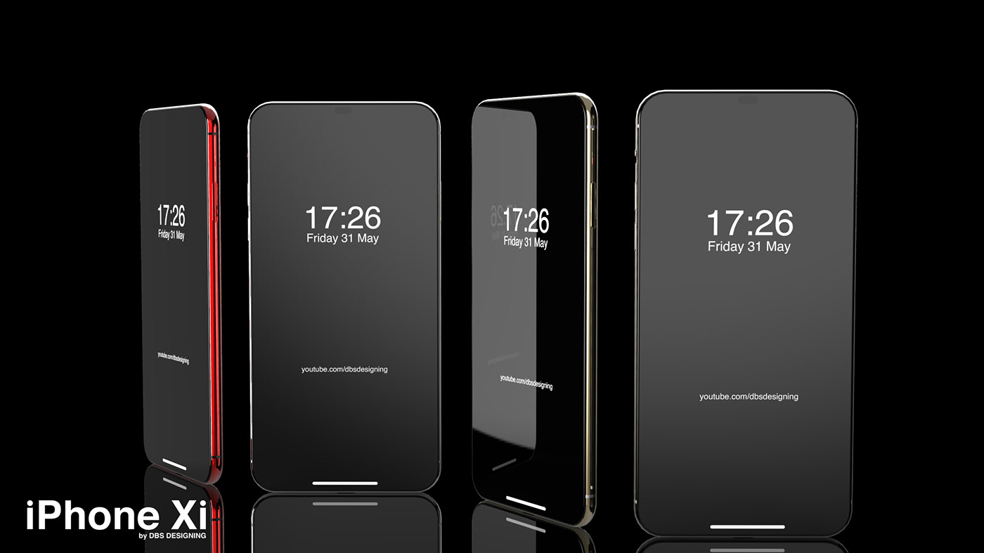
Graphic designer Muhsin M. Belaal Auckburaully, who goes by DBS Designing on YouTube, seems to agree that Apple’s upcoming new iPhone 11 series is a bit dated. The overall look of the phone is still gorgeous, of course, so he took the iPhone 11’s design and stuck a more modern display on the front, which includes a small hole at the top for Apple’s front-facing cameras rather than a large notch. Here’s how it came out:


Now, there’s no question that a display that extends farther to the edges of the front and a hole-punch screen with a tiny hole for the cameras is a bit improvement over Apple’s actual iPhone 11 design. There’s also no question that it could never happen. The TrueDepth camera system Apple uses for Face ID has more components than just two tiny lenses like the ones we see above, so it needs much more room.

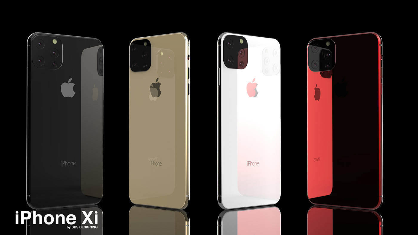
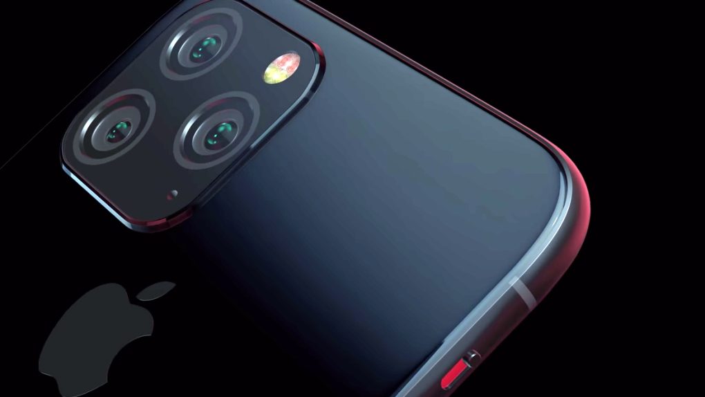
Around back, the graphic designer’s iPhone 11 mockup looks exactly like the real thing, but he decided to add a fourth camera lens in the bottom-right corner of the square camera bump. We’re not sure why, considering that there will be a rear-facing microphone there to capture audio for videos and Live Photos, but it doesn’t really change the overall look of the phone.
You can find more images of Auckburaully’s iPhone 11 on his Behance page, and a video showcasing the design is embedded below.


