Here's All The iOS 11 Screenshots You've Been Waiting For

Unless you've been trapped in a VR cave, you've probably heard by now that Apple has a new version of iOS. The 11th edition of Apple's mobile OS has it all: redesigned apps, a system-wide facelift, new Siri, and yes, a kinda-sorta Dark Mode.
iPhone
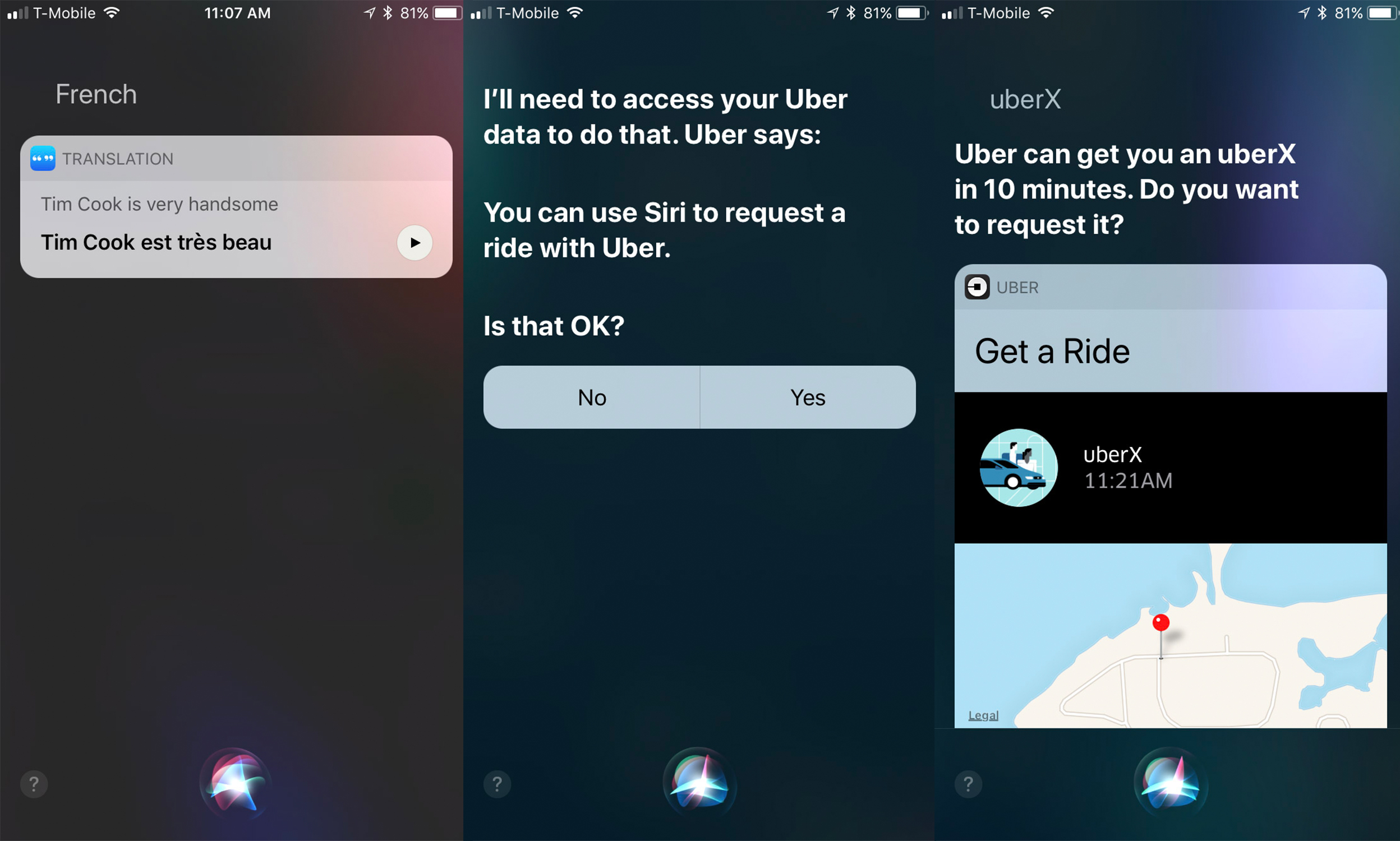
One of the biggest visual changes is to Siri. You now get a circular icon at the bottom that turns into a waveform when Siri is waiting for you to speak, which looks a lot like the light on top of Apple's new HomePod. The action buttons are also redesigned to be a little more engaging, and overall it's meant to make Siri feel like less of a one-trick pony.
Whereas previously, interactions with Siri were limited to a single question followed by an answer, Siri's bag of tricks is now much bigger. A side effect is that you have multi-stage interactions with Siri far more frequently. If you ask her to translate a phrase, for example, you'll get a choice of languages before the translated phrase is shown. If you ask her to get an Uber, she'll ask what kind of car and then confirm your location before ordering.

Messages has also had a minor redesign, mostly to put the Message apps far more front and center. Although the physical apps haven't changed much, they're more prominent in the Messages app than ever. Expect Apple Pay to appear right up front in the near future.
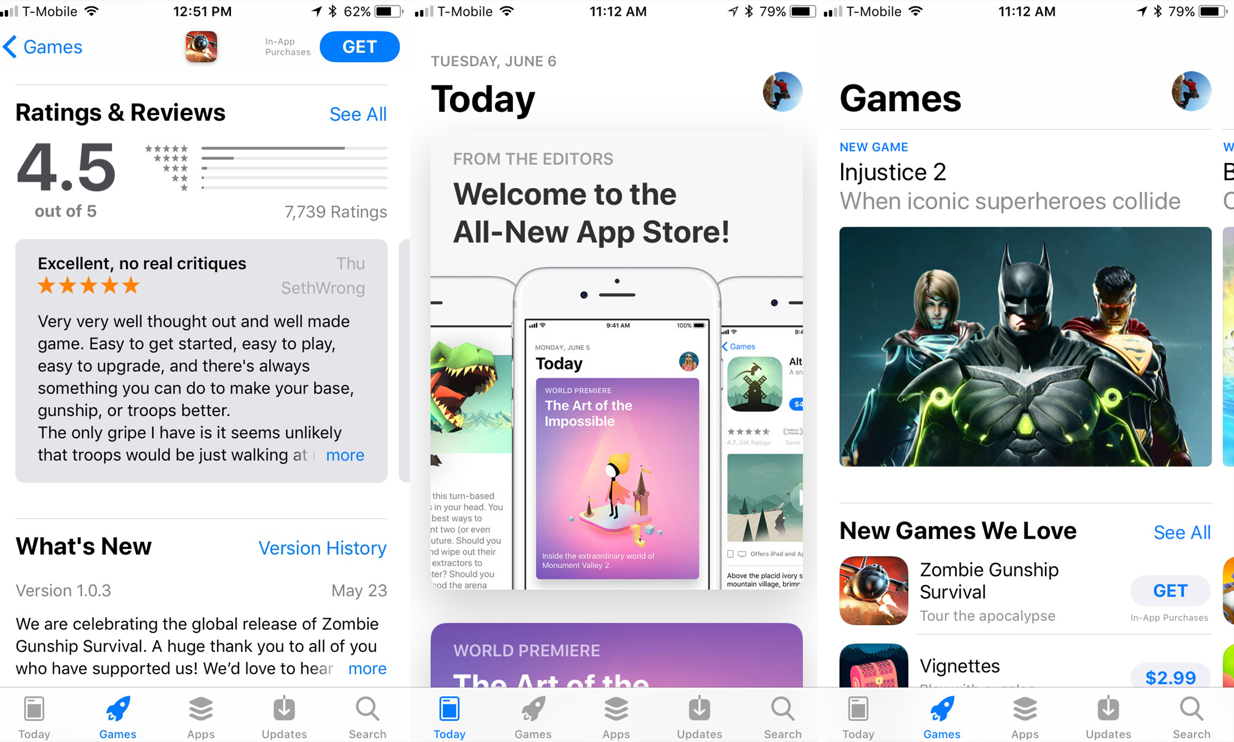
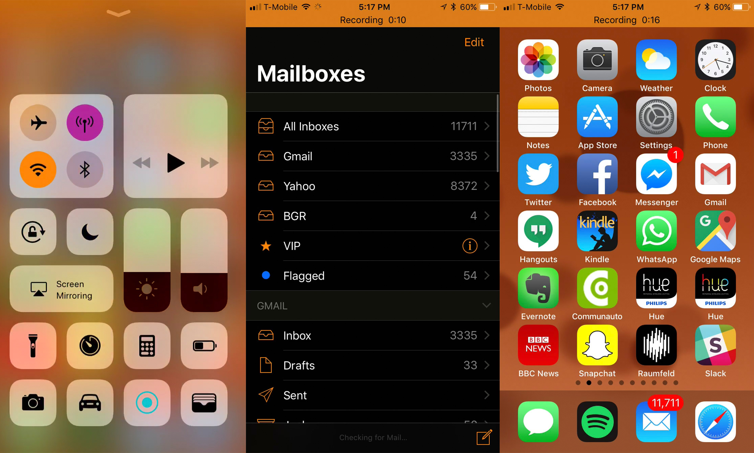
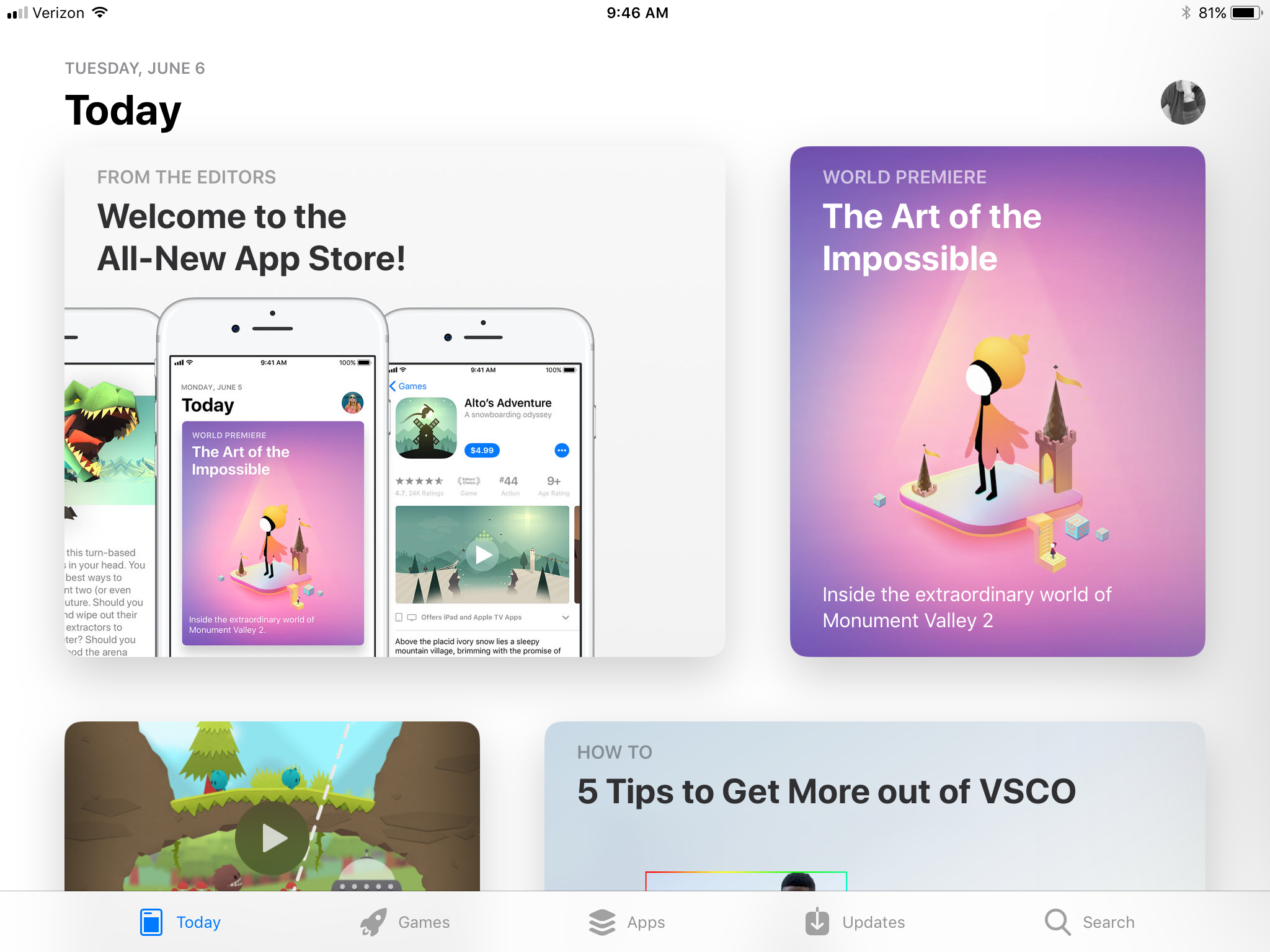
The App Storee has a complete overhaul. The design is more card-based, and individual elements are more distinct than they were previously. There's a new selection of tabs, including a "Today" page that's meant to surface new content, and a Games tab to highlight, well, Games.
Individual apps also have a new page that jumps out when you tap for more information. The design features more bold headers — a theme throughout iOS 11, actually — and reviews are highlighted much higher up. It actually feels more like Amazon than the App Store, which may well be deliberate.

Speaking of redesigns, the Music app has a facelife. Although the tabs have stayed the same, Apple's new bold-header design makes an appearance, and individual artist channels make a bigger appearance.
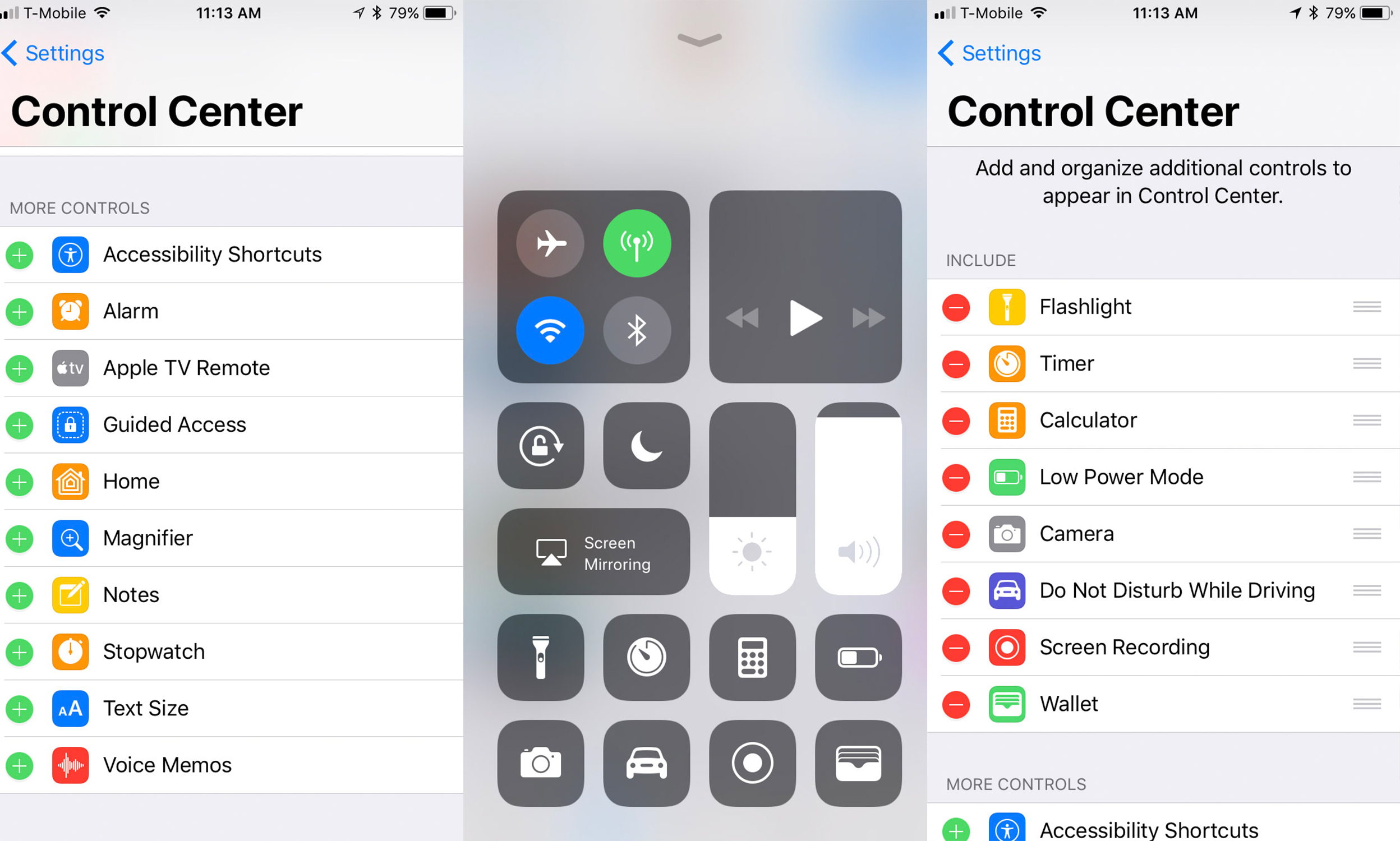
The Control Center has been completely changed. It's down to one pane rather than three, and you're able to customize settings and buttons to whatever you want. Navigating the new Control Center makes more sense with a 3D Touch device, as hard-pressing on an icon gets you more options like flashlight brightness or timer duration.
The most welcome addition is being able to customize the buttons, including having a toggle for low-power mode. The new brightness and volume controls certainly look a lot more quirky, but they're smaller and (I find) quicker to adjust with a single thumb flick.
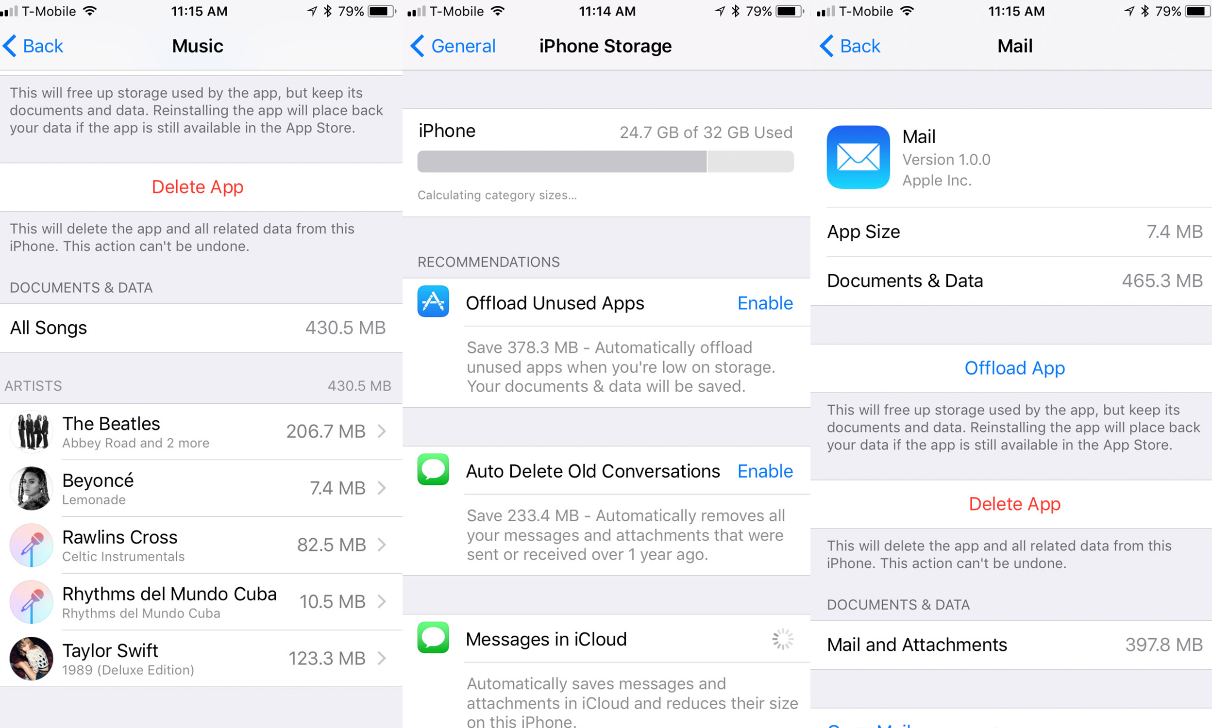
Another menu that's been changed big-time is Storage. It used to be a place to just see what's taking up room, but you have way more control over your storage in iOS 11. There's a few "suggested" settings up top, like auto-deleting old Messages conversations off your device, or offloading unused app data off your device and onto the cloud.
The "Offload App" feature is also available app-by-app. It removes all local data from your device, but if you choose to re-download it in the future, you won't have to sign back in again, play through old levels of a game, or redownload Kindle books. It's a particularly fantastic idea for apps you only use twice a year on Wi-Fi but don't want taking up room the rest of the time.
Finally, there is a new Dark Mode of sorts. It's the same Invert Colors option that's existed in the Accessibility menu for years, but with tweaks to make it more usable. Media like photos and app icons remain the true color, but white and black (and every other color) are now inverted. It's still a little buggy and will probably remain that way until app developers fully embrace it, but it seems like the dark-screen hordes may finally have their wish.
iPad
Apple saved more of the big design changes for iOS 11 on the iPad, which is more multi-tasky than ever.
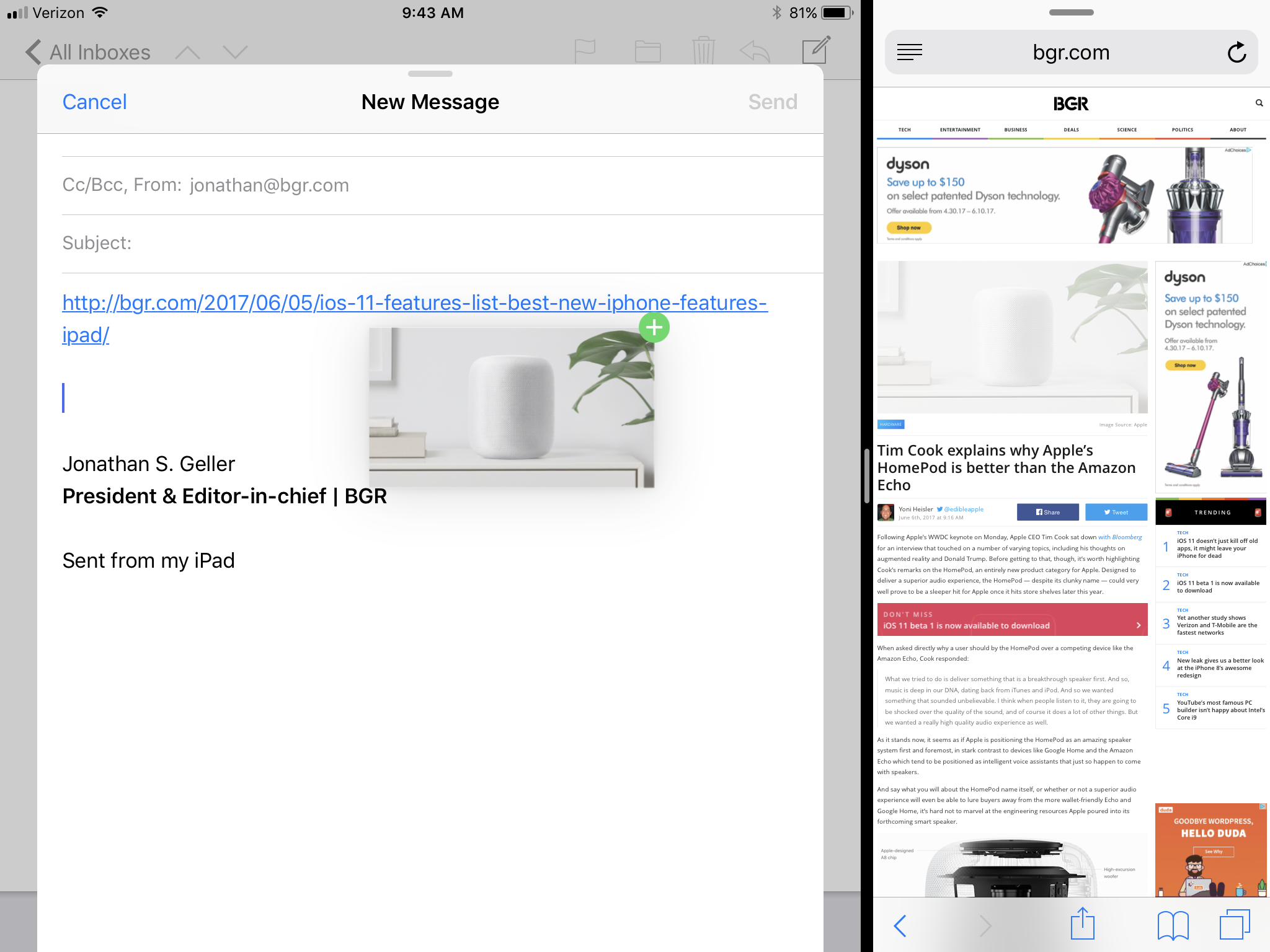
Mail looks and feels like more of a desktop email app and less of a blown-up iPhone app. There's more options to see your emails while also composing a draft, and split-screen viewing is way better.
There's a new, much wider taskbar that looks a lot like the dock from macOS. You can long-press on icons to get more options.
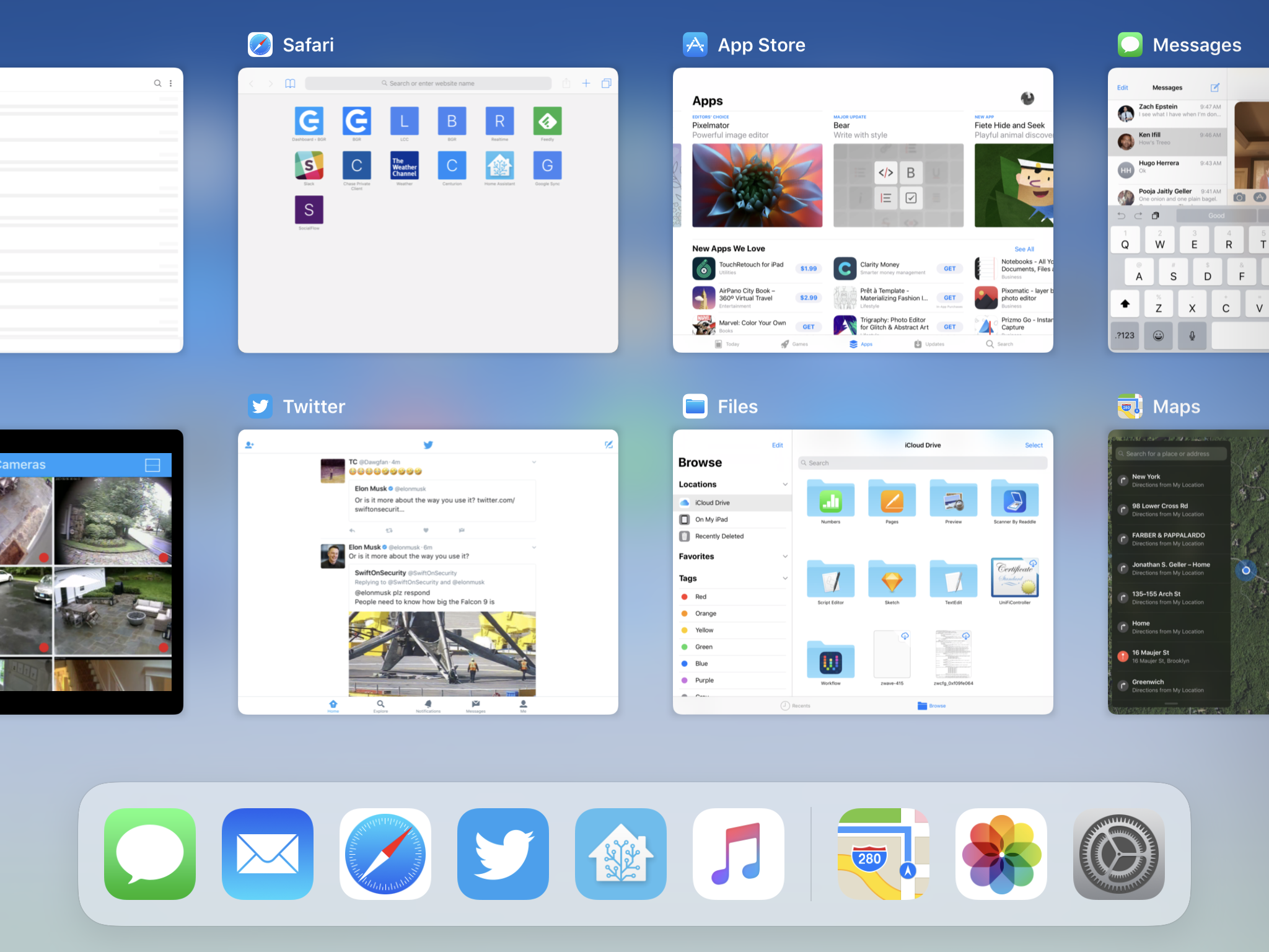
The multi-tasking overview gives you a better look at all the apps you currently have open.
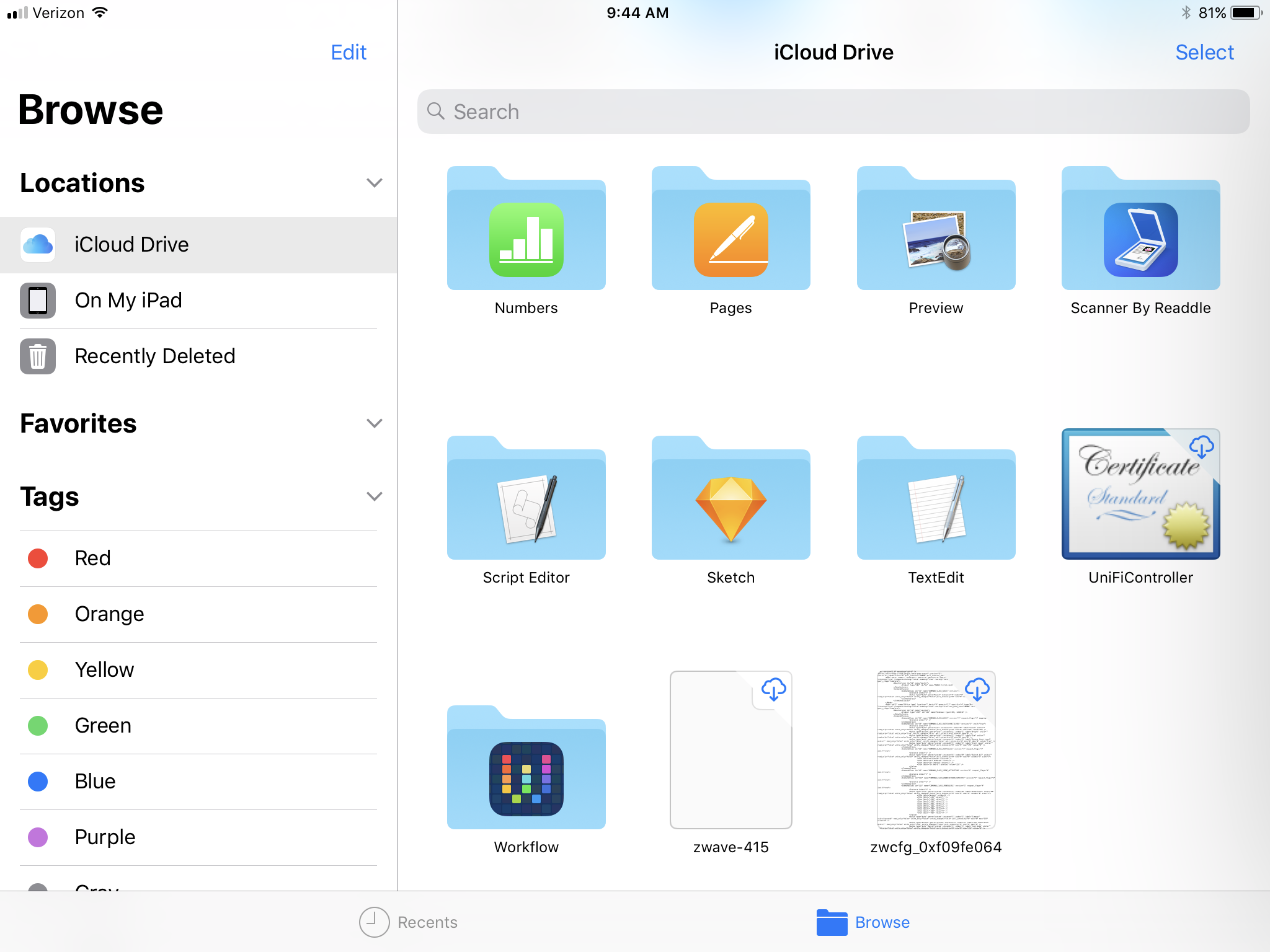
Files is an all-new app that is the file manager we've been clamouring for since the iPad first came out. Drag-and-drop, one of the iPad's big new (old) features, should be particularly useful here.
Split-screen viewing is made better with the new dock, which lets you drag apps to the side to open them in a split-screen view with your current app.

Drag-and-drop works for more than just pictures — you can drag and drop a webpage into an email to share the URL, for example.
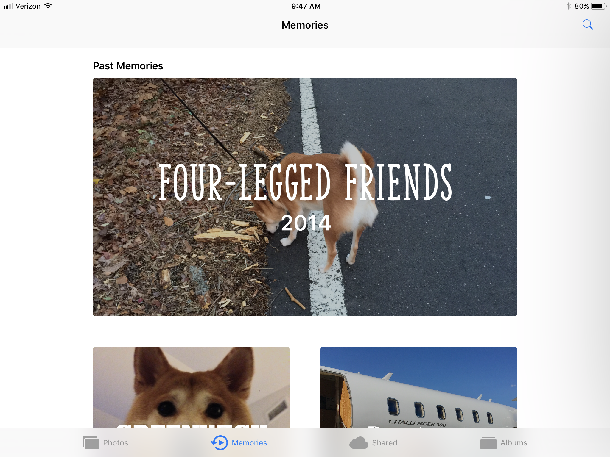
The Photos app now uses machine learning to recognize people and dogs, and can make you a cutesy little slideshow with all the living things you love in life.
The App Store redesign is less cluttered on the iPad, and much more horizontal than the vertical card design on the iPhone.

Finally, the keyboard has also been redesigned. Special characters and numbers are overlaid on the keyboard, and you just have to press a key and flick down to get the number rather than the letter.