I Was Skeptical About The New App Store, But Now It's My Favorite Part Of iOS 11
Like many others, I'm still not sure how I feel about iOS 11. There's no question that in contains some much needed fixes and upgrades that iPhone and (especially) iPad users have been clamoring for in recent months and years, but other changes, like the new Control Center, feel completely unnecessary and even overdesigned.
But there is one element of the updated OS that has completely won me over, despite my initial reservations. For the first time in my long history of owning Apple devices, I actually look forward to visiting the App Store every day. It's not perfect, but it's a marked improvement over just about everything that came before it.
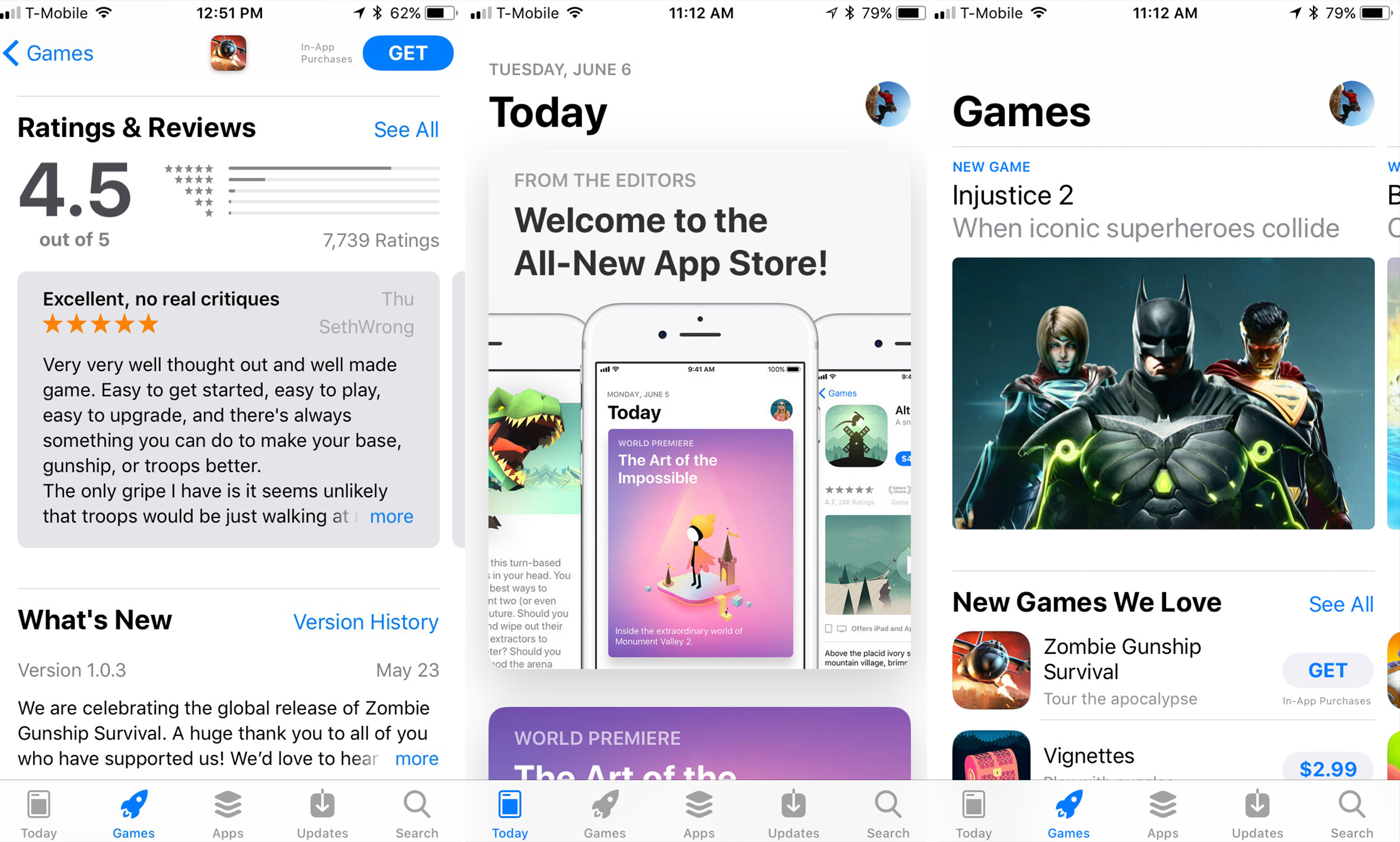
As I alluded to above, I wasn't convinced that the radically redesigned App Store was a good idea when Apple debuted it at WWDC 2017 this past summer. Finding the apps you're looking for has always been a struggle on iOS devices, and by simplifying the design even further, it looked like the search was going to become even more difficult. So rather than complicate the design even further by trying to pack more information on to every page, Apple pretty much nuked the old design and started over with a cleaner, simpler template.
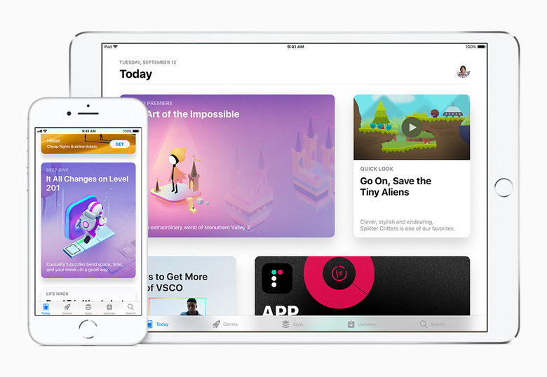
It all starts with the brand new Today tab, which my editor referred to this morning as "a remarkably inefficient use of space." He's not wrong, but if I can choose between a sleek, attractive home page and a dense, headache-inducing one, I'll take the latter option every time. But more than just being easy on the eyes, the Today tab is actually a fairly competent magazine highlighting the best apps and games that the App Store has to offer.
For example, today's selections (which are each represented by massive cards on the Today tab that take up a vast majority of the display on my iPhone 8) include a behind-the-scenes look into the origins of award-winning indie game Mushroom 11, a short piece about getting into sous vide cooking and a collection of ten games that are packed with bite-sized minigames (including a personal favorite of mine, Peter Panic).

The articles are well written, and short enough that it doesn't feel like a chore every time I tap on one of the cards. And better yet, I actually get some context about the apps I'm thinking about downloading, which was something that collections on the previous version of the App Store sorely lacked. There are now over 2 million apps in the App Store today — I'm never going to see them all, so I'd rather Apple focus on presentation than try to cram as much content as possible on the screen. It's a balance that Apple has yet to perfect, but this is a step in the right direction.
Finally, for those of you who couldn't care less about the Today tab, the other sections have been kept mostly intact. Yes, Games and Apps have replaced the Categories and Top Charts tabs, but you don't have to scroll very far down either page to find the charts. The jury's still out on Apple's obsession with large, bold titles, but I prefer this look on the App Store. I'm no longer being bombarded with app icons, and I can actually focus on what's on the screen.
I'm still scratching my head over the notch on the iPhone X, and I have never been the biggest fan of Apple's software design, but as skeptical as I was about it, the App Store redesign of iOS 11 has been a welcome surprise.
