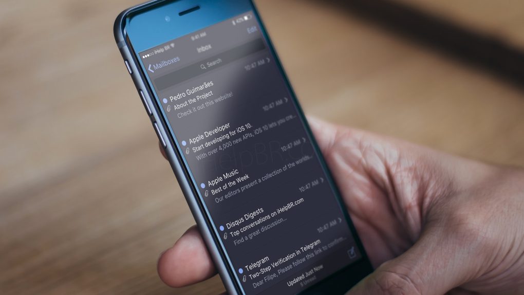
Apple’s iOS platform is arguably the best-looking mobile software in the world, but there’s always room for improvement. And according to some snooping done this past week by developers digging through Apple’s iOS 10 code, there are some big improvements that are indeed coming soon to an iPhone and iPad near you.
MUST SEE: New leak suggests the most controversial iPhone 7 rumor is all wrong
Seriously, how excited would you be if your iPhone looked like this? Well guess what: It’s looking increasingly likely that your iPhone actually will look like that soon enough.
It didn’t take long for iOS app developers to start poking around in Apple’s latest software release. iOS 10 beta 1 was pushed out to developers shortly after Apple’s big WWDC 2016 keynote wrapped up last Monday, and we immediately began to learn new things about Apple’s next-generation iOS software that weren’t announced on stage during the event.
Want some examples? Check out this video of 50 hidden iOS 10 features in action.
One of the most hotly anticipated features of iOS 10 ahead of WWDC was a new dark mode that would allow users to switch to a modified user interface that was heavy on the dark colors instead of light ones, which is what we’re used to in iOS. Developers found dark mode hiding within the iOS 10 beta so we now know it’s coming, and we saw a few concepts mocked up that show us how sleek dark mode could look on the iPhone.
Now, a new series of mockups from Reddit user “simalary44” includes some of the sleekest shots yet. In particular, Apple Music and widgets look amazing when given the dark mode treatment.
Check out the images below, which were originally posted in a thread on Reddit in the iPhone subreddit.


