
Google has added plenty of new features to Google Maps this year that can improve your navigation and driving experience. From the new Waze-like incident reports to the improved public transportation data, Maps is ready to assist with your daily commutes and vacation travel. Google also added plenty of features to make it easier to discover places of interest around you and handy features that can help improve your safety while you’re exploring new locations. But Google isn’t solely working on new features for the Google Maps app, it’s also looking to improve the app’s design. Now, a brand new leak reveals that Google is finally ready to address the most annoying thing about the app.
The side menu in Google Maps that expands to partially cover the maps is the design element that Google is looking to fix. Some Maps users have already encountered a much better alternative, sharing with Android Police images that highlight the design ideas that Google is currently testing.
The hamburger menu on the left of the search box will be removed in a future Maps version. Then the bottom menu, which includes the Explore, Commute, and For You options, is going to get a significant overhaul. We’ll have five buttons in the redesigned app, including Map, Commute, Saved, Post, and Latest. Some of the previous buttons were just renamed, while others got brand new features. For example, For You now handles Latest and Messages, with the latter being a menu item that had previously been on the hamburger menu.
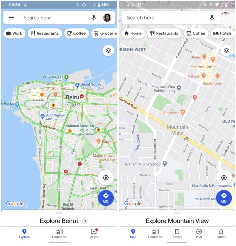
The worst thing about that old menu is that it expands to occupy more than two-thirds of the screen in the Google Maps version that most people have. But in the version that’s being tested right now, most of the items in the hamburger menu have been relocated to the account switcher button on the right side of the search bar.
It’s much cleaner than before, and it looks a lot better. That said, it’s still early days for the new design and it’s unclear whether some of the items in the old menu are placed in a different location, or were removed from the app.

You can’t do anything to get to the new features if you’re not already seeing them in your app. The new interface has been rolling out to some users on Maps 10.31.1 for Android, but not to everyone. This is just a test for now, after all. Once Google moves forward with the new design, it should become available to all Android and iPhone users rather quickly.


