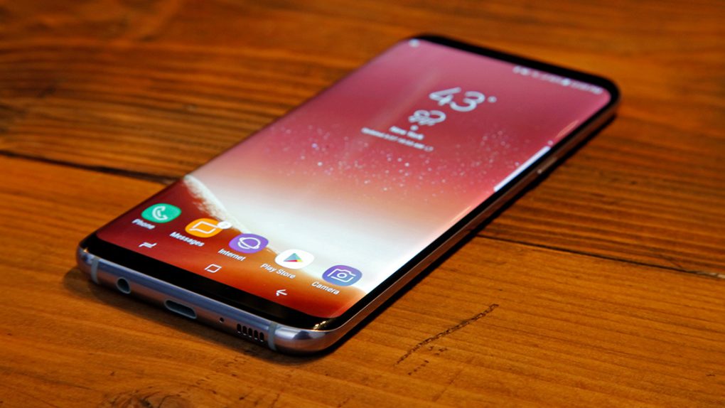
The Galaxy S8 is the hottest Android smartphone in the world right now, and it hasn’t even been released yet. It’s probably the only high-end smartphone you should consider buying if you’re an Android user. It has an amazing design, some exciting new features, and a surprisingly good price considering all the extras you get for free when buying one. But sadly, Samsung found a way to ruin the Galaxy S8.
Remember the old days when a Galaxy S’s plastic design was so bad that Samsung tried to make it more appealing by telling annoying design stories about the phone? Samsung has grown a lot since then. The Galaxy S’s design and build quality have improved tremendously, so you’d think Samsung would finally forego its awful design stories with this phone. But you’d be wrong.
The Galaxy S8 now has its own romantic design story, and it’s one of the most painful reads we’ve come across in a long time. It doesn’t say anything about Samsung’s initial design goals for the phone, but it does offer plenty of filler that users don’t need and won’t care about at all.
Curious what Oneness and Newness are? Of course you’re not, but Samsung wants to tell you anyway.
“The Galaxy S8 is a manifestation of holistic oneness,” Samsung explains. “Elements that felt needlessly mechanical have been eliminated to only focus on the essence of the device itself, which resulted in a design that merges the user and device as one.”
The newness, on the other hand, is all about Bixby, Samsung’s virtual assistant. Apparently, Bixby is a major part of the Galaxy S8’s design story. Or Samsung seems to think so, given that it dedicates ample space to this software feature in an article that’s supposed to focus on design.
Let’s look at a few other gems.
“The Home button has been removed to utilize its technical space to expand user space and shatter the boundary between the device and the real world,” Samsung says while describing the Infinity display.
Remember when the Galaxy S was inspired by nature? Well, it looks like the Galaxy S8’s glass is “flowing like streams of water.”
The phone, however, has a design that should speak to everyone. “Boundaries have diminished among various fields, and the desire to be unbiased about a particular region, gender, or age is growing larger,” Samsung says. “The Galaxy S8 design is about maintaining a natural balance that suits well with anyone, instead of striving to appeal to specific preferences.”
That’s just the phone. Some accessories should apparently appeal to millennials, for some reason. Samsung: “The silicone cover boasts vivid colors which are representative of the millennial generation.”
I’ll end things here with what’s probably the weirdest phrase in Samsung’s Galaxy S8 design story:
“Galaxy S8’s innovative exterior speaks a single language of design that seamlessly connect from the inside to the outside, and again from the outside to the inside,” Samsung says, trying to explain the cohesiveness of hardware and software. Reread that phrase again, but this time add a Jony Ive accent for extra fun.
Headline updated on Apr. 6 to better convey that this is the author’s personal opinion.


