Apple is a company that’s rightly renowned for its designs but it also serves up its share of stinkers, as we noted earlier today. Popular YouTuber Jonathan Morrison has also noticed that there have been some flat-out bad designs from Apple this year and he goes over them in loving detail in his year-end video about the worst Apple designs of 2015.
MUST SEE: Meet Pine A64, a 64-bit quad-core supercomputer that costs just $15
The first object of Morrison’s derision is the new 2015 MacBook, which he slams for having only having one USB Type-C port and a headphone jack. While a lot of the design of the new MacBook is absolutely beautiful, only having these two ports severely limits its functionality and he doesn’t understand why Apple couldn’t have at least added a second USB Type-C port.
Next up is the Magic Mouse that has a Lightning Port on the bottom instead of on the side and thus looks absolutely ridiculous while charging:
Speaking of things that look ridiculous charging, just look at the Apple Pencil charging on the iPad Pro:
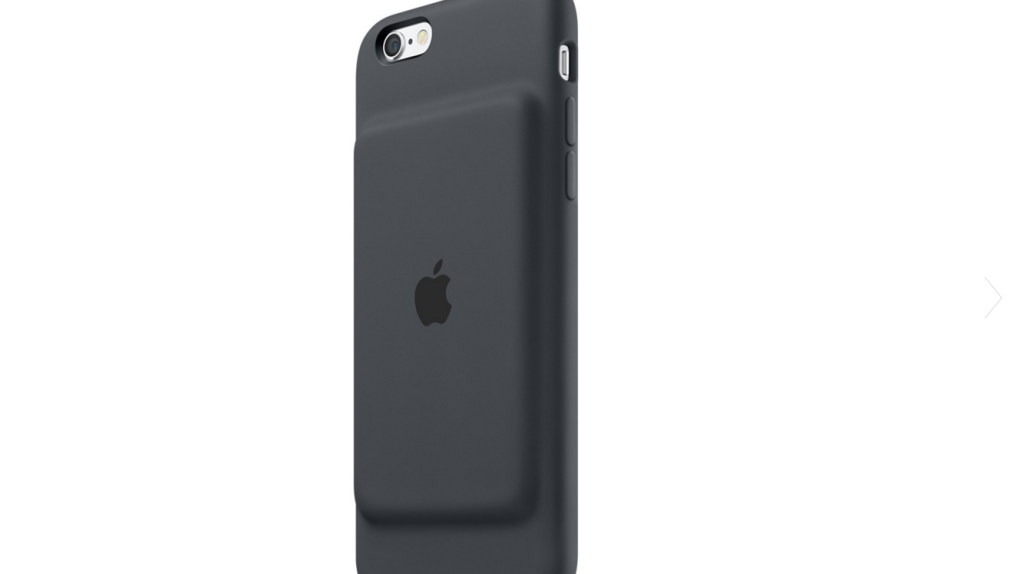
And yes, the ridiculous looking new iPhone battery case gets its share of abuse as well. The whole video is worth checking out and can be found below.


