T-Mobile Samsung Behold II Hands On

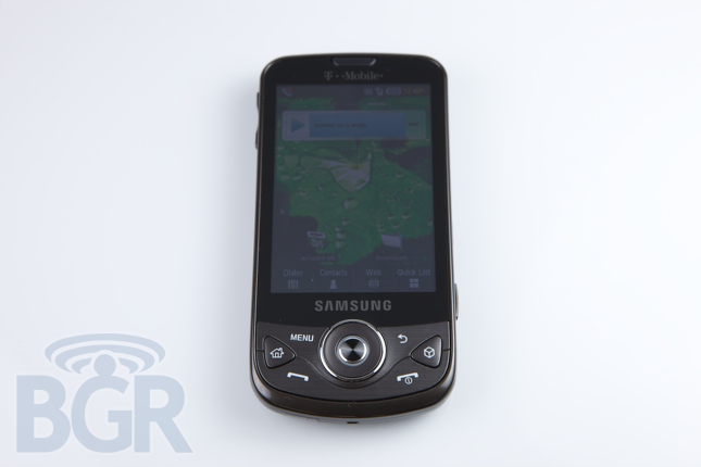
Haven't had your fill of Android handsets yet? Neither have we. T-Mobile just hit us up with a Samsung Behold II and here are some first impressions:
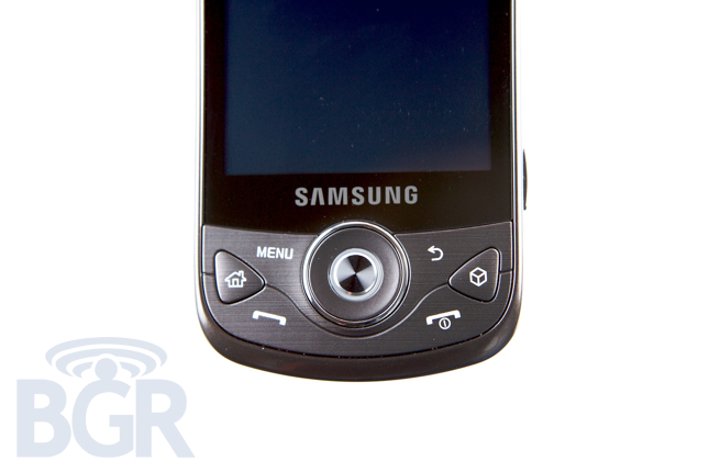
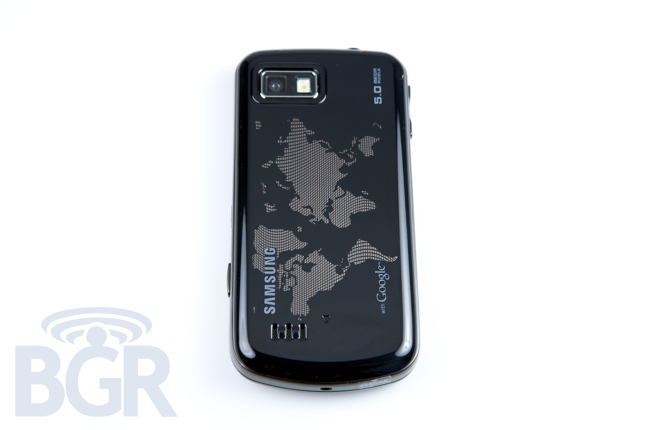
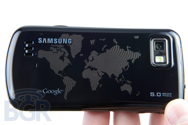
Physically the unit feels pretty good to hold, albeit a little cheap. The weight is good, but the choice of a glossy plastic makes it feel a little chintzy to us. The back cover has a certain depth to it and it's pretty darn cool, but we can see it scratching really easily if you're not careful. As far as the front of the device, the buttons are surprisingly pretty easy to press despite their intimidating layout, and the 5-way navigational circle is also pretty friendly. Now for what we don't like...
Samsung needs to learn that it isn't 1999 anymore, and re-skinning most of Android's decent but not great UI elements isn't a good idea. We literally feel like we're in downtown Seoul when the display is on — neon blues, neon orange, neon yellow — all on a black background which really doesn't make for the most appetizing phone interface. Additionally, you can no longer press the Menu key to unlock the display once you turn it on, you're forced to press a dedicated unlock / lock key on the side of the phone. Awk. Ward. While the paper specs on the phone (capacitive screen, 5 megapixel camera, AWS 3G, etc.) are definitely competitive, at first glance, the user experience seems to be way too involved for the average user. It's not friendly by any means and the price point of $199 seems borderline laughable with other devices available at this time. On and off T-Mobile.


