Google’s big I/O 2025 event is just around the corner, and AI will obviously dominate the main keynote, which is usually focused on the upcoming version of Android. Google will still talk about Android at I/O, even though AI will take center stage. Android 16’s main consumer-facing features are likely to be unveiled before the keynote even begins. Android 16 is set to launch this summer, ahead of the Pixel 10 launch.
As it turns out, we don’t need to wait for I/O to learn that Google is planning a major Android redesign. It’s called Material 3 Expressive, and it’s official, thanks to a Google slip-up. The company accidentally published a blog post outlining Material 3 Expressive, detailing what went into rethinking the user interface for Android apps.
Google took the blog post down, but the internet never forgets. The Wayback Machine has already archived it, and 9to5Google saved images from the post.
This isn’t Google’s first Material-branded redesign for Android. It started in 2014 with Material Design, followed by a major update in 2021 called Material You.
Material 3 Expressive is the natural evolution of that. In the now-deleted blog post, Google said it developed the new design after conducting 46 separate studies over the last three years to better understand what users want from a mobile UI.
Among other methods, Google used eye-tracking to see what people focus on and ran focus groups to help shape the new Material 3 Expressive design language. The company also measured how quickly users could navigate a new UI and how they felt about the experience.
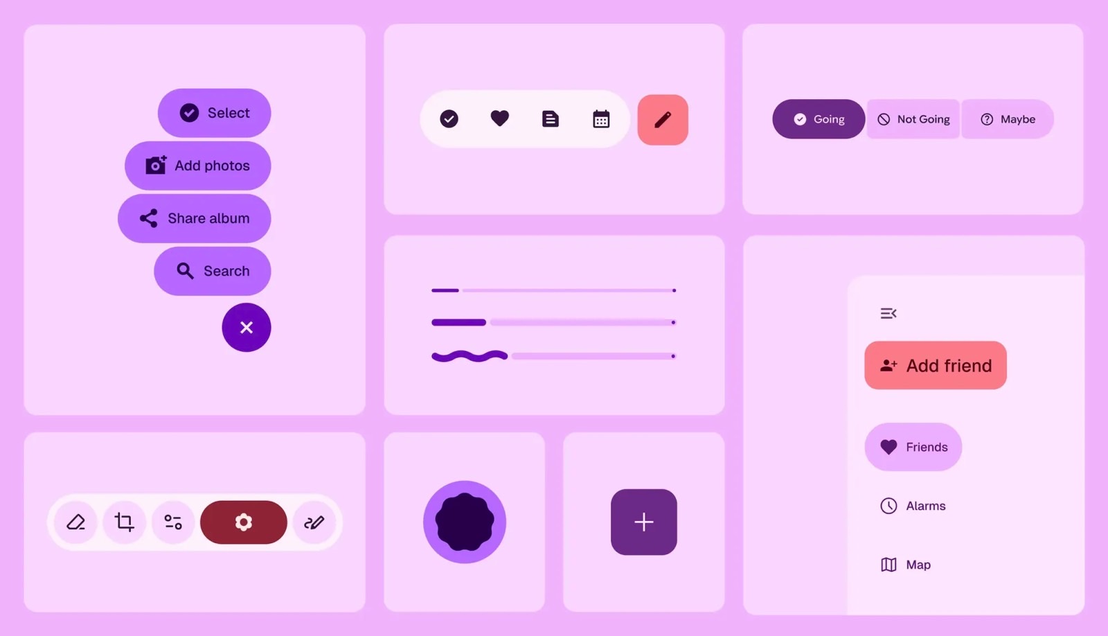
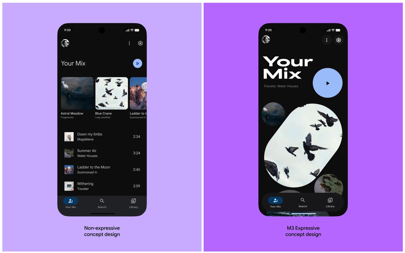
Google wants Android to feel more dynamic and less “clean” and “boring.” That likely explains the bold colors and shapes shown in the images from the blog post.
While Google’s new UI aims to stir emotion, it’s also designed to make Android apps easier to use, whether you’re a power user or someone still getting used to smartphones. Google even took a few jabs at iOS, highlighting Android 16’s more engaging look compared to Apple’s interface.
So what does Material 3 Expressive mean in practice? Android 16 users will see redesigned apps, starting with Google’s own. Expect new menus, like a pill-shaped floating toolbar at the bottom that doesn’t stretch across the screen. This toolbar will include larger, more prominent buttons to guide users more intuitively.
Menus and buttons in general will be bigger and more noticeable. Google shared an example of a music app where the “Play” button is much larger than on the iPhone, making it easier for users to spot and tap it.
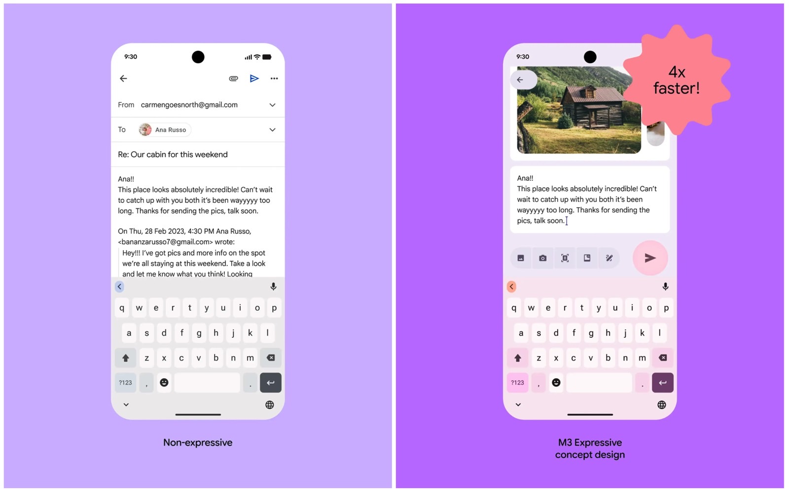
Another example comes from a mail app, where the “Send” button is not only larger than its iPhone counterpart, but also placed right above the keyboard instead of in the top menu.
That’s the whole point of Material being “expressive.” The UI uses color and shape to guide users faster and more effectively. According to Google, the new Material 3 Expressive email app let users find the “Send” button four times faster during testing.
You’ll see this approach across other Google apps too, as shown in the blog post. It’s a preview of where Android app design is headed.
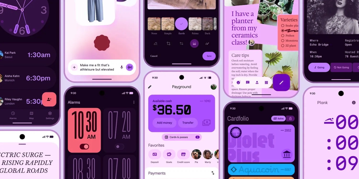
Google will likely bring Material 3 Expressive to all its preloaded apps on Android 16 phones, especially Pixel devices. Third-party developers will have to decide whether to adopt it, and the same goes for Android phone makers with their own apps.
You can read Google’s blog at this link while it’s still archived. The company is expected to republish it soon. Google I/O kicks off on May 20, and we’ll learn more about Android 16 and the new design direction then.


