Nothing will launch the Phone (2) in a few days, the company’s first true flagship and the kind of device fans of the British startup have been waiting for. We don’t have to wait another week to see the Nothing Phone (2) design, as YouTuber Marques Brownlee got an early hands-on preview of the device, showing off Nothing’s new design language for its Phone series.
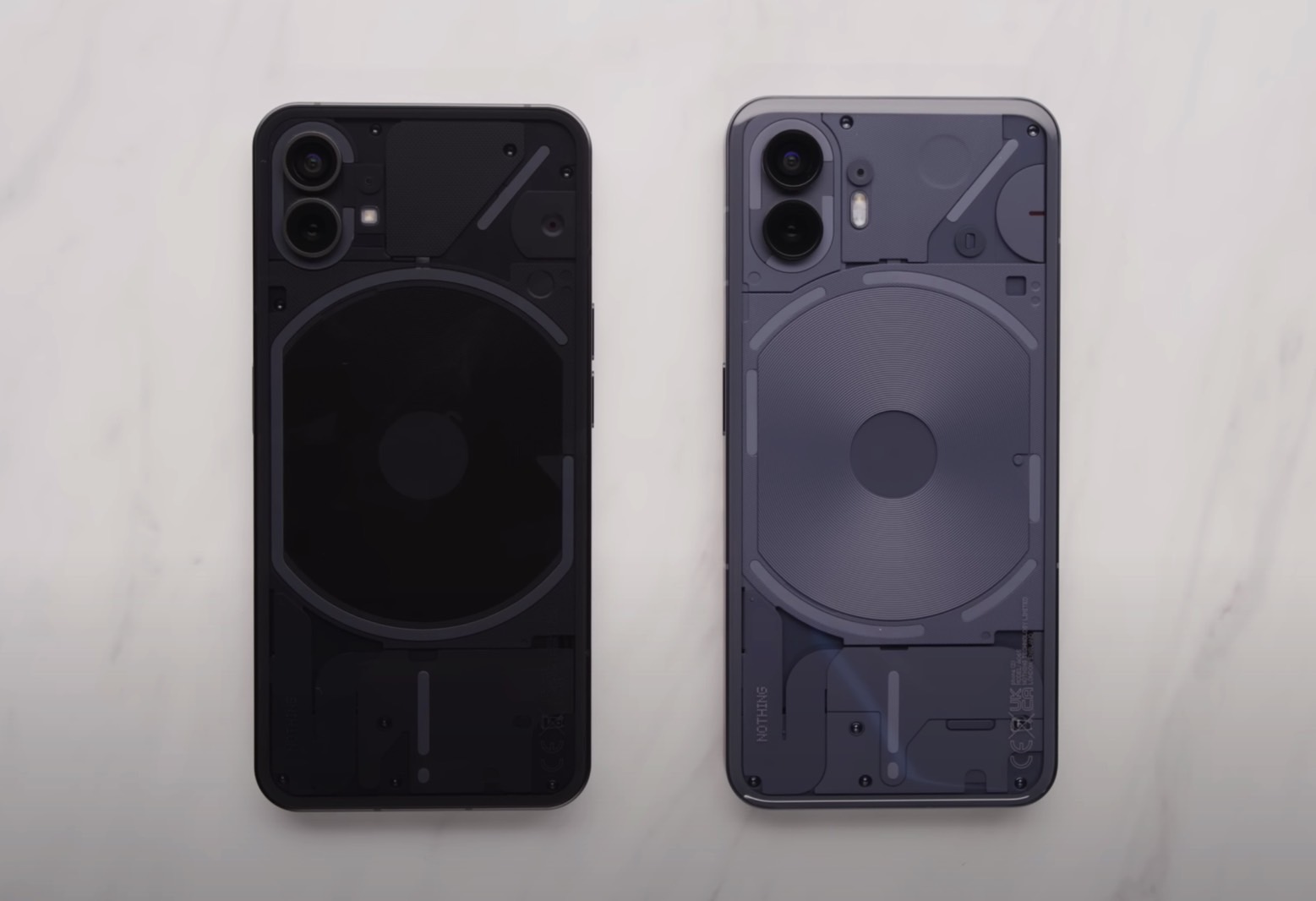
As expected, Phone (2) looks a lot like Phone (1), but you’ll easily tell them apart. And, as expected, Nothing isn’t ready to ditch the gimmicky feature it introduced with the first handset. I just don’t see any value in having LED lights flashing on the back, but Nothing is going forward with this design decision.
I didn’t need MKBHD’s hands-on video to know that the Nothing Phone (2) will not ditch the LED glyphs on the back. Nothing teased the rear-facing lights in recent Phone (2) images. Nor did I expect Nothing to ditch the LED indicators after just one year. There’s nothing wrong with establishing an identity and sticking to the same overall design for more than a generation.
Come to think of it, that’s the path most smartphone vendors should employ, even if it might seem boring to some buyers. Sticking with a similar design can cut down manufacturing costs, and that’s more important for many customers.

The Nothing Phone (2) will not be an identical copy to its predecessor, no matter how you look at it. On the front, we still have the same hole-punch display with symmetrical bezels as the Phone (1). But the camera cutout is placed centrally rather than on the side.
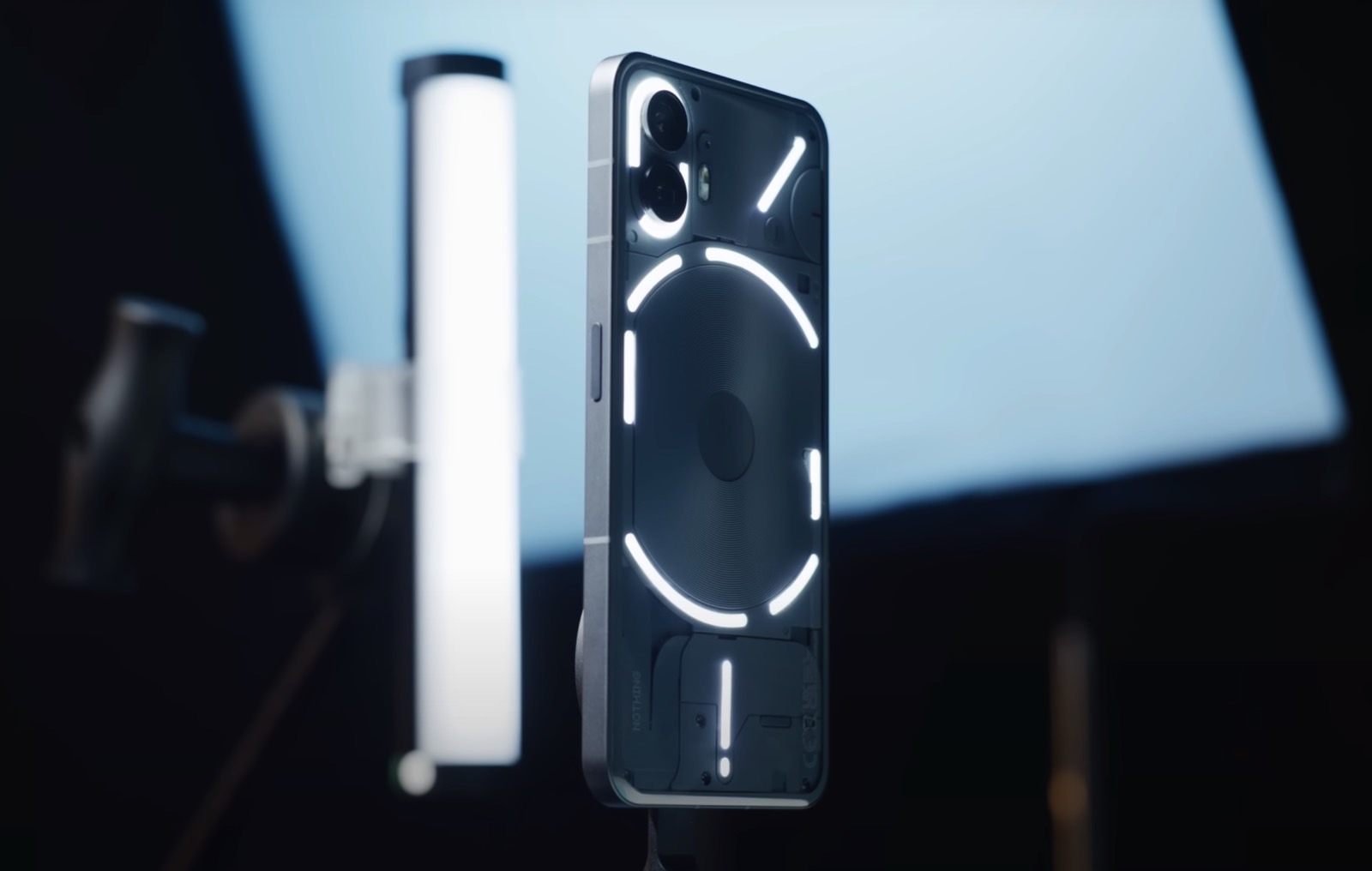
On the back, there’s still a transparent case that shows the LED glyphs. But Nothing broke those strips into multiple standalone parts to support different patterns and customizations. The phone now has 33 lighting zones instead of the previous 12. One of them gets 16 zones for more granular control. It’s the glyph you’ll use most if you like the LED strips.
Brownlee demos a few of them in the video. For example, one of the LED strips will provide a visual indicator when you raise and lower the volume. But you’ll only see it if you do that when the phone is placed face down on the table. I can’t think of a recent instance where I used that particular type of behavior to control the volume of my iPhone.
Similarly, the LED lights will show you a progress of a timer. But it’s just a bar of light. And the same LED indicator can give you an idea of how far your Uber ride is. That’s just one of two third-party apps that have confirmed support for the new LED indicators on the back.

Other notable Nothing Phone (2) design features concerning the phone’s rear are the dual-lens camera setup and the curved edges. Nothing uses two cameras for the Phone (2), but I expect hardware and software improvements. As for the curved edges, I wish my iPhone had those as well.
I will say that the transparent back of the Nothing Phone (2) gives it enough personality to stand out from the crowd. It might look like an iPhone, but it’ll turn heads for that transparent design. If I were to pick it up, I’d turn off the rear-facing lights the first chance I got.
Other Nothing customers might appreciate the LED lighting system, of course. They’ll soon be able to discover it, complete with the ability to create custom LED-based notifications. Nothing will unveil the Phone (2) on July 11th, with sales likely to start soon after that. Meanwhile, you can check out the new handset in the clip below.


