- iOS 14 beta 5 fixes one of the tiny iOS 14 changes that aren’t important enough to be addressed during an iOS presentation. But it’s a feature that a certain group of people will observe as soon as they upgrade to iOS 14.
- The iconic time picker scrolling wheel you’re currently using to set up new alarms is gone in iOS 14, as Apple replaced it with a keypad that lets you enter the time manually.
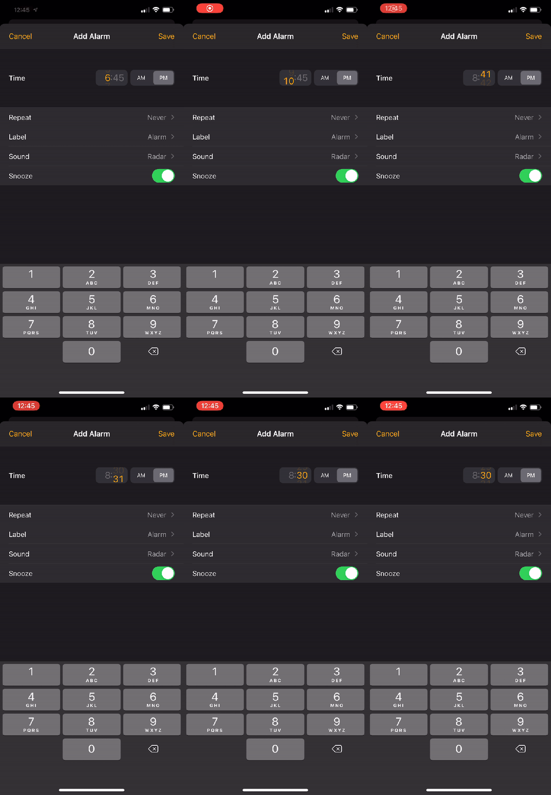
- iOS 14 beta 5 fixes that “issue” by adding a smaller scrolling wheel to the time field.
Apple’s latest iPhone and iPad operating systems bring over several new features and changes, which are already available to customers willing to install the iOS 14 and iPadOS 14 beta version on their devices. While bugs and issues are to be expected from beta releases, the beta builds are relatively stable and offer an overall great experience. You can easily test the public beta on your daily driver, although you should make sure you backup your current iOS 13 install before you move to iOS 14 beta 5. Once you do install the beta, you’ll start noticing the more significant changes, like the new widgets support and the App Library panel that’s added at the end of your home screens. Dig deeper, and you’ll discover smaller changes that are coming to iPhone and iPad. And if you end up using iOS 14 for a few days, then you’re bound to notice one of the most annoying iOS 14 changes. Thankfully, iOS 14 beta 5 fixes it. Well, sort of fixes it, but it’s still better than nothing.
There are two kinds of people in this world when it comes to alarm. Some have a single alarm on their phones, and some have one for every occasion. If you’re in the latter group like me, then you’re always adding and editing alarms inside the clock app. That time picker wheel makes it incredibly easy to set your alarm quickly, and that’s what iOS 14 ruined.
Apple replaced the wheel with a keypad that you can use to enter the time for the next alarm manually. Some might prefer the new user interface over the click wheel, but it will undoubtedly annoy many long-time iPhone users who are used to it.

Thankfully, Apple decided to fix the problem in iOS 14 beta 5 that was released earlier this week. The wheel isn’t exactly back. The keypad still dominates the bottom half of the Alarm screen. But Apple added a tiny wheel to the time section. Rather than inputting the time using the keys, you can scroll the wheel as you’re used to. It’s not quite the alarm scrolling experience you loved, but it’s still better than manual input if you ask me.
The animation above, via 9to5Mac, shows the new Alarm UI as well as the new wheel in action.
If you’re not going to jump to iOS 14 until the final release is available this fall, you won’t have to deal with this minor annoyance. But you have to mentally prepare for the untimely death of the time picker wheel.

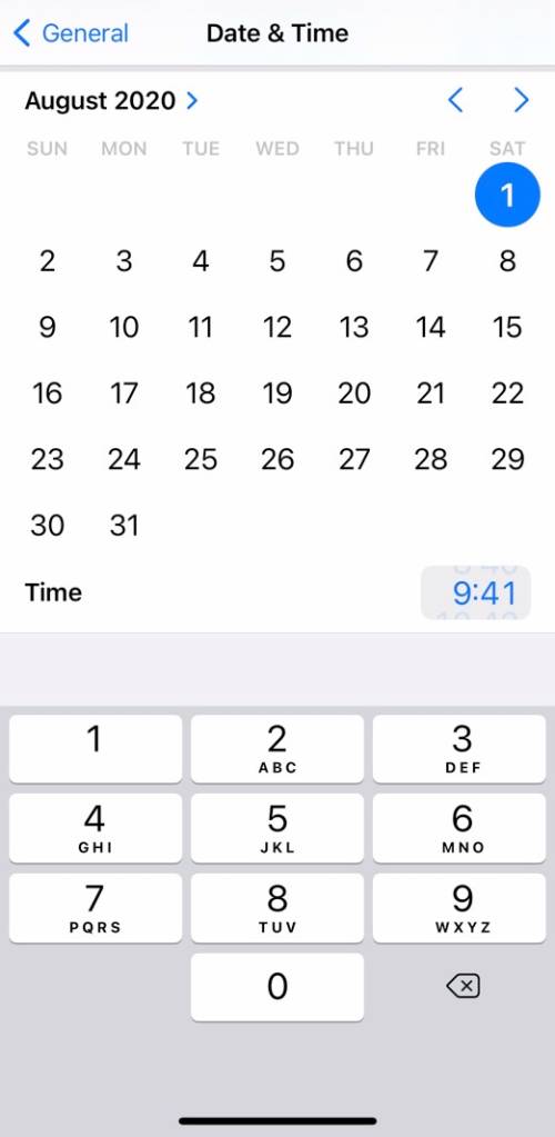
If you were wondering whether the time picker wheel is also gone from the Date & Time section of the Settings app, then I have bad news for you. Yes, it is. If you ever have to set the time manually, you’ll get a similar interface. You’ll have to pick the date from the calendar and use the keypad for the time or the almost invisible new scroll wheel, as seen in the screenshot above.


