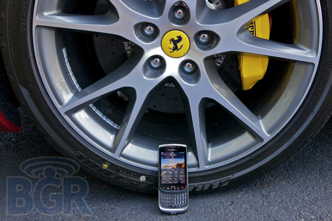
RIM’s mythical sliding device finally got official after years and years of rumors. It’s being released tomorrow exclusively on AT&T and features the all new BlackBerry 6 operating system. We’re talking multitouch, gestures, redone multimedia applications, and a whole lot more. It packs the best camera of any BlackBerry, a touch screen, full keyboard, and even an optical trackpad to help with navigation. Not to mention it has a web browser that is actually usable, and everything is packed in a pretty tight package. We have been using a BlackBerry Torch 9800 for over 5 days, and we’re excited to share our thoughts on it with you.
Hardware
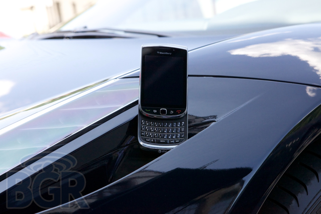
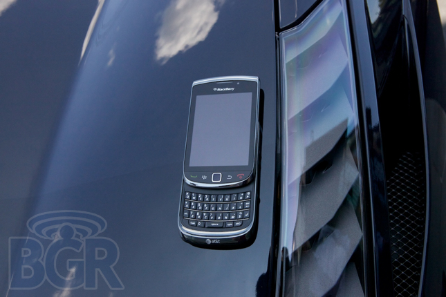
Solid. That’s the first word that comes to mind. The second? Heavy and bulky. I love using this line more than RIM executives have played it out: RIM plans three years out. Unfortunately, they must still be planning for 2007, because the device is pretty thick compared to modern and current smartphones. It’s very well manufactured and doesn’t appear to be cheap, yet… it feels pretty cheap. The casing is a glossy budget-conscious plastic, and the four BlackBerry buttons are glorified piano black plastic. I can’t imagine how stunning a partly brushed gun metal / dark grey stainless steel BlackBerry would be. Cut off the sliding mechanism from the Torch and make the device that thin, and you’d have me seriously interested. Well, you’d have to throw a decent OS on that bad boy of course.
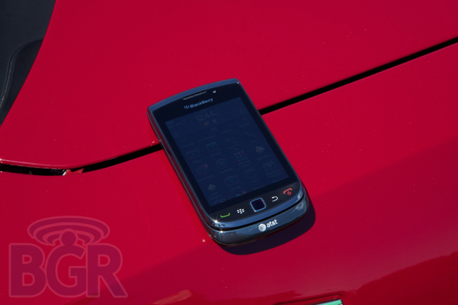
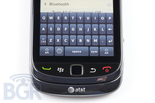
RIM’s optical trackpad makes an appearance here, as it should, and it works great. It’s very clickable, and doesn’t change the course of history — same trackpad you know and love. The four black piano keys are a little tougher to describe. Since each key is attached to its significant other, it is at times a tad bit difficult to accurately press either the send or end key (both on the sides of the device). They’re much smaller than their respective keys on the Bold 9000 or Bold 9700 and give less — they are almost flush with the device — but after some daily usage, it isn’t the end of the world.
It pains me to say this, but RIM has once again changed the location of the microUSB charging/data port. It is now located on the lower left side (at the expense of the left side convenience key). It is pretty ridiculous, but it’s also par for the course when you’re dealing with a manufacturer that can’t even get buddy icons to show up in their AOL Instant messaging application after three years. The 3.5mm headset jack that’s usually present on the upper left side has been shipped halfway around the world to the upper right side, followed by its partners in crime, the up and down volume keys. Below those sit the dedicated camera shutter button — half press to autofocus, full press to snap, snap, snap.
We’ve been using the device for over 5 days, yet we didn’t need more than a couple minutes to determine that the lock and mute keys on top of the device are extremely gentle. Since RIM AT&T doesn’t ship their flagship product with a holster (first time ever, I believe), we can’t tell you how many times the device got unlocked by mistake in our pockets. End of the world? No, but it’s not the best design that’s existed. While we’re talking about design, we’d have loved it if RIM would have pushed their device design identity forward a bit. Unfortunately the Torch looks pretty dated from a design perspective.
As far as internals go, the BlackBerry Torch is meticulously planned out. It uses an Marvell 624MHz CPU, 512MB of RAM (also for application storage), 4GB of internal storage, packs a 5 megapixel autofocus camera with LED flash, quad-band GSM/GPRS/EDGE, tri-band UMTS/HSDPA 3.6Mbps, aGPS, Bluetooth, and Wi-Fi. For a flagship product, we’d expect nothing less than a 1GHz CPU, though the BlackBerry Torch seems to perform decently with light usage.
Display
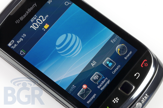
Sad. It literally makes me sad — and I’m not phased that easily. It really hits you how bad the screen is when you compare it to a BlackBerry 9700 because of how much larger the 9800 screen is. Text is pixelated, normally crisp images look low quality by comparison, and web browsing is unusable without zooming in constantly. It takes away from the experience, and if there is something RIM doesn’t understand, it’s presentation. With a high quality, beautiful, large screen, you can at least show that you’re playing game to the average user. Unfortunately for RIM, this would mean even more fragmentation with their devices and a higher resolution screen would also highlight their general lack of focus on UI even more. For instance, when holding the BlackBerry button to bring up the transparent multitasking popover (by the way, do you know which BlackBerry application was the first to do a transparent popover?), RIM forgot to make the effect stretch to the edge of the display, so you actually see through the effect on the right side. Huge deal? Not at all, just representative of how Research In Motion overall could care less about the small things that can up and actually make a product.
We also have to say we noticed some wonkiness with the touchscreen side of the display at times. Mostly erroneous touch events when on a phone call (touching the top part of the display set off the lower touch buttons), though we’re not sure if this is a software or hardware issue.
Keyboard
Look, here’s the thing: all of you moaning about having to have a physical keyboard need to suck it up and get used to typing on a capactive screen. It’s what most phones will be in the near future and all in all, it’s superior to physical keys when you look at the big picture. Customizable keyboards and layouts, thinner, more solid, less clunky handsets — everything is moving over to touch and it’s for the better. If you’re an iPhone user and you pick up a BlackBerry (especially the Torch) you literally think to yourself, “What in the hell am I holding in my hands?” It’s that bad.
I have never in my life seen a worse onscreen keybaord than the one RIM included. The fact the phone has a physical keyboard is no excuse, this is an insight into what RIM is thinking, and it’s completely disappointing. The virtual keyboard looks like a Swype Android keyboard without the sexiness. Keys are tough to hit, the symbol shift key is awkwardly placed, and above all, you can’t see what key you’re hitting since the popups that display when you touch a key are practically useless. It’s almost insulting that there’s even a virtual keyboard at all.
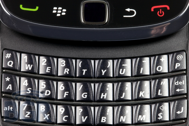
Switching gears to the physical slide-out chiclet keyboard: it’s good, very good. RIM usually knocks these out of the park and the Torch’s keyboard is no exception, for the most part. Keys are graciously sized, pretty contoured, infinitely and deliciously clickable (the Torch totally doesn’t pass the typing-in-bed-while-someone-is-sleeping-next-to-you test). The keyboard is modeled after the devices in the BlackBerry Bold lineup, and even carries over some nice design elements; one of them being the chrome struts that serve as keyboard row dividers. If we had to complain about the keyboard, it would be that the keys seem to be pretty hollow and, well, cheap. It kind of sounds like bubble wrap if you run your fingers over them, and they aren’t as luxurious as the original Bold’s keyboard (obviously from a size perspective) in feel. We believe the keys are slightly less raised than a traditional form-factor BlackBerry device, and that’s quite an accomplishment — have you ever used a Palm Pre — but a small part of us yearns for that perfect, perfect keyboard.
Phone
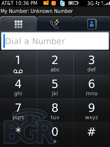
Ah, making phone calls on a BlackBerry. It’s actually pretty enjoyable. Dialing phone numbers on the keypad is effortless (and extremely quick, too), checking your recent calls is straight forward, and calls were generally pleasurable-sounding, crisp, and volume-packed. One exception would be the fact that sometimes calls can sound a tiny bit distorted (mostly the top end) if the volume is up all the way on the ear speaker.
Something that annoyed the heck out of us was RIM’s proximity sensor. It literally is a pulsing/blinking red LED light that is visible to the human eye. Do you see this when you’re on the phone? Not at all, but now that we have seen it, we can’t not notice it when we dial a phone number and bring the phone up to our face. It’s ridiculously amateur-ish and we don’t remember the BlackBerry Storm2 (also a device with a proximity sensor) doing this.
Speakerphone unfortunately isn’t as successful as traditional phone calling on the BlackBerry Torch. It’s volume output was low to acceptable, but callers had trouble hearing us properly most of the time.
OS
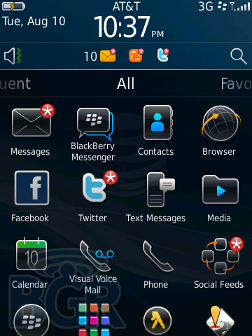
BlackBerry operating system 6 isn’t an overhaul of the BlackBerry OS, and while it brings a couple API-level changes, it’s mostly top layer UI modifications. For starters, BlackBerry 6 brings modal popups, press-and-hold gestures, multitouch gestures like pinch to zoom and two finger select, and drum roll please… a WebKit-based web browser with tabs.
In addition to the above, there are a bunch more enhancements: universal search, multiple contact lists (sadly you can’t link duplicate contact entries), a social networking application that can aggregate all your social networks/accounts in addition to posting simultaneously to them, redone multimedia applications, a new camera interface, kinetic scrolling (though we would have liked to see even more of this), a notifications drop down menu, and much more.
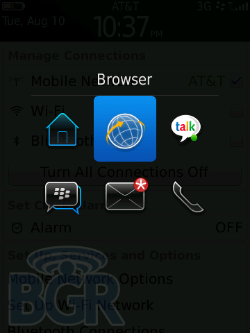
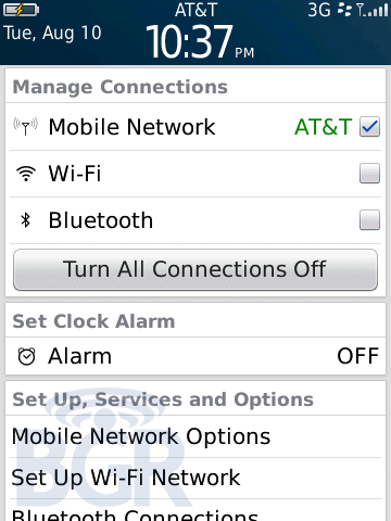
In general, BlackBerry 6 seems a bit more cohesive in some ways, yet it seems to be pulled in different directions at times. For instance, the homescreen now combines the entire application icon view with a drop down notification view and a wireless networking view. Think about this, you are pulled in literally different directions by flipping through the aforementioned menus, and for basically no reason. If you want to get crazy, you can actually drop the application drawer up on the homescreen to reveal more than the default 4 icons. You can increase the view to 8 icons, 12 icons, or even slide the drawer all the way to the top if you wish.
Something we’re pleased as punch to see in BlackBerry 6 is faster application downloading/installation. Previously it would take forever to download apps (or anything for that matter), but in BlackBerry 6 the progress bar zips along just fine most of the time, and this is a welcome improvement. The phone also boots much, much quicker (everything is relative, it’s still a good minute or two)
We’re not in love with the multiple categories on the homescreen, though. It seems to add unnecessary complexity to an already complex UI. Now, in addition to the wireless connection menu sliding down, the app drawer sliding up, and the notification drawer sliding down, you can also slide left to right and right to left to flip different categories of application?
Unfortunately for BlackBerry 6, and the BlackBerry Torch, we experienced lag, slowdowns, and the dreaded black BlackBerry clock on multiple occasions, even when we weren’t pushing the phone hard. Simple tasks like marking more than one message as read, or exiting the web browser, or updating the social feeds application, set off that clock of death. Once we had to even pull the battery out due to the phone becoming unresponsive from a simple non-taxing task.

Browser
RIM’s new browser couldn’t have come soon enough. Rumored since the first Bold (we heard they were testing a Webkit browser when they were working on the 9000), RIM’s first real web browser is the best it’s ever delivered. In terms of rendering, web pages actually display as if they should on a desktop — correctly and formatted properly most of the time. Pinch to zoom is a go, and while it’s not as fluid as some other platforms out there, it does get the job done. We can’t say we love how the browser reformats text (RIM says it pioneered word wrap, though we have to say Opera Mobile does a pretty good job of this), but for the most part, tabbed browsing and even thumbnails in browser history are nice touches. We like the fact that when using the optical joystick to navigate you actual see an on-screen mouse cursor, though some of the hiccups with RIM’s browser start to overshadow much of their progress.
Since the BlackBerry Torch isn’t packing a bleeding-edge CPU, and since the core OS is pretty outdated, we experienced many slowdowns in panning and zooming, and even standard web page loading. We actually crashed the browser a couple times loading up our favorite non-mobile-optimized sites. This isn’t even with any sort of Flash 10.1 support whatsoever. We’re not sure how RIM will be able to pull that off at all. Unfortunately, as we said before, RIM doesn’t seem to understand presentation, and the web browsing experience on the BlackBerry Torch is neither completely fluid nor competitive to other leading mobile smartphones for the most part.
Camera
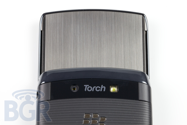
RIM’s 5 megapixel camera is certainly a great improvement over their 3.2 megapixel offering. It takes pretty decent photos, and RIM has completely redone their photo-taking UI. Geotagging photos now has a prominent presence, RIM added scene modes (even face detection, portrait, sports, landscape, party, close-up, snow, beach, night and text modes) even though people most likely won’t use them, and there’s a new photo review mode to check out your latest shot and decide whether to keep it or not.
Unfortunately in a time when manufacturers are competing to see who can capture the highest quality, faster frame rate HD video, RIM fails to join the pack with 640×480 resolution video capture. Video taken on an iPhone 4 or Motorola DROID X could sometimes pass as being shot on a real video device and not a cell phone, but video from the BlackBerry Torch unfortunately can’t.
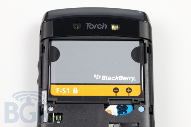
Battery:
We’ve been pleased by how much battery we can squeeze out of the Torch. Like all BlackBerry devices, RIM knows how to optimize, optimize, and optimize how much power their smartphones utilize, and the Torch is no exception in that regard. We’re not sure if we’d rate the BlackBerry Torch as having better battery life than it’s cousin, the Bold 9700, but we’d say it’s pretty close. It no question can power a moderately-heavy user through a pretty long day, and for a casual user, expect the phone to last more than a day without a recharge.
Conclusion:
We actually liked the BlackBerry Torch more towards the end of our use than we did at first. Once you get into using the device, you slightly warm up to it. With that said, I can’t help but think that the Torch goes against everything that a BlackBerry stands for. Or used to stand for. Simple, pick up and go, and focused. With BlackBerry 6, a touch screen, and a sliding form-factor, the Torch is not simple, it’s not a pick up and go device, and it’s not focused. Just the process of sliding the display up and away from the keyboard and dealing with a touch screen seems extraneous. There is much more work involved to use the BlackBerry Torch, definitely not less.
The device is a decent attempt to keep some of RIM’s current user base happy. Unfortunately, as you’ve read above, in our opinion, it’s not enough to stop the exodus of BlackBerry users switching to Android and iPhone devices for the most part, and it’s definitely not good enough to draw in boatloads of new customers. Definitely not when it’s on display next to an iPhone 4 and a Samsung Captivate in the store. RIM has possibly missed the most crucial and best chance to show the market and their loyal customers that they know what they’re doing.
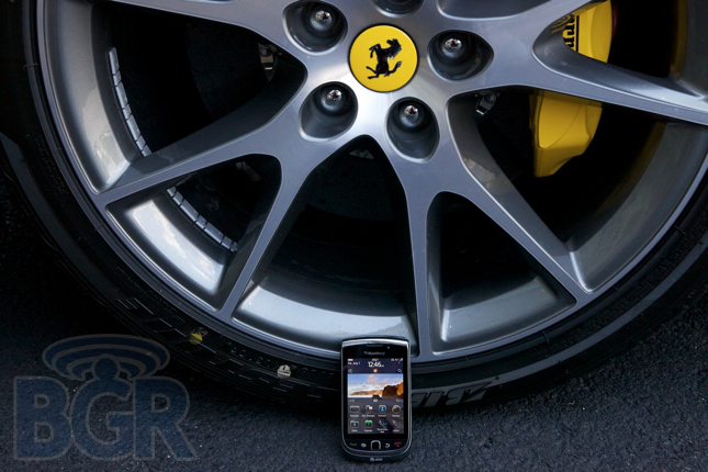
In a world where things are supposed to get simpler and easier to use, the BlackBerry Torch 9800 unfortunately complicates things. Is it the “best BlackBerry yet”? It’s certainly possible. Though it’s most definitely not the easiest to use, and even RIM’s best product at this point in time seems so far off from being competitive in the smartphone market landscape. Our first photo in the review sort of says it all — it’s a nice phone that is easily overshadowed by something newer, leaner, and much sexier. We’re not sure we’d recommend the 9800 to any new cell phone buyer unless they had a specific need for a BlackBerry. Even then, there’s a good chance we’d recommend the Bold 9700 (or Bold 9700 refresh device) with OS 6 on it. While the BlackBerry Torch isn’t a complete screw-up, it’s far from the Apple-killing, Android-slaying device RIM thought it would be. Unfortunately RIM’s next product has to be a home run for them to continue winning the ballgame, or we’ll start to see some strike outs. If they can’t manage to excite consumers with the next go-around, RIM will most likely be relegated to a low-to-mid end market player, something Nokia certainly knows a thing or two about.


