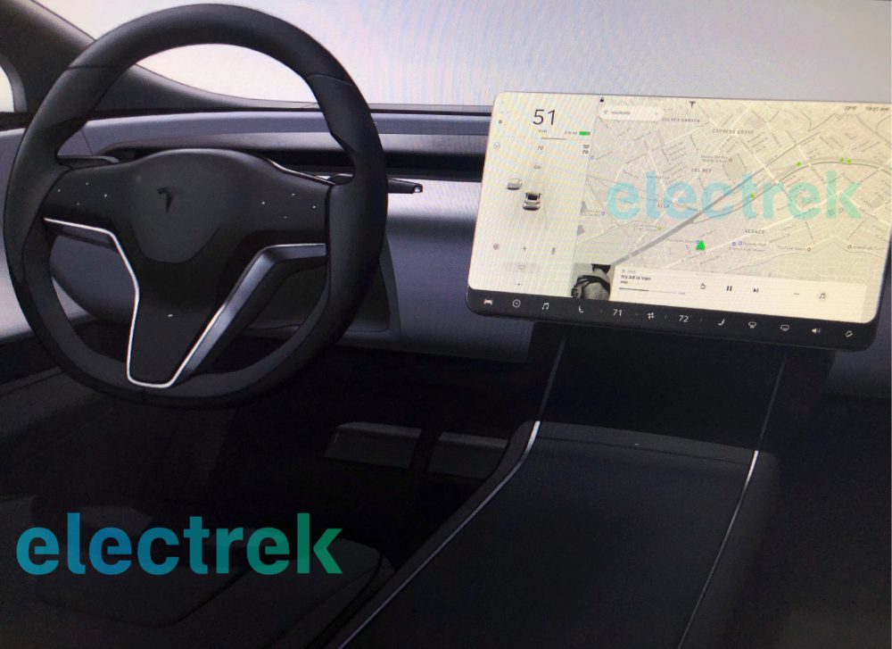
When Tesla introduced the Model 3 a little more than two years ago, many folks were shocked to see that the car lacked a traditional instrument cluster. Instead, the only way for Model 3 drivers to access pertinent information such as speed is via a 15-inch touchscreen located on the center of the console. Though the initial design was certainly controversial — with some even speculating that the shipping version of the Model 3 would feature a HUD — it seems that the design has been less problematic in practice than some initially anticipated.
In light of that, a new report from Electrek relays that upcoming versions of the Model S and the Model X may borrow some of the design cues first introduced by the Model 3. Specifically, Tesla — perhaps in an effort to keep costs down or perhaps as a nod to the inevitability of autonomous driving — will implement a similarly sparse interior design whereby any information worth keeping tabs on will be available via a display on the center dash. The instrument cluster itself isn’t going anywhere, but will reportedly be “smaller and more embedded into the dash.”
The photo below purports to show what the interior on next-gen Model S and Model X vehicles will look like. It’s hard to make out what the instrument cluster is going to look like, but what’s plainly obvious is that the orientation of the display is in a landscape orientation as opposed to portrait.


