I have to be perfectly honest with you… I never thought this day would come.
When Samsung released its first Galaxy phone back in 2009, it was clear that the company would become a contender in the revitalized smartphone market. When it released the first Galaxy Note smartphone two years later in 2011, it was clear that Samsung wasn’t afraid to take chances. And when Samsung released the Galaxy S4 in 2013, it was clear that the company’s displays would be the best in the industry for years to come.
But something else was clear during all that time. Despite Samsung’s willingness to take countless pages out of Apple’s playbook, the company’s hardware designs were still sorely lacking. The look of Samsung’s phones was boring. The thin plastic backs felt cheap and flimsy. Long story short, Samsung smartphones looked and felt like cheap iPhone knockoffs.
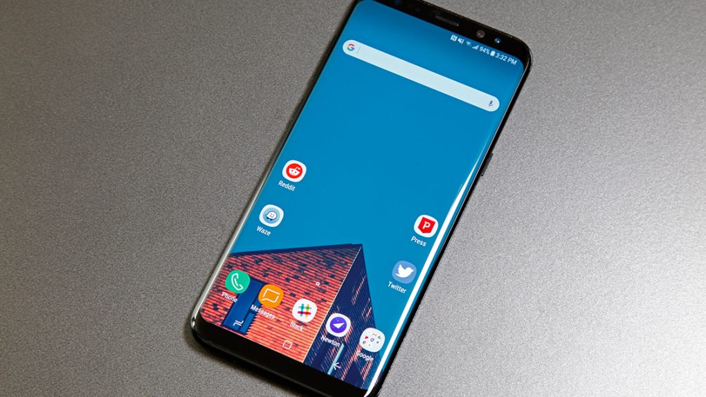
Now, in 2017, the new Galaxy S8 and Galaxy S8+ mark a changing of the guard. The torch has been passed. The student has become the teacher. Call it whatever you want, but the bottom line is this: Samsung has out-designed Apple with its new flagship smartphones. They look and feel like the future, and Apple’s three-year-old iPhone design is stuck in the past.
Samsung’s transition began in 2015 when the company released the Galaxy S6. It was the first flagship phone from the South Korean electronics giant that looked and felt like a flagship phone. The smooth glass front and back were joined by a sturdy aluminum mid-frame, and there were only a few small pieces of plastic on the phone’s exterior — the small strips that separated each section of the aluminum frame, and the home button.
It was official: Samsung was a premium smartphone maker.
The company’s flagship Galaxy S and Galaxy Note handsets have always featured cutting-edge specs. They have always offered terrific performance that was on par with the best Android phones in the business. And they have always had stunning displays with vivid colors and great contrast. Now, starting with the Galaxy S6, they also featured designs to match. But still, few people would argue that the company’s phones looked as sleek or felt as premium as Apple’s iPhones.
Until now, that is.
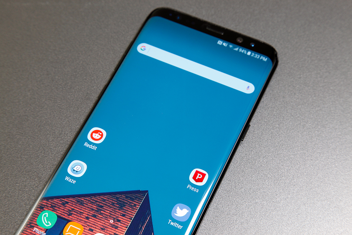
In terms of hardware design, the Galaxy S8 and Galaxy S8+ are the complete package. They’re industry leaders in terms of specs, as Samsung’s flagship phones always have been. They also feature Super AMOLED screens that are unrivaled. Again, this has been the norm for Samsung for years. But the biggest story in terms of Samsung’s growth as a smartphone maker is the design.
Samsung has always been a follower, ever since it released its first smartphone nearly a decade ago. But now, Samsung is a leader.
In fact, diehard Apple fans have been unable to find anything to complain about, so some of them have resorted to insignificant nonsense like the alignment of the USB-C port and speaker openings on the bottom of the phone. While it’s true that Apple’s alignment on the bottom of the iPhone 6/6s/7 is perfect, I’m not sure there’s a sane end user on the planet who would actually care about something like this.
But it’s indicative of the difference between Samsung and Apple when it comes to attention to detail! Perhaps. Or perhaps Samsung decided it was more important to squeeze in the phone’s internal components as tightly as possible so that it could create a design with a remarkable screen-to-body ratio of 83%. Trust me, Galaxy S8 and Galaxy S8+ users are going to appreciate the narrow bezels around the Infinity Display far more than any iPhone user appreciates his or her perfectly aligned ports. Also of note, Samsung managed to make its new flagship phones IP68 water-resistant without removing the 3.5mm headphone jack, misaligned though it may be.
Speaking of screen-to-body ratios, welcome to the next smartphone battleground.
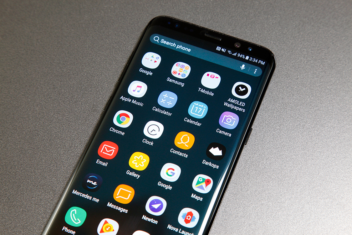
First, it was specs. Then, after Apple introduced the Retina Display, it was pixels. Now, beginning in 2017, it’s bezels. Every top smartphone vendor in the world is hard at work shrinking the bezels on their flagship phones so that the screen takes up as much of the phone’s face as possible. Is doing away with bezels on smartphones really that important? In a word, yes.
Apart from being crucial to upcoming advances in augmented reality, barely-there bezels like the ones surrounding the Galaxy S8 display allow for a much more immersive user experience. Distractions fade away and content becomes the sole focus. Why do you think Apple has never included a logo or anything else that might be distracting on the faces of its iPhones? It’s because when someone is using his or her phone, the content on the screen is all matters.
The 83% screen-to-body ratio on the Galaxy S8 and Galaxy S8+ is the best in the business among top-tier global smartphone makers right now. By comparison, the three-year-old iPhone 7 and iPhone 7 Plus design has a screen-to-body ratio of 66%. As I wrote in an earlier opinion piece, using the iPhone after having used the Galaxy S8 feels like going back to a tube TV after having upgraded to a flat-screen.
On the flip side, Samsung had to remove its physical home button from the Galaxy S8 and S8+ in order to achieve such an impressive screen-to-body ratio, and the company tried its best to copy Apple with its new virtual home button. It failed.
The virtual home button on Samsung’s new phones is pressure sensitive, similar to Apple’s 3D Touch home button on the iPhone 7 and iPhone 7 Plus. Apple’s solution utilizes advanced pressure sensors coupled with a Taptic Engine to make pressing the virtual home button on an iPhone feel and sound like pressing a real button. On the Galaxy S8, pressing the home button feels like pressing a plain old touchscreen, and presses are accompanied by the same weak vibration feedback you’d find on any other phone.
It might seem like an insignificant detail, but it’s not. As we move further toward phones that don’t have any buttons at all, advanced haptic feedback systems can make flat glass feel like a button. Apple has a huge head start in this area, and it will be quite some time before other companies catch up.
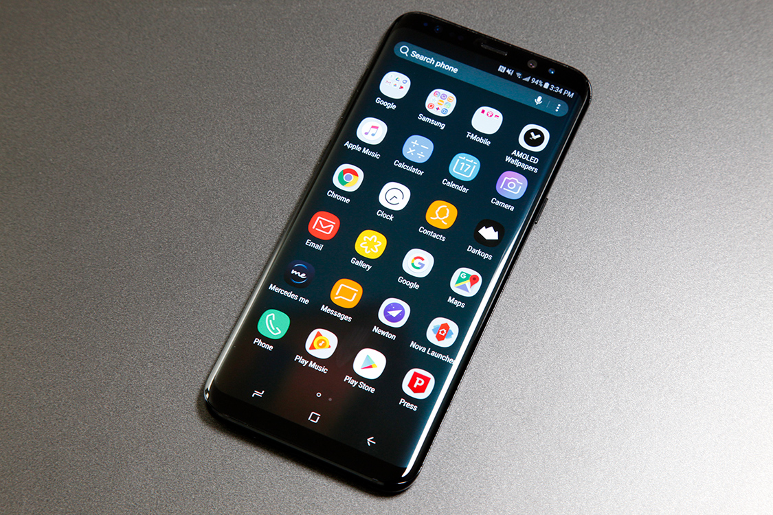
Like the LG G6, Samsung’s new Galaxy S8 and Galaxy S8+ both feature screens with a tall 18:9 aspect ratio. As a result, it’s difficult to compare their sizes to other smartphones. For example, the 5.8-inch display on the smaller Galaxy S8 is technically bigger than the screen on Apple’s iPhone 7 Plus phablet, but Apple’s screen is wider than the one on the S8. Long story short, diagonal measurements no longer tell the whole story.
What matters is that both new Galaxy S8 models have nice big displays that are simply unrivaled right now. They both feature Quad HD+ (2960 x 1440) resolution, so the 5.8-inch screen on the Galaxy S8 has a pixel density of 570 ppi while the Galaxy S8+ has a 6.2-inch screen with 529 ppi. On paper, it’s a fairly big discrepancy. In reality, it’s difficult to notice a difference in most scenarios. What matters is regardless of which model you end up with, you’ll hold in your hand the finest smartphone display that has ever existed.
As was the case with the ill-fated Galaxy Note 7, the sides of the Galaxy S8 and S8+ are curved on both the front and the back. The phones are each about the same width as comparable smartphone models from other vendors, but the curved sides help them sit more comfortably in the hand because they feel narrower. They also feel much thinner than they are thanks to the curves, though widths of 8mm for the Galaxy S8 and 8.1mm for the Galaxy S8+ aren’t very thick even without the curves on either side.
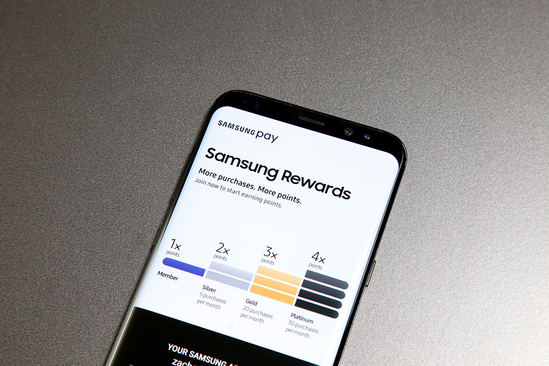
Inside, the US versions of the Galaxy S8 and Galaxy S8+ are both powered by Qualcomm’s new 10nm octa-core Snapdragon 835 chipset, which marries a 2.3GHz quad for heavy lifting with a 1.7GHz quad for everything else. When they are released on Friday, April 21st, they’ll be the first widely available smartphones in the world to feature 10nm chips, which should offer advantages both in terms of power and efficiency. You’ll also find 4GB of LPDDR4 RAM in Samsung’s new flagships, along with 64GB of UFS 2.1 flash storage and microSDXC support.
I can vouch for the Snapdragon 835’s performance. Everyone has seen the benchmarks by now, but that’s only part of the story. Everything on the Galaxy S8 feels faster than on rival Android phones, from opening apps, to switching apps, to using apps. It really does feel turbocharged. In my testing over the past few days, I have yet to find anything that can trip up the phone’s performance in any meaningful way.
Unfortunately, I cannot vouch for any gains in power efficiency that might be afforded by the Snapdragon 835 or any other optimizations Samsung has made in the Galaxy S8 and S8+. Samsung delivered my review unit just this past Friday, and my usage while testing the phone is obviously nothing like average usage on a day-to-day basis. Normally when I review phones, I like to beat them up with heavy testing for a couple of days and then use them normally so I can communicate real-world battery performance.
What I can say about the batteries in Samsung’s new phones is that they refuel quickly. I tested Samsung’s standard fast charging via USB-C as well as its wireless fast charging, and both methods were fast to fill up the phone. As long as they don’t explode, Samsung appears to have done a fine job with the batteries in the Galaxy S8 and Galaxy S8+. I believe either phone will carry a person through a full day of average usage, and they charge up very quickly to minimize the hassle on days with heavy usage.
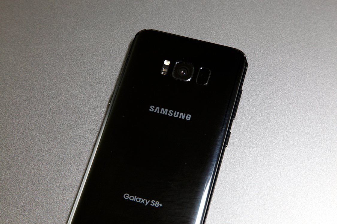
When Samsung confirmed that the rear camera on the Galaxy S8 and Galaxy S8+ would be the same 12-megapixel Dual Pixel camera found on the Galaxy S7, Galaxy S7 edge, and Galaxy Note 7, I saw a number of bloggers and smartphone enthusiasts complain online. On one hand, I can certainly see where they’re coming from — no mobile camera is perfect, so we’re used to seeing camera tech improve with each new generation of smartphone. But on the other hand, Samsung’s Dual Pixel camera is easily one of the best in the business. In some lighting it is the best, hands down. It’s difficult to complain about such a solid smartphone camera.
Samsung says that it has made some changes to the rear camera on the software side, though I really haven’t noticed much of a difference in my testing. The Galaxy S7 captured great photos, the Galaxy S7 edge captured great photos, the Galaxy Note 7 captured great photos, and now the Galaxy S8 and S8+ capture great photos. What’s not so great, however, is the rear-mounted fingerprint scanner next to the camera on the back of the Galaxy S8 and Galaxy S8+.
The back of a phone is an awful, awful place for a fingerprint scanner. Even after you’ve spent months with a phone and you know it like the back of your hand, unlocking a smartphone with a rear-mounted fingerprint scanner means blindly sliding your finger around the back before finding the scanner. It’s bad enough on phones with scanners that are placed on the center of the back, and it’s even worse with the Galaxy S8’s fingerprint reader, which is high up the back and off-center next to the camera lens. Side note: Thanks to Samsung’s scanner placement, your rear camera lens will always be covered with plenty of oil from your finger.
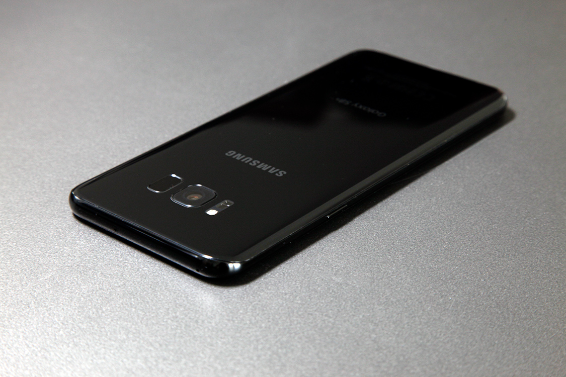
Speaking of oil, the rear glass panel on the Galaxy S8 and S8+ is not treated with an oleophobic coating like the front, so prepare for a permanent layer of grease and grime unless you plan to use a case. Of course, this issue will be familiar to anyone who has owned a Galaxy S7 or Galaxy S6.
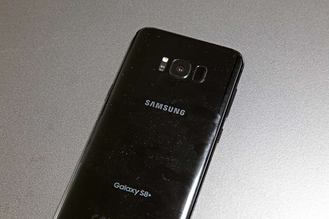
The positioning of the fingerprint scanner is, without question, a poor design choice. Complaining about misaligned charging ports is stupid, but the scanner placement is a very valid complaint, and I would wager that Samsung’s own design team would agree. Rumor has it the company wanted to embed the fingerprint reader in the display itself, like Apple is rumored to be doing, but Samsung and its parts suppliers couldn’t find a way to make it work in time for mass production.
If fumbling around for a fingerprint scanner doesn’t sound appealing, there are plenty of other ways to unlock your Galaxy S8. Beyond PINs, patterns, and passcodes, the S8 and S8+ also support iris scanning and facial recognition. The latter isn’t terribly secure since it has already been discovered that it can be fooled with a photo.
The iris scanner is a bit more secure, but it can also be inconvenient since you have to swipe over from the lock screen by default before the phone will scan your eyes. This was done to avoid accidental unlocks when the user is trying to read notifications or check other lock screen content, which certainly makes sense. If you don’t can about seeing lock screen content, you can configure the phone so that you don’t need to swipe to scan your irises. But you obviously still have to hold the phone out in front of you and position it so that your eyes are in the alignment circles that appear at the top of the screen. It’ll never be as quick as a fingerprint scan.
Moving inside the Galaxy S8 and Galaxy S8+, you’ll find a newly refined software experience. As is the case with the Galaxy S8 hardware, the company’s “Samsung Experience” software in 2017 is its best yet.
Each year, Samsung continues to strip away more and more clutter, moving ever closer to a stock Android experience. Closer, yes, but make no mistake — there’s nothing stock about the Android build on Samsung’s Galaxy S8 and S8+.
The first thing you’ll notice about Samsung’s software on the Galaxy S8 is that it’s fast. Very, very fast. Hardcore Android fans were upset when they found out that a special upgraded Galaxy S8 with 6GB of RAM would be made available in some Eastern markets and not in the US, but I can assure you that the Snapdragon 835 and 4GB of RAM provide more than enough oomph and memory to keep things humming along.
From news readers, Twitter and email apps to media streaming apps, 3D games and more, the Galaxy S8+ powered through all my tests without a hiccup. Long story short, it can handle anything a user might throw its way. I had videos streaming in half of Samsung’s multi-window layout while I was loading large web pages in the other half, and again, not a single stutter or stammer to speak of. Apart from a few Android oddities here and there — seriously, is Google EVER going to get scroll physics right?! — the Galaxy S8 and Galaxy S8+ offer the smoothest experience you’ll find on a Google-powered smartphone.
While some other manufacturers have moved away from developing their own apps when Google already offers, Samsung still insists on holding onto a few dupes. For example, you’ll find Samsung’s Gallery app in addition to the preinstalled Google Photos app, which is clearly superior. Samsung also includes its own web browser in addition to Chrome. While moves like these made precious little sense on older phones, there’s a method to the madness on the Galaxy S8.
Using a device that Samsung calls DeX, the Galaxy S8 and Galaxy S8+ can connect to a monitor, keyboard, and mouse to power a desktop computing experience. Samsung’s apps are optimized for this experience, while third-party apps might not always perform as well in desktop mode. The DeX solution looked impressive when Samsung demoed it briefly for me last month before the Galaxy S8 was announced, but the company didn’t supply a DeX dock with my review phone so I haven’t yet been able to test it myself.
Beyond Samsung’s apps, the TouchWiz experience — sorry, Samsung Experience — has been tweaked in a number of areas on the Galaxy S8 and S8+. Some changes are minor, such as the option to swipe up from the bottom of the screen to open the app drawer. Other changes are more significant, like Samsung’s move to on-screen home, back, and app switcher buttons, an obvious necessity since the physical home button was scrapped.
Samsung staples like the Always On Display feature and Samsung’s customization options are all still present on the S8. There’s also an “Advanced features” section in the settings app that provides access to several Samsung-only features. Here are some examples:
- Smart stay: Eye detection keeps the screen on as long as you’re looking at it
- Game Launcher: A special launcher that can hold all your games instead of mixing them with apps in the drawer
- One-handed mode: Swipe up from a corner to shrink the size of the screen so everything can be reached with one hand
- Finger sensor gestures: Open and close the notification panel by swiping up or down on the fingerprint sensor
- Quick launch camera: Double-tap the power button to launch the camera
- Multi window: Open two apps on the screen at the same time
- Smart alert: This feature makes your phone vibrate when you pick it up and have missed notifications
- Video enhancer: This setting automatically upscales videos to enhance picture quality
There are a bunch of other ones in there, and they vary in their usefulness.
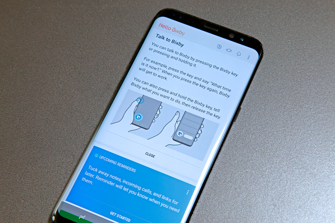
Another new addition to the Samsung Experience on the Galaxy S8 and S8+ is Bixby. As many people might have already read, however, Bixby is a huge letdown for the time being in the US market. In a nutshell, Samsung’s voice-controlled virtual assistant can’t yet be controlled using one’s voice.
The weirdest part about is that there’s a dedicated Bixby button that is supposed to offer two functions. Pressing and holding the Bixby button is supposed to launch the Bixby voice assistant, which is like Siri or Amazon Alexa. At launch, this core Bixby feature won’t actually exist; Samsung has delayed the voice portion of Bixby in the United States.
Tapping the button launches the Bixby Home page, which is a collection of cards similar to Google Now. At least, it’s supposed to — the alternate method of accessing Bixby Home (swiping right on the first home screen) is the only method of accessing Bixby Home that actually works on my review unit. So, right now on my review unit, the Bixby button does nothing at all.
As it stands now, Bixby Home is Samsung’s answer to Google Now. The interface is the same cascade of cards, and the content therein is similar as well, offering time, location, and context-aware content. One nifty feature that Google doesn’t yet have, however, is Bixby Vision. This is similar to the Firefly feature Amazon introduced on the ill-fated Fire phone. Point the camera at an object and Bixby will offer information and context, if it recognizes the object. Bixby Vision can also offer information about points of interest using the camera and your location, and it can translate printed text in real-time in more than 50 different languages.
Bixby could grow into a very useful feature on Samsung phones, but right now it’s painfully incomplete. The Galaxy S8 and Galaxy S8+ run Android 7.0 Nougat, however, so they also include the much more complete Google Assistant solution. I certainly plan to revisit Bixby once it’s a more complete product, but Google Assistant is clearly the way to go for the time being. Remember, Siri was a mess as well when it first launched, and now it has evolved into a fantastic tool that millions of iPhone owners use all the time. Give Samsung a while to work through Bixby’s initial growing pains before you dismiss Bixby completely.
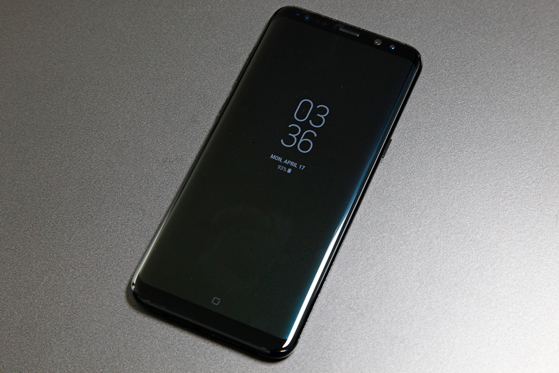
Nearly everything about Samsung’s new Galaxy S8 and Galaxy S8+ leaked long before the company actually unveiled its new flagship phones last month. We thought there was no way there would be any surprises left. While all the phones’ new features were indeed covered by the leaks and rumors that led up to the unveiling, we were still entirely unprepared for the devices Samsung showed off that day.
The fact that Samsung has managed to out-design Apple is nothing short of shocking. The South Korean company has been chasing Apple ever since it first entered the smartphone market, but matching the iPhone in terms of design and build is something I never thought I would see Samsung manage. The company hasn’t just matched Apple’s iPhone design with the Galaxy S8 and Galaxy S8+, it has surpassed Apple’s iPhone design.
Like anyone else who has been keeping an eye on iPhone 8 rumors, I fully expect Apple to make a strong showing later this year when it unveils its redesigned tenth-anniversary iPhone. There’s a lot of time between now and September, however, and I have a feeling many Apple fans will have some soul-searching to do when they finally get the chance to check out Samsung’s new Galaxy S8 and Galaxy S8+ following their release this Friday, April 21st.
For Android fans, meanwhile, the Galaxy S8 is a no-brainer unless you absolutely must have stock Android. There are a number of good reasons to stick with stock Android, and the timeliness of operating system updates is at the top of the list. It’s a big tradeoff though, when you consider the power, performance, and beautiful design of the Galaxy S8.
