Going into yesterday’s Apple event, the expectations hoisted upon Tim Cook were sky-high. Not only had it been an excruciatingly long time since Apple delivered a solid refresh to its Mac lineup, but Microsoft earlier in the week impressed the tech world with an innovative (and yes, hyper expensive) desktop PC.
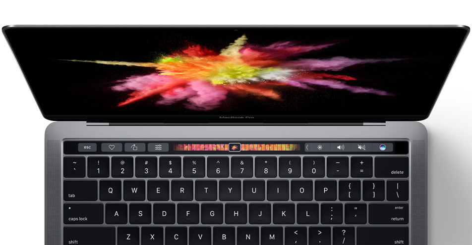
So with all eyes in the tech world laser focused on Apple’s product announcements yesterday, the company delivered in a big way. Apple’s revamped 2016 MacBook Pro is a thing of beauty. Far from an incremental upgrade, it may completely alter the way we interact with computers. Aside from impressive hardware improvements and a sleeker, thinner and lighter form factor, the biggest selling point on Apple’s top of the line MacBook Pros is a feature Apple calls the Touch Bar.
DON’T MISS: The iPhone 7 has an exciting new feature that Apple is keeping secret
The Touch Bar on the MacBook Pro is a multitouch OLED display that completely replaces the function key row. The benefit of such a design is that the OLED display can offer up users specialized controls that correspond precisely to specific apps. All the more intriguing is that the default controls on the Touch Bar can be customized to better fit a particular user’s workflow.
Apple’s new MacBook Pros won’t ship for another 2-3 weeks, but Apple yesterday offered select outlets some hands-on time with its new machines. While overall impressions of the machine itself were overwhelmingly positive, we’re far more interested in taking in what early reviewers of the MacBook Pro thought of the new Touch Bar.
Here’s a brief sampling.
Susie Ochs of Macworld had mostly positive things to say:
But the coolest part of the Touch Bar is how quickly it changes as you switch apps. I used it for scrolling through a full-screen album in Photos, as well as for scrubbing through the timeline in Final Cut Pro. Both were fast and responsive.
…
The other killer Touch Bar feature might be predictive suggestions in Mail. When you’re looking at a list of messages in your Inbox, you’ll see a button on the Touch Bar that says “Move to Vacations” or the name of another folder the app thinks is suitable. Mail seems to be guessing based on context, such as the sender and content of the message, and I can’t wait to see how well it does with the volume of email I get every day.
Brian Heater of TechCrunch was similarly impressed with the Touch Bar’s responsiveness:
It’s quick and responsive, reacting to multi-touch and the amount of pressure the user applies. It also adapts quite quickly as you toggle between different apps. It’s a really cool and really versatile new addition — like having a small mobile display embedded directly into the notebook.
Ina Fried of Recode writes:
As expected, it’s super light and the Touch Bar looks like the kind of thing that those who spend all day on a laptop will grow to really love. (It might prove too pricey a nice-to-have for casual laptop users, though.)
AppleInsider
had a number of positive things to say:
In our short time with the Touch Bar, we came away impressed with the component’s ability to surface features and functions that might otherwise be lost in menus or tool palettes. As demonstrated onstage today, the Touch Bar also frees up screen real estate, allowing users to go fullscreen without obscuring their work.
Being integrated directly above the keyboard makes it natural to “chord” Force Touch trackpad selections and TouchBar controls while working in a full screen interface. Contextual content makes the experience all the more engrossing, actually adding to MacBook’s usability rather than distracting from it. Users are able to customize toolbars to a certain extent in Apple’s system controls and first-party apps, though more robust options are expected to debut once third-party developers begin rolling out updates supporting the new hardware.
Dieter Bohn of The Verge writes:
I also rearranged buttons (you can find the option in a menu) and it worked, well, as advertised. What’s neat about dragging buttons down from the screen to the Touch Bar is that you can keep moving them with the mouse on the second screen.
…
One last neat thing on the Touch Bar: you can tap-and-hold on a bunch of buttons to get to functions faster. Long-press on Reply and you can slide over to Reply-All. Same for other buttons like volume control.
:
The whole idea is going to take some getting used to: each app does different things, in different ways, to different effect. In Mail, you can quickly tap on the Touch Bar to compose a message; in Pages, it’s a super-fast way to access a bunch of formatting options. In Photos, you can use the Touch Bar to quickly scrub through a bunch of images, and it’s a really nifty way to move through a timeline in Final Cut. A bunch of demos on stage at Apple’s event featured a number of people doing a sort of two-handed dance, one twiddling on the my-god-it’s-huge touchpad and one on the Touch Bar. How people will use this thing, and what the right features and mechanisms will be, will take some time to sort out.
And to close things out, here are a few video overviews of Apple’s new Touch Bar feature.


