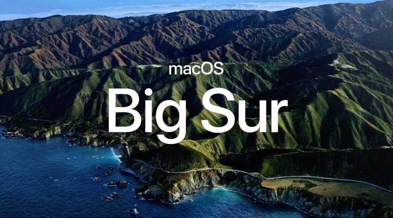
macOS Big Sur Launches With A Big Redesign
- Apple unveiled macOS Big Sur during the main WWDC 2020 keynote, revealing a significant design makeover for its computer operating system.
- Everything inside Ben Sur has been redesigned to look exactly like its iPhone and iPad equivalent, and some apps are built on Apple's Catalyst platform, including the new Messages and Apple Maps applications.
- Safari has also received a major update, from design to new privacy features, to favicons, and add-ons.
- The Big Sur redesign comes in preparation for Apple's big switch from Intel to ARM that was also announced at the show.
- macOS Big Sur public beta 1 will be launched next month, although we don't have an actual release date for it. The developer version will be available right away.
WWDC 2020 came much later than expected this year, and the event is streamed only online for the first time. It's all thanks to the novel coronavirus pandemic that stopped the world in its tracks for several months. Apple wasn't an exception to that rule. If anything, Apple was quick to act, issuing policy changes for its stores in real-time, creating its own visor design for health workers, setting-up a COVID-19 symptoms app, and partnering with Google for a monumental effort, a privacy-guarding joint contact-tracing system.
All the while, Apple worked on its upcoming products, including its software announcements scheduled for WWDC. We'll never know what exciting features may have been pulled from the event, but we do know that the macOS Big Sur part of it is ready, as Apple just introduced it.
"This year, we're taking the macOS experience you love even further," said Craig Federighi on Apple's virtual WWDC stage before revealing the name of the new Mac operating system. It's Big Sur, and Big Sur is big on design. Specifically, Big Sur is about making the Mac look and feel a lot more like iOS. And a look at it will suffice to make it clear. We need this feature to unify the overall computing experience between the iPhone, iPad, and Mac.
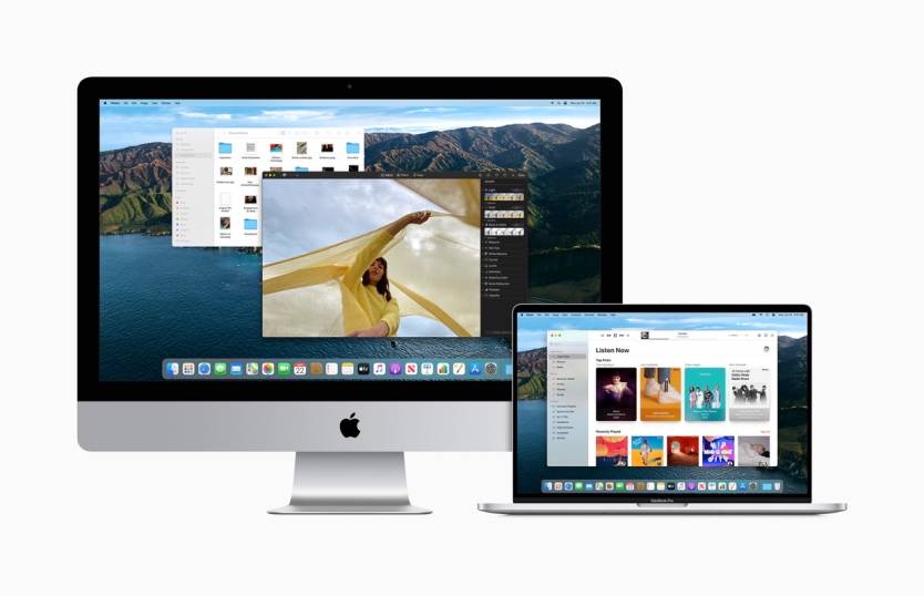
macOS Big Sur running on iMac and MacBook.
Everything was redesigned, but this is still a recognizable Mac operating system. The apps are the same, even if they have square-ish icons replacing the circular ones you've gotten used to. The menu bar is still there, even if it's more translucent than before. The drop-downs from the various menus sitting on the right side of the top menu bar also borrow heavily from the iOS Control Center. And I'd dare say they look better than what's now available. And I'd dare say they look better than what's currently available. What's strange about the new design is that the new settings controls practically beg you to touch the screen, especially when it comes to the buttons and sliders of the macOS Control Center. But, of course, you can't, because the Mac does not support touchscreens.
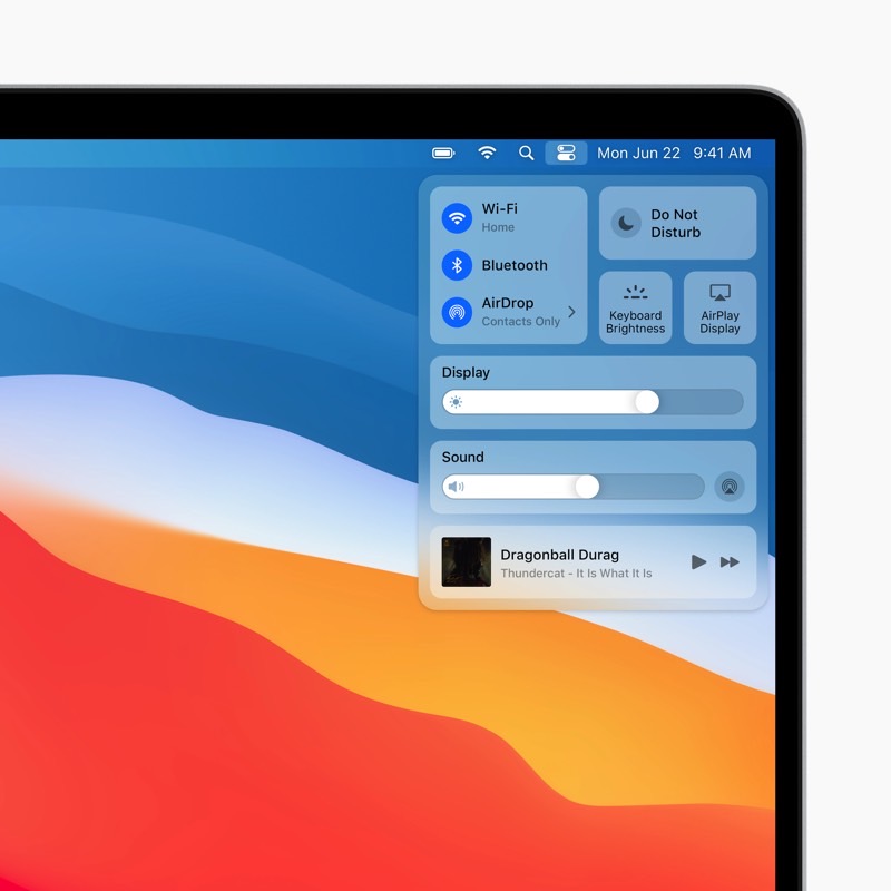
macOS Big Sur: New Control Center for Mac.
Other apps will also bring over design features that were first introduced in iOS, whether it's Finder, Safari, or Mail.
The Photos app has also been overhauled to offer a supposedly more comfortable way to manage photos. Unsurprisingly, this will look a lot like the iPhone's Photo app, combined with a sidebar.
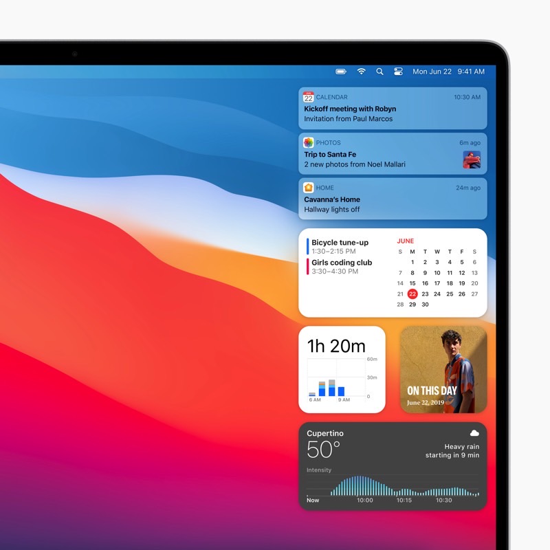
macOS Big Sur: Notification Center.
Even the new iOS widgets have been imagines for the macOS experience. If you love widgets, you'll love them on the macOS. Otherwise, you might not actually bother with them. But they will show up in the new Notifications Center.
More importantly, the Message experience has been improved in Big Sur to support better search than what's available right now. And search in Message is something I've hated for years now. Picking a photo to send over is far easier, and you'll be able to create Memoji.
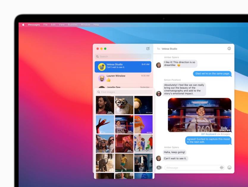
macOS Big Sur: New search in Messages app.
The new iMessage feature available on iOS 14 will transition over to Messages on the Mac, like the new pinned conversation feature that Apple just introduced.
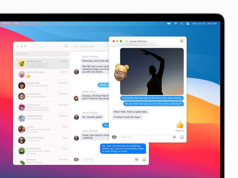
macOS Big Sur: Memoji support in Messages.
Big Sur's Apple Maps app will also look immediately familiar because it looks exactly like the Apple Maps on iPad. Again, this makes sense as a way to unify the overall Apple computing experience without actually merging iOS and macOS. The same features coming to Apple Maps on iOS will also be available on macOS.
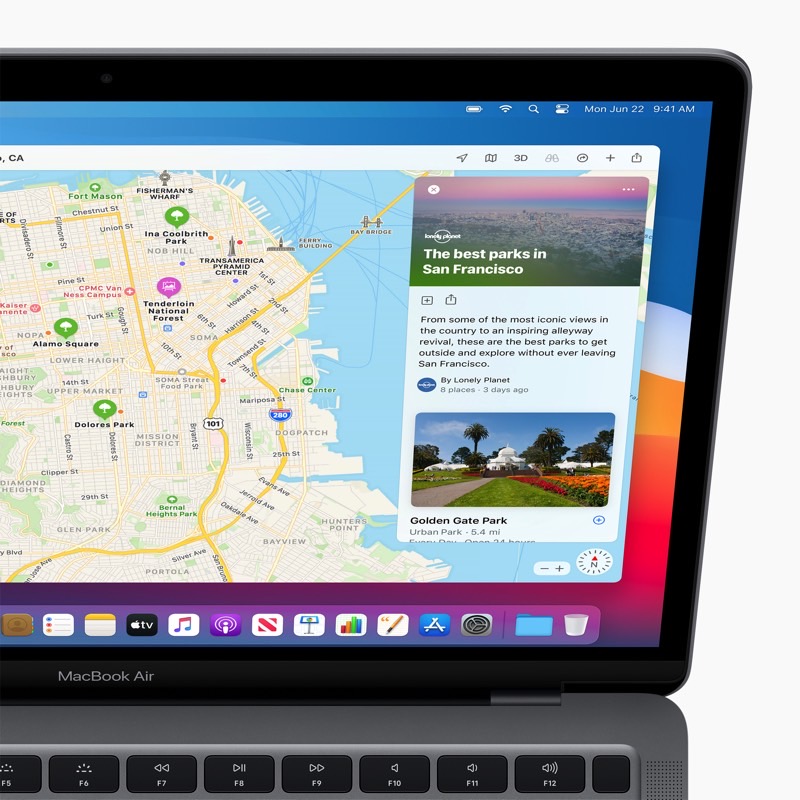
macOS Big Sur: Apple Maps guides demo.
Messages and Apple Maps are both Catalyst apps, which is Apple's unified programming platform that lets developers create apps for both iPhone and Mac. It hasn't been really successful so far, but Big Sur will surely make Catalyst apps more accessible.
Safari is another Big Sur app to receive a significant update. And Federighi said on stage that the browser is now faster than ever. JavaScript performance is better, and Safari is much faster and secure than Chrome. That's Apple's messages. Safari will soon tell you how sites track you with a "privacy report" button. Moreover, the browser will actively monitor your passwords to make sure you haven't been hacked. And the browser is getting extensions via the Mac App Store.
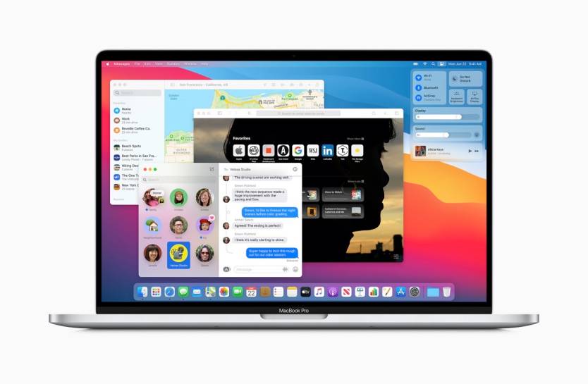
macOS Big Sur running on a MacBook.
Even better, Safari is getting a native translation tool built into the browser, which is undoubtedly something Chrome users love on Google's browser.
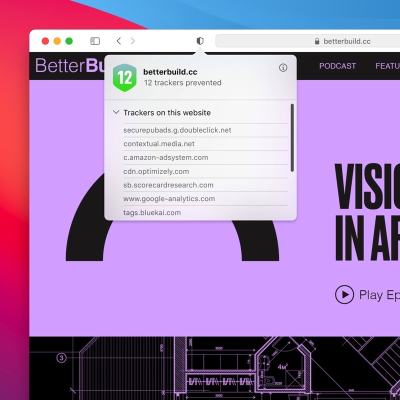
macOS Big Sur: Privacy checkup in Safari.
Safari is also inheriting new privacy features from iOS, like the ability to offer specific sites temporary permissions. Think "allow for one day" and "allow for this website" permissions that you'd see on iOS or iPadOS. A built-in intelligent tracking prevention button in the address bar will tell you exactly how your apps are tracking you.

macOS Big Sur: Safari improved tabs.
Color favicons? That's right, Safari will get them.
That's pretty much everything Apple was willing to share about Big Sur during WWDC 2020, but Federighi said these changes are only the beginning before passing the baton over to Tim Cook to challenge Intel. That's right, Macs on ARM are happening, but that's an entirely different story.
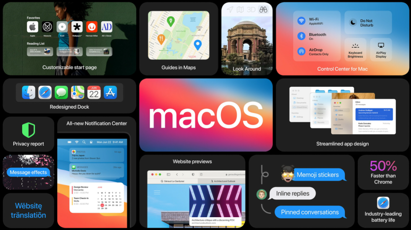
macOS Big Sur features roundup from WWDC 2020.
To sum up, macOS Big Sur will rob a part of Mac's personality to make it look and feel more like the iPhone and iPad. But there's nothing wrong with that. If anything, the Big Sur redesign is exactly what we needed, given everything that happened today at WWDC.
As always, the first macOS Big Sur beta will launch next month, with the final release to drop at some point this fall.
