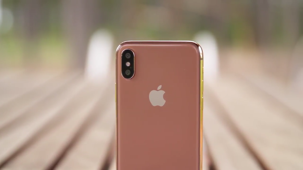
A few days ago, we wondered whether the iPhone 8’s user interface will be as ugly as reports said it’d be. It turns out, we have our answer, and it’s yes. The “notch” housing the front cameras, speaker, and sensors that totally ruins the all-screen design is something that can’t go away. And rather than hiding it, Apple will embrace it, and make the most of the available screen real estate. The ears flanking the notch will be functional, displaying various elements on the screen.
How do we know? Well, we’re past renders created by designers right now. iOS 11 GM has leaked, revealing many iPhone 8 and Apple Watch LTE secrets. And the iPhone 8’s UI is part of the story.
We already showed you the iPhone 8 secrets buried in iOS 11 GM. But some of the developers who already inspected the leaked HomePod firmware, that’s Steve Troughton Smith and Guilherme Rambo, are back with more findings from the iOS 11 software.
Before we start, you should know that D22 that gets referenced in some of the following tweets and images is the codename of the OLED iPhone that Apple is about to launch. That’s the device we keep calling iPhone 8, a name that might be used for the iPhone 7s instead.
Let’s look at some images.
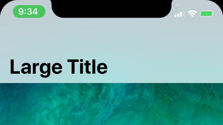
The notch will be flanked by ears that display the time and location tracking notification on the left, and the cell phone signal, Wi-Fi signal, and battery on the right.

Here’s how the iPhone 8 status bar will accommodate the notch https://t.co/zahdOn4Wuk pic.twitter.com/OtuXhhHhKk
— 9to5Mac.com (@9to5mac) September 9, 2017
There’s also a little dot near the top left corner of the right ear (yeah, it sounds confusing) that seems to be going away while in airplane mode.
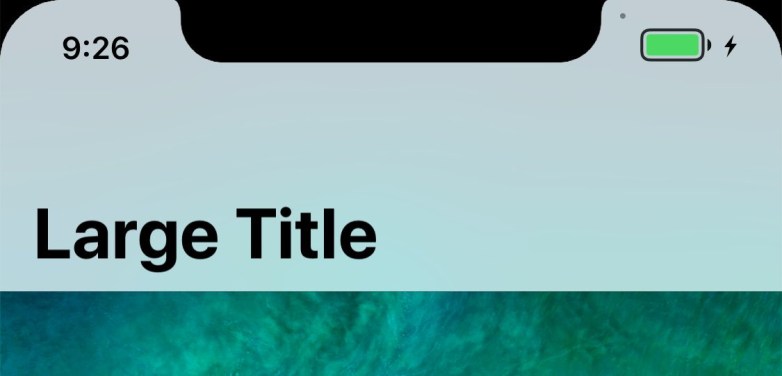
Here’s what the ‘double height’ statusbar looks like — screen recording, or in-call. The ears are interactive pic.twitter.com/bdacrEYMCw
— Steve Troughton-Smith (@stroughtonsmith) September 9, 2017
When you recharge the iPhone 8, you get this neat animation in the right display ear.
https://twitter.com/_inside/status/906423328570822656v
But the “back” button that appears in apps is here to stay, and it looks incredibly ugly.
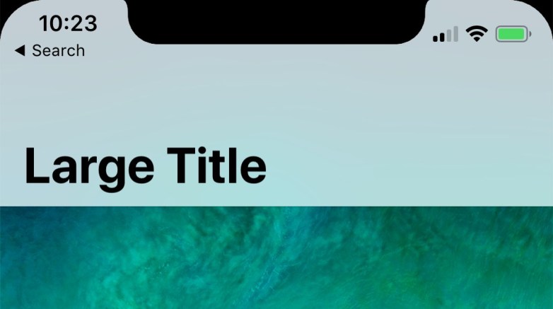
Bad news: the dumb deep link back indicator doesn’t seem to be going away pic.twitter.com/DlNvkaPkRA
— Steve Troughton-Smith (@stroughtonsmith) September 9, 2017
Someone deconstructed the image to highlight one other glaring issue with this design.
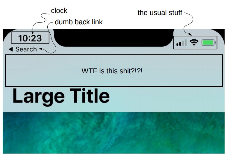
https://twitter.com/bob_burrough/status/906451404515979264
And here’s what the keyboard experience will be like on the iPhone 8.
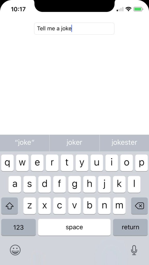
Here is what the keyboard looks like on the iPhone 8/D22 (the home indicator would go down there too, so it wouldn’t be this barren) pic.twitter.com/Gvd9q5IcFq
— Steve Troughton-Smith (@stroughtonsmith) September 9, 2017
Yes, there’s plenty of space there for a virtual home button, which may look like this.
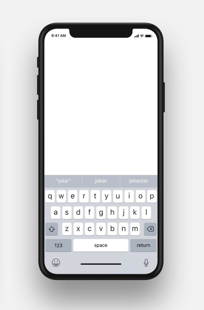
Something like this? pic.twitter.com/8xfxrWjfAW
— Trevor Kay (@trevormkay) September 9, 2017
Here’s how the left ear will tell you you’re on a call — the time is green.
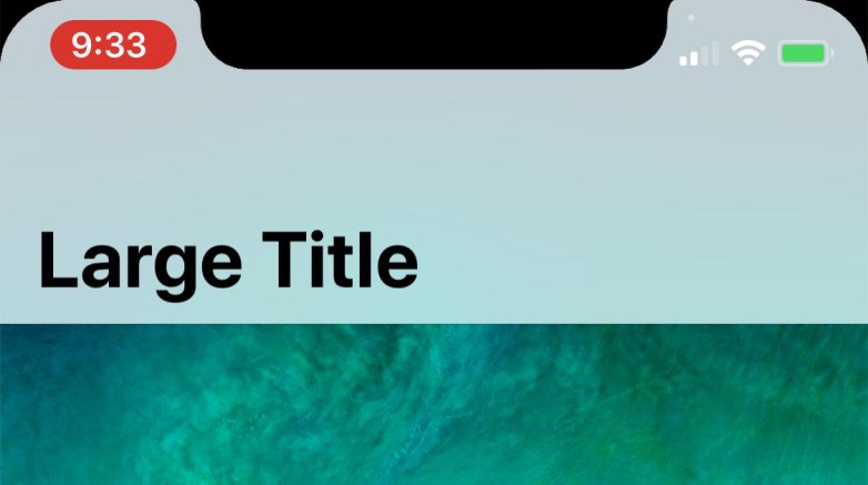
Here’s how the left ear tells you the screen is being recorded — the time is red.
Developing…
