Snapchat Separates The Social From The Media With Its Redesigned App
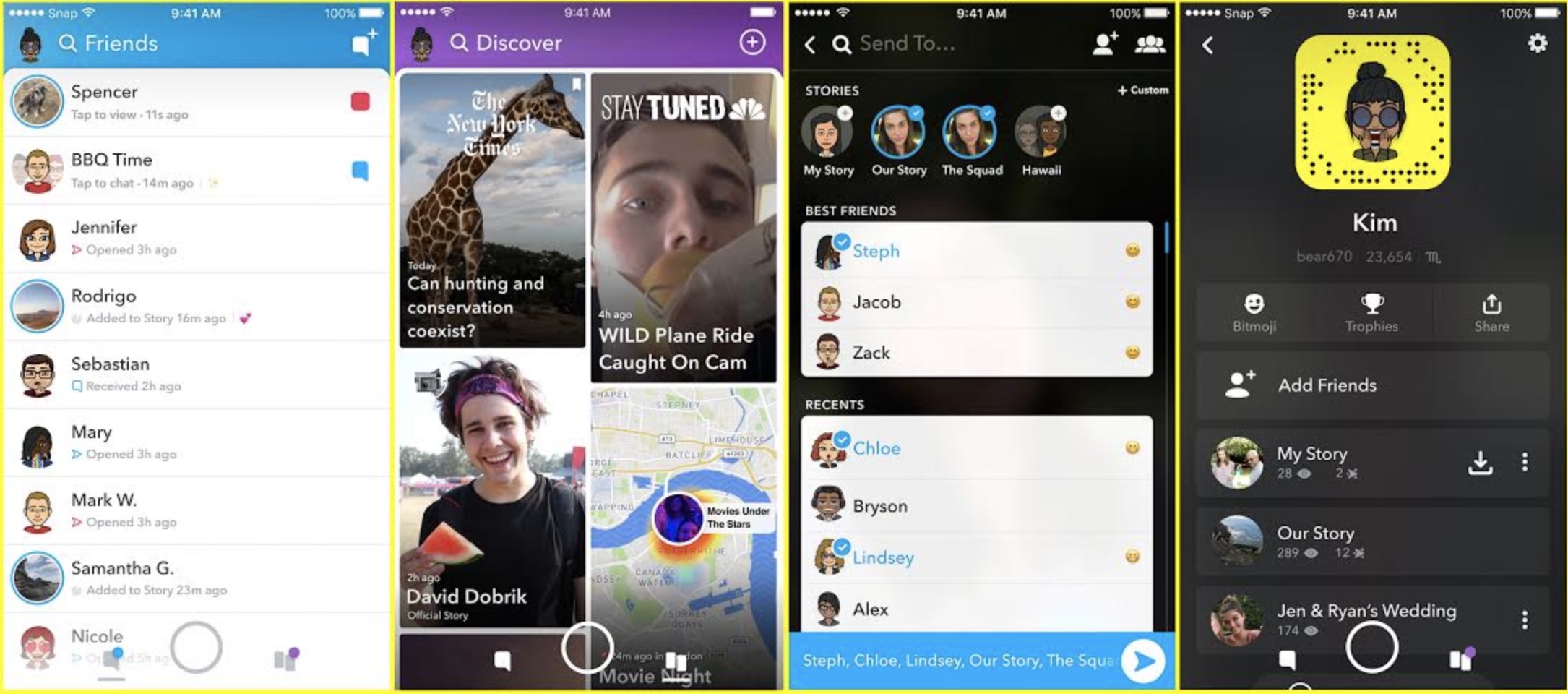
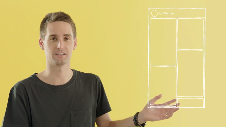
After hinting that big changes were in store for the popular social media app during an earnings call earlier this month, Snapchat CEO Evan Spiegel debuted the redesigned Snapchat app on Wednesday morning. Once the update rolls out, your friends and the content that brands share will be separated into two completely separate tabs. From the camera screen, you can swipe to the left to see your friends and to the right to see the new Discover tab.
"When we first built Snapchat, we made it easier to express yourself by talking with pictures," Spiegel explained in a video. "But today we're making it easier to find the people you want to express yourself with."
As a byproduct of splitting up the friends list and the content from publishers, creators and the community, the look of the app has changed as well. The new dynamic Friends page will sort your friends based on how frequently you snap with them, so rather than having to scroll to the bottom of a long list, your closest Snapchat friends will appear right at the top of the page. Snapchat says it will take some time for the app to learn your preferences.

The Discover page to the right will include the same Stories from third-party sources that you see today, but they will no longer be bunched up horizontally beneath your friends' Stories. Instead, you'll see the providers you subscribe to at the top of the page, followed by content Snapchat thinks you might be interested in. Once again, the algorithm will learn what you like over time, and will adjust the placement of content accordingly.
Snap says that the update will roll out to a "small percentage" of users this week, with a wider release scheduled for the coming weeks. In the meantime, enjoy the current incarnation of Snapchat before it vanishes for good.
