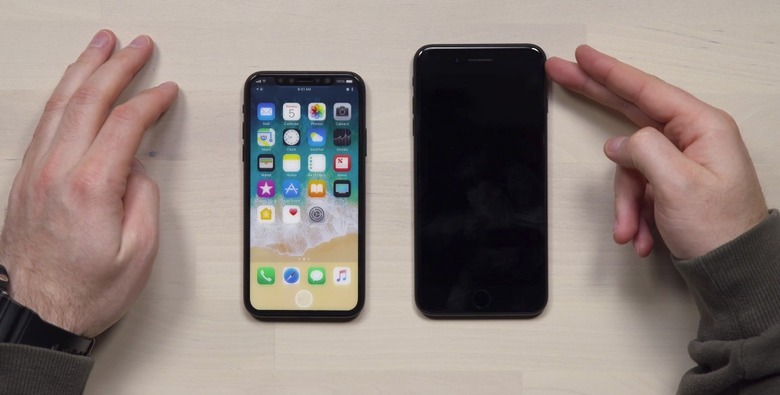
This Might Be Our Best Look Yet At The iPhone 8
The iPhone 8, or whatever Apple ends up calling the best of the three different iPhone models it'll launch this year, is the talk of the town right now. Rumors and leaks pop up from Asia on a regular basis, while analysts and insiders share new details about Apple's hottest iPhone with increased regularity. Because it's already July, it's very likely the iPhone 8 design is finalized, which would explain why we keep seeing the same iPhone 8 dummy unit pop up left and right. And as you'll recall, they match the exclusive look we gave you back in May of the iPhone 8's final design.
The dummy units are getting better and better, and now a new video gives us what's probably one of the best hands-on iPhone 8 previews so far.
YouTube channel Unbox Therapy, which is no stranger to covering iPhone 8 dummy units, got its hands on an even better version, one that appears to look more like the finished product than any previous mockups. Of course, we've yet to see the iPhone 8 so only time will tell if this design is accurate.
That said, the handset in the video at the end of this post does look a lot like the iPhone 8 we've seen in countless leaks, schematics, and renders based on rumors.
We've got the same full-screen design, with only the top side sporting a bezel that should house the front-facing camera, sensors, and speaker. There's no physical home button on the front, just as expected. On the back, there's a vertical dual lens camera and no fingerprint sensor. The standby/power button is bigger than usual, and there's no 3.5mm headphone jack on the bottom — hardly a surprise there.
The device is not functional, so the screen can't be turned on (because there is no screen). Instead, we see a printed dummy version of a home screen based on iOS 11, which was apparently created by designer-turned-leaker Benjamin Geskin. The designer imagined how Apple would deal with the absence of the home button and that top bezel.
My take on #iOS11 Home Screen on #iPhone8
What do you think? Will you be happy with this design? pic.twitter.com/N5SRgNAQvg
— Ben Geskin (@BenGeskin) July 8, 2017
The iPhone 8 will have a larger dock at the bottom, in Geskin's vision, to incorporate a virtual home button. Let's just hope Apple's design looks nothing like this one because it's hideous.
Geskin's solution for the top bezel is a lot better, and it's exactly what we discussed a while back. The display flanking the top bezel only shows connectivity and battery life indicators, but these are always white on a black background. Because the iPhone 8 will have an OLED display, it'd be easy for Apple to adopt this solution without consuming too much energy in the process. AMOLED displays are black by default, and they only consume energy when pixels are lit up.
Check out the video below to see this good-looking iPhone 8 dummy unit in action.
