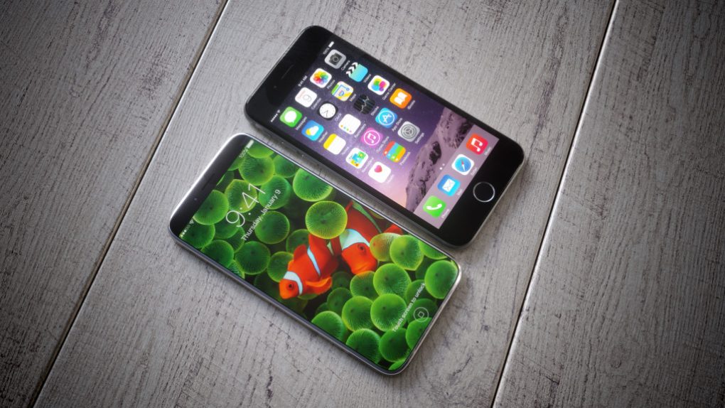
Now that Apple has released iOS 11 into the wild, designers working on iPhone 8 concepts don’t have to imagine operating system features and can create renders that are even more realistic. Add to that the most common iPhone 8 rumors and leaks, and you may end up with an iPhone 8 concept that foreshadows the real thing. Someone did exactly that, and the end result is equally impressive and troubling at the same time.
A constant source of iPhone 8 leaks, including conflicting reports about Apple’s next iPhone release is Twitter user Benjamin Geskin. And while he’s yet to prove himself as a leaker, he certainly can create sleek renders based on available information.
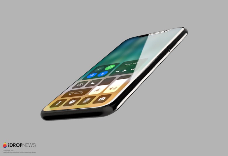
In his latest series of images, he used the iPhone 8 design that most rumors agree on at this point, and merged it with iOS 11 screenshots. As you can see in the following images, it all looks great until you realize there’s a massive problem staring you in the face.
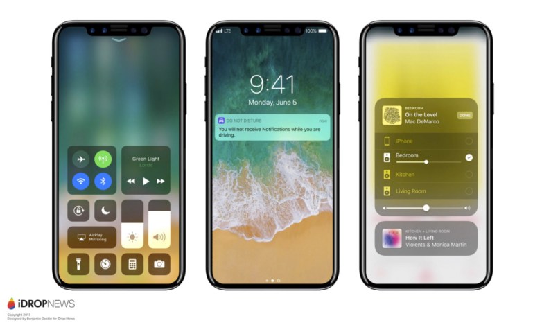
That area where the front-facing cameras and sensors are occupies a huge chunk of the front side of the display, and it needs to go. Or, if it’s meant to stay, then Apple has to figure out exactly how to redesign iOS 11 so that the camera assembly fits nicely with iOS 11.
An iPhone 8 running iOS 11 as suggested in these images is hideous. Just look at the time, which is usually placed in the center of the top bar. That just can’t happen. It’d be even uglier than any questionable Apple decision has made in the past.
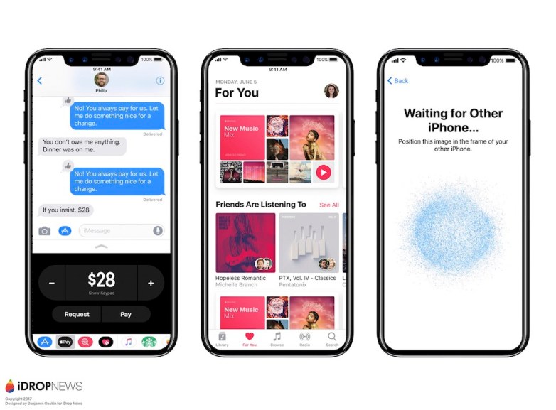
One of the first things we noticed when Apple unveiled iOS 11 was the reintroduction of the antenna bars that replace the dots used in iOS 10. Apple may have done that to free up some space in the middle of the screen for that camera assembly. Apple also changed the way you open the notification pane on the phone — swiping up will open them on the lock screen — which may also have something to do with the central position of the complex camera system.
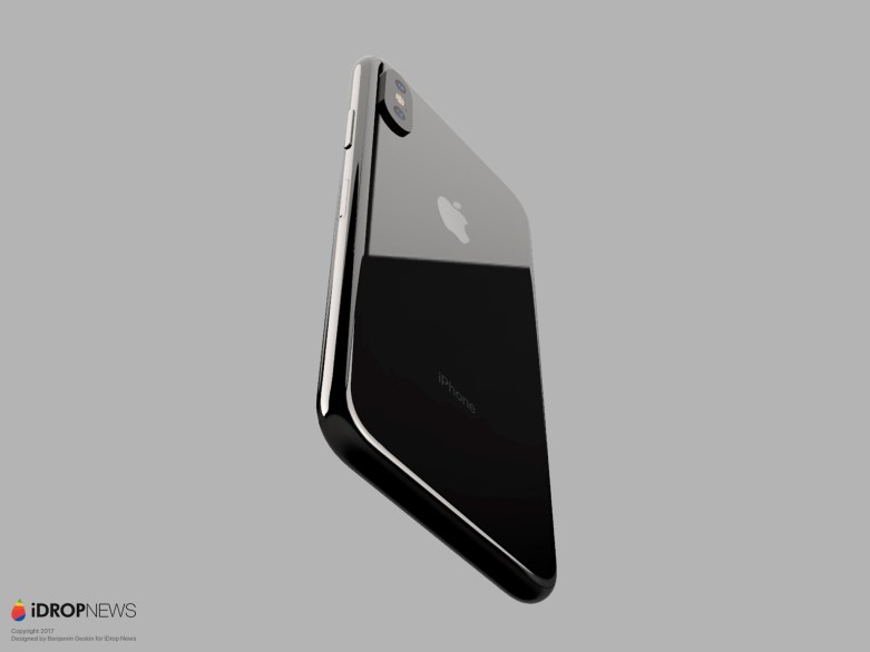
But I can only hope that the final iPhone 8 design will not ruin iOS 11’s appearance like that. There are ways to fix it, such as including the entire camera assembly under the display if such a thing is technologically possible right now, or reducing the size of the camera system. Alternatively, we can always live with bigger top and bottom bezels than what’s shown in these images. As great as bezel-less designs are, I’m pretty convinced that we can still cope with bezels that are a few millimeters taller if it means getting a phone without that hideous cutout.
