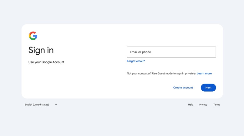
Google Refreshed Its Ancient Sign-In Page
In recent months, whenever you had to sign in to your Google account, you probably saw this message at the top of the page: "A new look is coming soon." Google said it was "improving its sign-in page with a more modern look and feel," and on Thursday, February 21, that refreshed sign-in page finally began rolling out to everyone.
Google announced the rollout on its Workspace Updates blog this week, explaining that its new look is more in line with the Material Design across other products. Once the design refresh hits your account, you'll see it on mobile and desktop devices.
Keep in mind that this update has no impact on the functionality of the page. You will still sign in the same way you always have, it'll just look a bit nicer when you do.
You might not see the refreshed design of the sign-in and sign-up pages right away. Google says that this will be a gradual rollout, which means that it could take up to 15 days for feature visibility on everyone's account. But you'll start seeing it sooner than later, as the new design is available to all Google Workplace customers and all users with personal Google Accounts.
Personally, I'm a huge fan of the new design, and there's no question that the page desperately needed an update. Even though I hardly ever see the page since I'm usually already signed in on Chrome, it still stuck out like a sore thumb every time it popped up.
