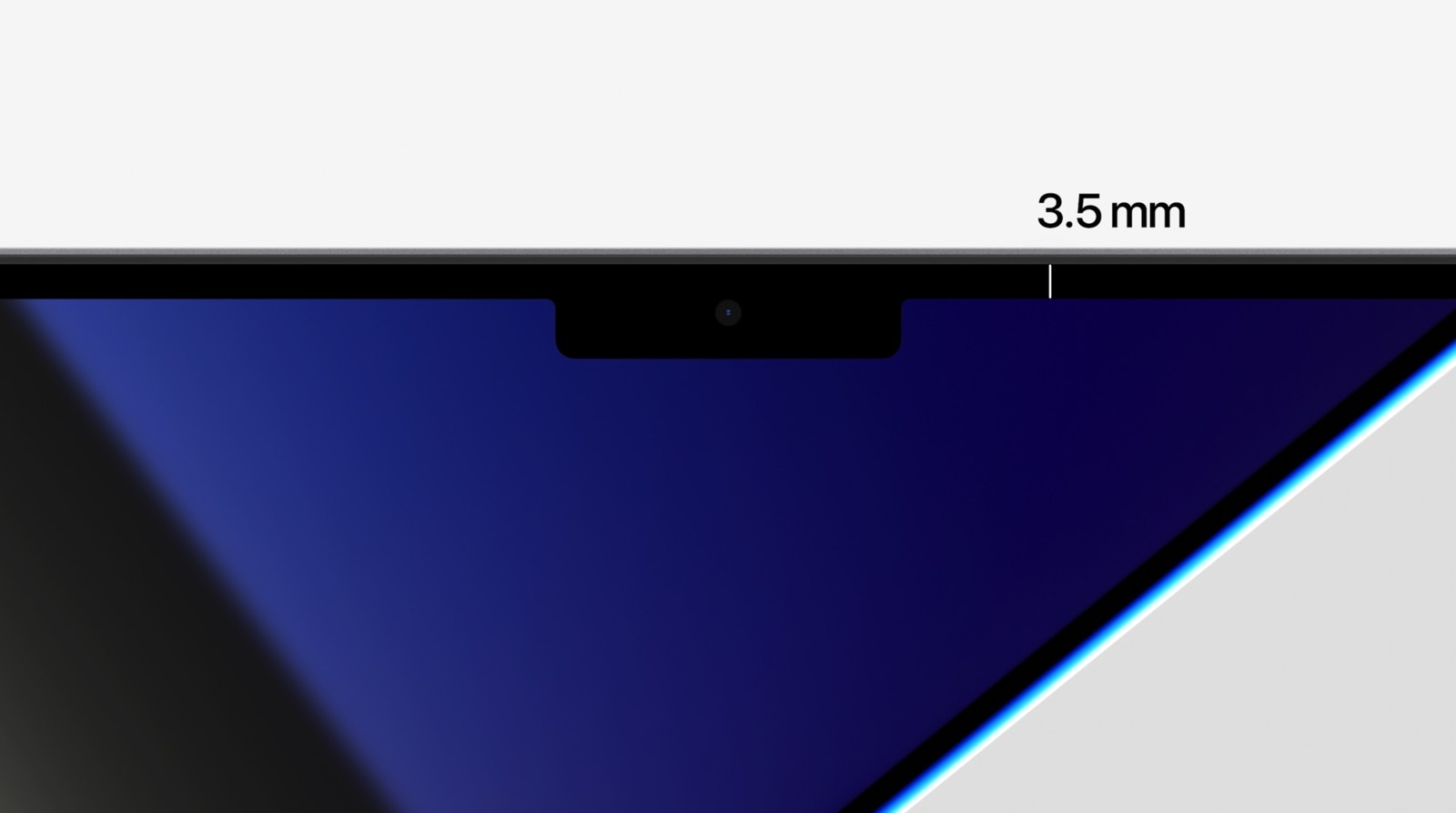
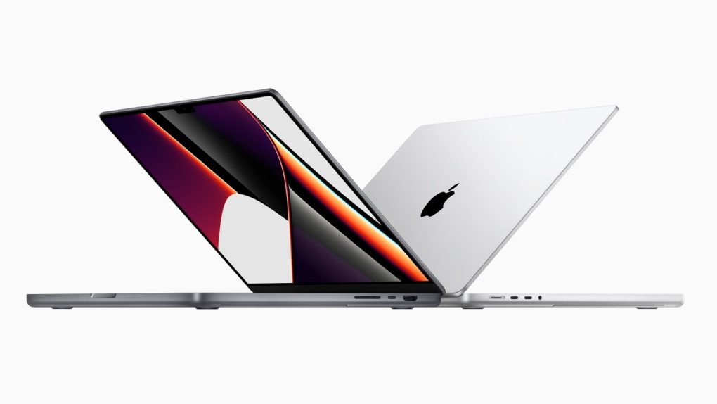
Apple’s 2021 MacBook Pro models are already shipping to buyers, with some models having sold out during preorders. Shipping times have slipped back to December for online orders, so in-store purchases might be your best bet. As the new laptops reach consumers, we will see more reviews and real-life experiences with the new machines. As a reminder, the new MacBook Pros feature the M1 Pro or M1 Max SoCs. These processors will deliver massive performance gains over the original M1, as seen in the first benchmarks that emerged online. Another essential upgrade concerns the MacBook Pro’s most controversial feature, the display notch. And Apple has explained in a new interview the thinking behind the notch upgrade.
Apple’s notch history
Apple first introduced the notch with the iPhone X in 2017. It’s a design compromise between form (all-screen display) and function (Face ID security). The notch has another purpose, which has to do with marketing. It gives the iPhone a strong visual identity. The iPhone will always stand out from the crowd, thanks to that notch.
All new iPhone flagships come with notches, with Apple having reduced its size this year. But, until the new M1 Pro and M1 Max MacBook Pro, we had no notches on Apple’s computers. Not even the iPad Pro, which supports Face ID, doesn’t have a notch.
The MacBook Pro notch is also a compromise between design and function. Again, Apple wanted to increase the screen real estate without increasing the laptop’s footprint. But the Apple’s new laptops still need front-facing cameras. The MacBook Pro notch doesn’t house Face ID components, however. That’s probably because the top panel is too thin compared to the thickness of an iPhone or iPad Pro.

Why the 2021 MacBook Pros come with a notch
Apple’s Shruti Haldea and Luke Tristram appeared in the latest episode of the Smart Brain podcast, where they talked about the 2021 MacBook Pro’s main features. The notch at the top of the screen came up. The two Apple execs told sisters Justine and Jenna Ezarik that the notch is the “smart way” of offering customers more space for their content.
The notch appears in the menu bar, so users still get a full 16-inch display with a 16:10 aspect area for their content.
“What we’ve done is we’ve actually made the display taller,” Haldea said. “Like on the 16-inch notebook, you still have a 16.0 active area on the diagonal in that 16:10-inch window, and we just grew the display up from there and put the menu bar up there. We just kind of moved it up and out of the way.”
Moreover, when users go into full-screen mode, the notch disappears, along with the menu bar.
“So it’s a really smart way to give you more space for your content, and when you’re in full-screen mode, you have that 16:10 window, and it looks great. It’s seamless.” Haldea said.
Same Brain’s full conversation with Apple follows below.


