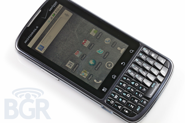
Motorola DROID Pro Review
Motorola is up to bat with their most competitive corporate device in years — they're aiming squarely at the fine boys and girls at RIM — and coupled with the latest Android OS and the nation's largest voice and data network, they mean business. Does that mean they have come up with the best business-focused handset on Verizon Wireless? How on earth will you be able to choose between a Motorola DROID Pro, a BlackBerry, or another Android handset? Hit the break to find out our thoughts!
HARDWARE
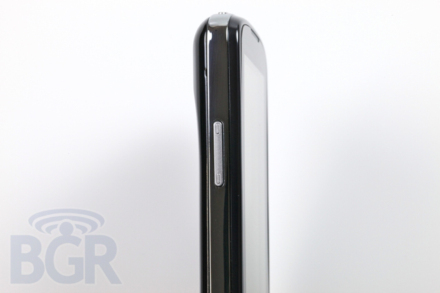
Motorola's DROID Pro is the first vertically-oriented candybar device with a QWERTY keyboard that we have reviewed, and at first glance, we have to admit that it does look a tad strange. However, once you pick up the phone and start using it, the entire handset makes sense. The Android OS that the DROID Pro runs would be more or less useless for most people if the screen wasn't vertical, and with the full QWERTY keyboard nestled below it, the entire design makes sense.
In between the small 3.1-inch display and the keyboard sits Android's default 4 buttons; menu, home, back, and search. They are touch sensitive, and if you've ever used a Motorola DROID or similar product, you'll know what they are all about it. We had no trouble using the keys in our testing of the device and found them to be very responsive.
The device is reasonably sized, decently thin, and mostly attractive to us. A dark-pewter colored glossy front plate blends in well with the black glossy keyboard and display, while a polished platinum-looking bezel houses the power button on top, programmable app button on the right, followed by a volume rocker key and microUSB port on the left side. Completing the device is a black lacquered looking battery cover with signature Motorola Android hump towards the top of the phone in the rear.
SCREEN
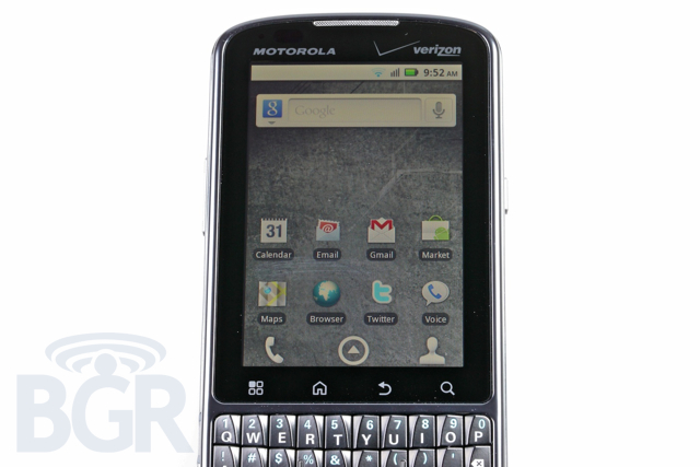
Motorola decided to go with a pretty low resolution display on the DROID Pro, and while the screen is reasonably small at 3.1-inch (especially compared to the gargantuan Android devices out there), we would have loved to see a high resolution than 320 x 480. It unfortunately makes a very solidly built and manufactured device feel less expensive than it is. Motorola has been pumping out 800 x 480 resolution displays ever since the original DROID launch over a year ago, and we'd have loved to see something a bit more high end on a device primary focused on the business and corporate crowd.
As far as touch sensitivity and response goes, our results were mixed. Motorola makes good touchscreen displays in our opinion, but we have noticed several irksome quirks on the DROID Pro. The first being that the touch area of the screen doesn't extend all the way to the edges of the display when you're using your thumb to quickly navigate. Here is what we mean... with the phone in our hand, using our thumb to swipe across the screen from either left to right or right to left doesn't get registered by the phone. If we're extra careful about it and start the swiping motion from more in the middle of the screen, everything works and gets sensed correctly. Not the biggest issue, but especially on a smaller-sized display, we'd have preferred not to change how we normally use a touchscreen just for this specific product.
One more touch issue we noticed was that when scrolling slowly with our thumbs, the phone's UI will start to literally twitch — it seems like it can't properly sense where our thumb is and it starts to get confused on where the touch selection is happened from.
Resolution complaints aside, the display itself seems vidid, colorful, and bright. Text could be a bit sharper, and the auto-backlight algorithm could be slightly tweaked as sometimes the phone will dim a little too much in some environments, but all in all, we are reasonably happy with the LCD on here.
KEYBOARD
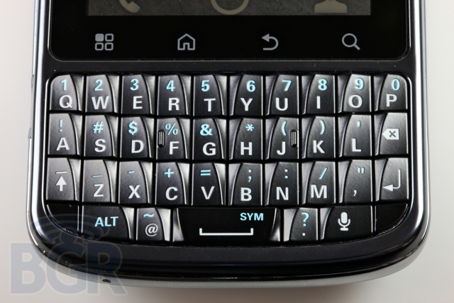
The Motorola DROID Pro is a direct assault on RIM and their BlackBerry products, and the keyboard is primarily the biggest reason. Comparing it to the latest BlackBerry handset — the Bold 9780 — the resemblance between the two QWERTY keyboards are striking. The keyboard on the BlackBerry 9780 is definitely better, but we think the DROID Pro's keyboard is good enough.
Both keyboards have the letters Q through P on the first line, both keyboards have the letters A through L on the second line followed by a backspace key, and both keyboards have a shift or alt button and end with an enter button on the third line. Both keyboards have the space bar positioned directly under the V and B keys, and both keyboards have 5 total keys on the last and final row.
RIM's keyboard layout is slightly curved upwards while the DROID Pro's is straight, and while it seems that RIM's keyboard depth is actually less than the Pro's, RIM's keyboard feels much better to type on. We wish Motorola would have arranged the numbers on the keyboard in a dialpad arrangement like RIM does
The DROID Pro keyboard, however, fares well in our typing tests, and while it was incredibly firm starting out, after a couple hours of use, it got a bit looser when pressing the keys, and made the typing experience much more enjoyable. We also like the dedicated period, comma, "@" symbol, and voice dictation keys on the Pro's keyboard. It's not better than a BlackBerry keyboard, but it's one of the better Android keyboards we have tested. Due to size, layout, and general feel, and we think this helps makes the product a serious contender to any BlackBerry device in Verizon's lineup.
PHONE / SPEAKER
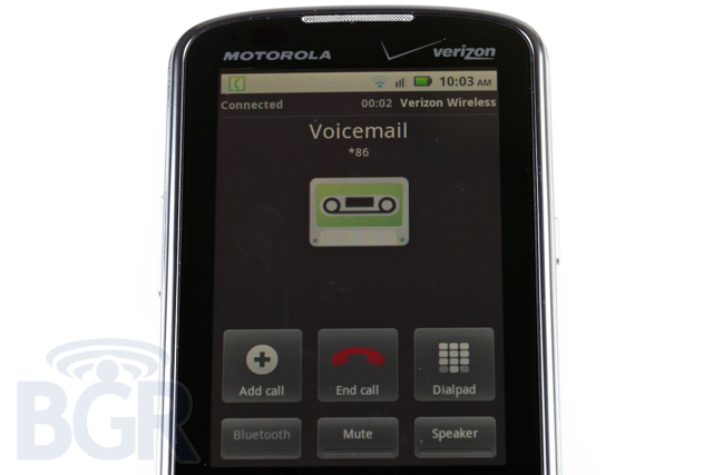
When we made our first call with the Motorola DROID Pro, we were positive we had a bum unit. There was no way in our mind that a Motorola product would have such a poor performing ear speaker. The person we were talking to went in and out to the point we couldn't hear them for seconds at a time, their voice sounded incredibly compressed and digitized, and the actual audio was crackling. Verizon and Motorola kindly swapped out our unit with a new one, and while it's better, we're still pretty troubled by the voice performance on the Pro.
The new unit exhibits many of the same problems we found in the original review unit, though it doesn't suffer from the cutting in and out, which is obviously the biggest problem we had originally. The new unit still has audio through the ear speaker that sounds very compressed and digitized, and it's extremely odd because of the strengths both Motorola and Verizon have with their devices and products. We have never heard such a poorly performing Motorola handset or device running on Verizon's incredibly solid voice network. Add in the fact that this is a very business-centric phone, and it's not too great.
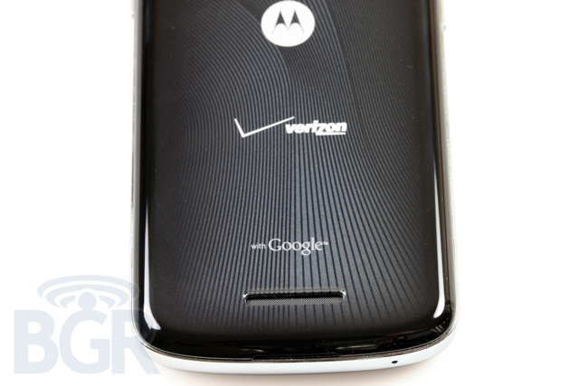
The rear speaker which is used for speakerphone and general audio playback is also not the greatest performing phone speaker we have heard and tested. It also suffers from a compressed / digitized sound when we talked on speakerphone, and the placement of the speaker on the back of the phone isn't optimal as laying the handset down on a flat surface resulted in a muffled sound experience.
It's rather disappointing. We realize this isn't a 100% consumer-focused product, yet audio performance in both ear and rear speakers proved to be some of the worst we've used in recent memory.
BATTERY LIFE
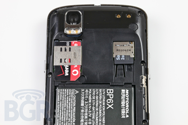
We have been through multiple battery cycles with the DROID Pro and battery seems about average for an Android device. Now, that doesn't mean it's great, but it should power you through an average day of use in most scenarios. It's not comparable to a BlackBerry unfortunately, and for a device meant to go head to head with RIM's consumer and business handsets, this needs to be a major strong point with the Pro.
One problem we have found with Android, not just the Pro, is the standby time. Where a BlackBerry or iPhone can be powered on for days and days, we have had trouble finding an Android device that can match the stamina of standby mode on other handsets. Thankfully Motorola offers an extended battery for the DROID Pro. While the new cell's require (and come with) a new battery cover, it doesn't add too much thickness to the handset from what we have been told. If you're always on the go, we'd definitely recommend picking up the extended battery kit from Verizon Wireless.
CUSTOMIZATIONS
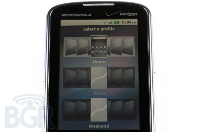
Just like the DROID X and DROID 2, the Pro runs Motorola's heavily-customized Android UI called BLUR; a mostly scaled down version of the original, and horrendous MOTOBLUR UI. It's not that the Pro's UI is bad — or Motorola's vision of Android is bad — it's just that compared to the beautiful and pure original DROID handset running stock Android, well, we just don't care for much else in this day and age. Motorola tries to provide their own integrated messaging and email inbox, their own social networking inbox and service aggregation, and while it's great in theory, it ends up coming across as confused, un-unified, and kind of a mess.
One of the reasons this isn't successful is due to the fact that most of the services Motorola tries to integrate on their own, are already supported in Android 2.0 and up in the stock operating system. You end up having two Twitter services, two Facebook services, and so on, and so on.
On the flip side, something good that comes out of Motorola's customizations are the added security and corporate IT policy support for business users on the DROID Pro. Motorola says that in early 2011, the DROID Pro will be the first Android device with data encryption which is a very big step in terms of security. Additionally, even though it's small, we really like the fact that Motorola has included the ability to set a time out after the device's screen turns off. On a non-BLUR Android device, you're stuck entering your password or PIN each time, regardless of the amount of time that has passed since the handset's screen has turned off.
THE BOTTOM LINE
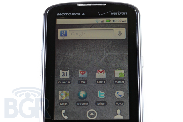
It's rather interesting how our opinions of the Motorola DROID Pro have flip flopped in between us not really considering the handset as a viable choice for an Android business device and us debating whether the DROID Pro could completely wipe out most of RIM's device sales on Verizon Wireless for the foreseeable short future. After spending a bunch of time with the phone, our feelings are still mixed. On one hand, it's great to see an Android phone with a portrait orientation and full QWERTY keyboard. It's a form factor we've been waiting for, well, since Android was first announced. On the other hand it's kind of frustrating to see that that all of the innovating and all of the advancements in manufacturing, processors, memory, software and UI kind of get lost when coupled together in this specific handset.
What makes the DROID Pro reasonably special is the fact that it's a global phone, and it's one of the first global Android devices to hit the market. However, with the serious issues in voice calling and issues just plain talking on the phone — the main purpose of a phone, but especially the main purpose of a business handset — it's very difficult for us to recommend this device to someone looking to depend on it day in and day out. It's especially tough for us to say that since there are many, many things about the DROID Pro that we love. On almost every level, the DROID Pro outperforms the BlackBerry smartphones that Verizon Wireless carries. Yet, on a BlackBerry, you're getting not only the best email experience on a mobile device, but a darn good voice calling experience as well.
Our verdict is this: if you're not married to this particular form factor, and want the flexibility of an Android device, we would suggest testing out the Motorola DROID 2 Global. For an extra $20 you're getting a much more solid Motorola product, a higher resolution screen, larger keyboard, and of course, global support.
