Netflix has had many ups and downs, but no one can deny that its user interface is among the best of any streaming service. Now, the company wants to redesign its TV app by simplifying how people look for content.
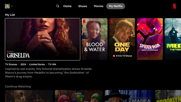
According to The Verge, the streaming service is looking to redesign its TV app by replacing the static tiles containing recommended shows and movies after you load the app with information that you’re looking for in a much more prominent box.
By hovering over a TV show, Netflix will play a short preview within the box alongside the synopsis, the year it was released, the number of episodes, and the genre. It should be easier to discover the content you want to see without scrolling up and down endlessly.
“We often see members doing gymnastics with their eyes as they’re scanning the home experience,” Pat Flemming, Netflix’s senior director of product, tells The Verge. “We really wanted members to have an easier time figuring out if a title is right for them.”

Besides that, the streaming service plans to ditch the sidebar menu in favor of a streamlined selection of options at the top of the screen: Search, Home, Shows, Movies, and My Netflix. My Netflix was introduced in the mobile app last year and offers content recommendations and quick access to titles you recently watched and saved. The old “Categories” option will be available under the new search tab.
“Think of this as a first effort, our best initial swing, at what we think is a great new TV experience,” Flemming says. To the publication, Netflix says it will test this redesign with a small group of subscribers using smart TVs and other streaming devices, and if it goes well, more people should see it in coming months and years.


